Uprise Cannabis Graphic Identity
- Credits
-
Bud Rodecker
Design DirectionAlyssa Arnesen
DesignValeria Bernal
DesignAvery Branen
DesignDarcy Nathanson
DesignChris Malven
Programming
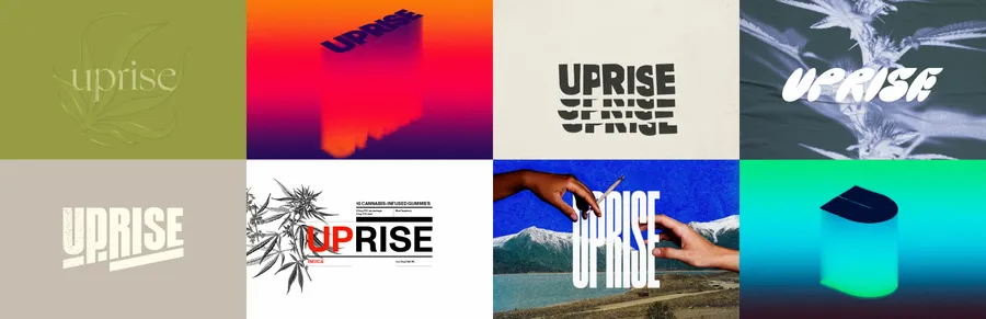
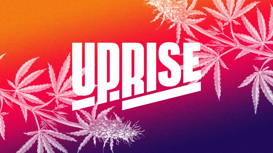
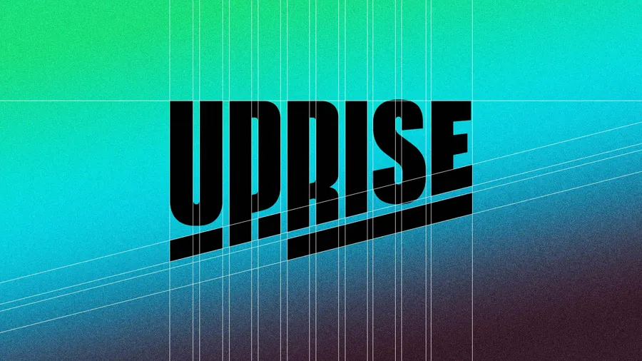
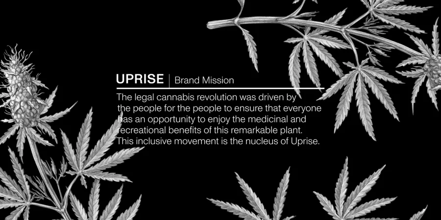
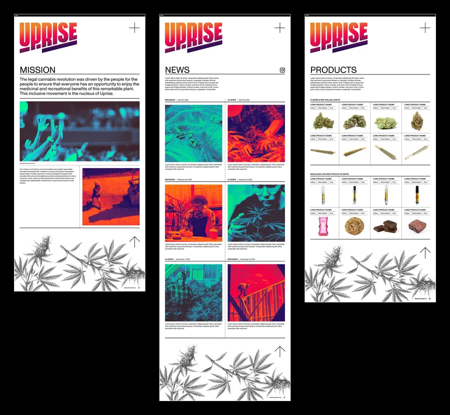
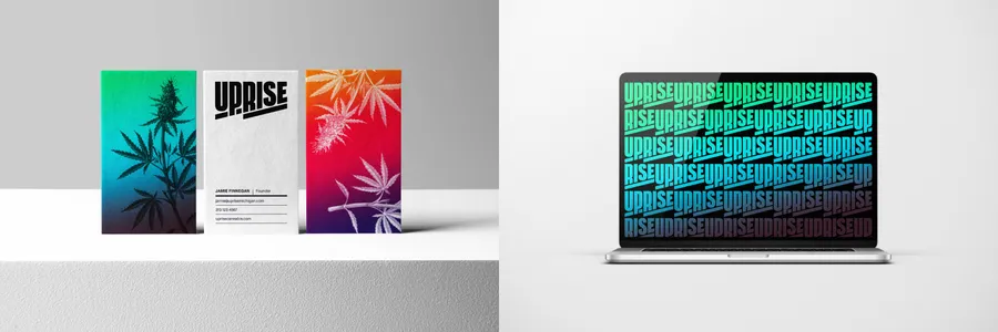
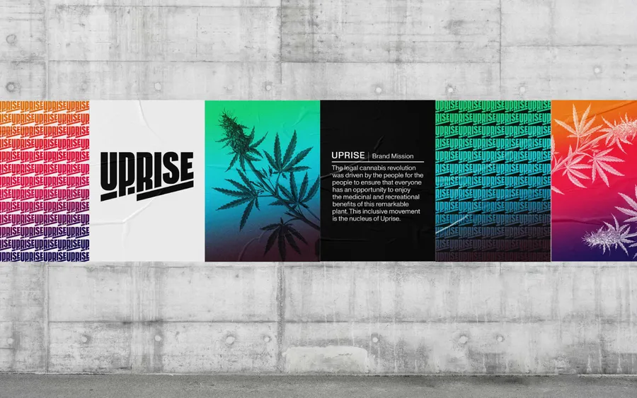
Uprise Cannabis is a start-up driven by the mission to build an environmentally and socially responsible cannabis enterprise. Span created an identity system that is inspired by the cannabis revolution in which people fought for the legalization of marijuana in their home states. The identity system pairs vivid gradients with botanical illustrations to speak to the artisanal product that Uprise is bringing to market. All of this is underpinned by a rigorous typographic system that enables the transparency Uprise hopes to bring at every stage of the cannabis life cycle.
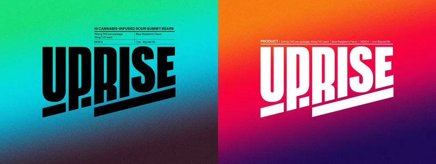
Product information can attach to the logo in various lockups. These lockups utilize rule lines and typographic hierarchy to separate product data.
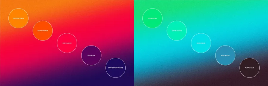
The colors in the Uprise palette are named after different strains of marijuana.
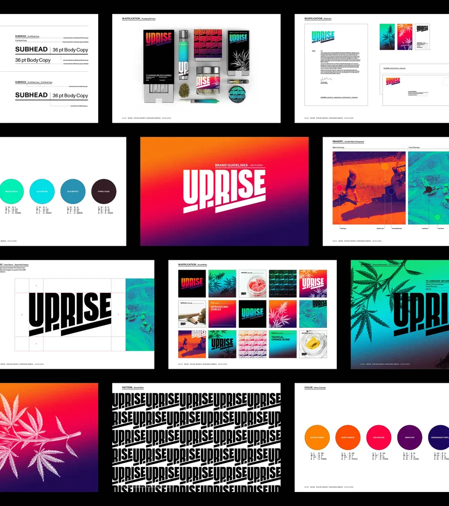
Span created an extensive graphic standards manual that outlines the architecture of the Uprise brand and how it is applied across different touch points.
Process
The final identity system for Uprise is created from a combination of multiple sketches Span presented in the first round of the branding discovery process.