Copi Name & Branding
- Client
- Tetra Tech
Illinois Department of Natural Resources
Southern Illinois University
- Community
- Civic
- Government
- Academic
- Awards
- Silver Anvil Award Silver Anvil Award for Excellence
- Shorty Awards
- Anthem Awards for Sustainability, Environment & Climate
- Credits
-
Nick Adam
Concept, Design Direction, Design, NamingBud Rodecker
Design Direction, NamingCheryl Kao
DesignAvery Branen
DesignValeria Bernal
AnimationLeah Wendzinski
AnimationSuzie Shin
IllustrationDarcy Nathanson
DesignJohn Pobojewski
Design Direction, Animation, Sound DesignZach Minnich
3D
- Also
Donna Speigel
Strategy, Voice Guidelines, Copywriting, NamingLyndon Valicenti, Daylight
Design ResearchAlex Roper
ProgrammingM. Harris & Co
Launch Strategy
Documentary Film
Event Execution
The Great Lakes are in danger of catastrophic impact from an invasive fish widely referred to as ‘Asian carp’. Several species of carp brought from Asia by fish farmers in the 1970s to reduce nuisance vegetation in commercial ponds escaped into the Mississippi River, the second-longest river in North America. Several stopgap measures — such as billions spent on barriers to prevent the carps from spreading further — have been implemented, but Asian carp still threatens the Great Lakes. If the carps aren’t stopped, the fish will severely damage the already vulnerable ecosystem.
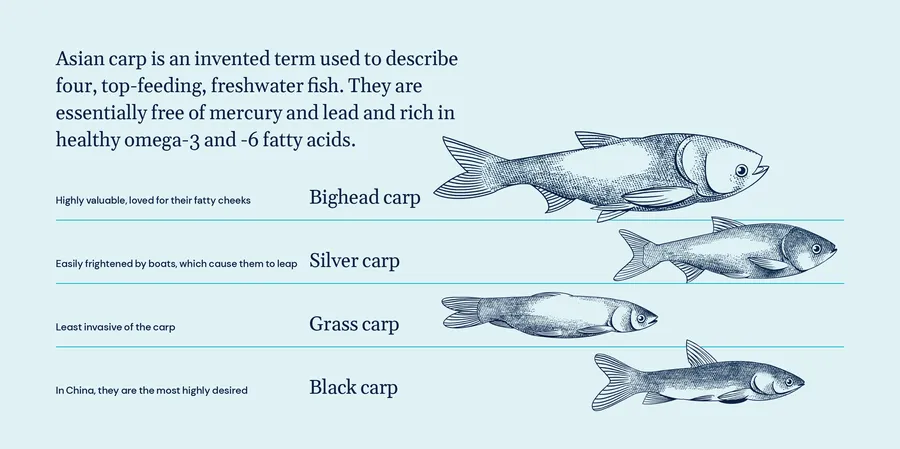
Water and Environmental engineering firm, Tetra Tech (commissioned by the Illinois Department of Natural Resources and Southern Illinois University) hired Span to reposition the fish for human consumption. ‘Asian carp’ — made up of 4 species of carp — are in fact low in contaminant levels and compare well with other popular fish in terms of purity. They also happen to be some of the most loved fish in cuisines around the world.
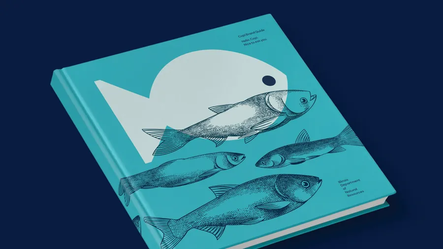
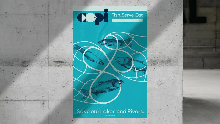
Span’s solution was to rename the fish Copi (derived from copious), rendered with a friendly, recognizable logotype and distinct identity system. The Copi rebrand — along with the tagline Eat well. Do good. — reintroduces these carps (which are in fact a clean, top-feeding fish rich in protein and fatty acids that are eaten all over the world) to the public as a healthy, delicious, and responsible seafood option that also helps solve an environmental crisis.
Copi will become synonymous with a responsible lifestyle and a healthier planet, attracting aware citizens, responsible consumers and modern adapters of new ideas — supply chains, chefs, retailers, consumers.
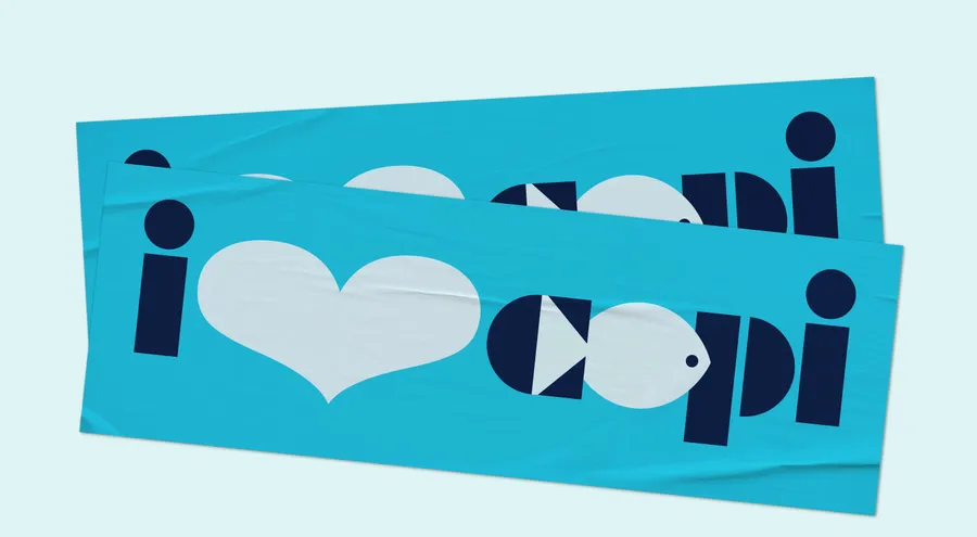
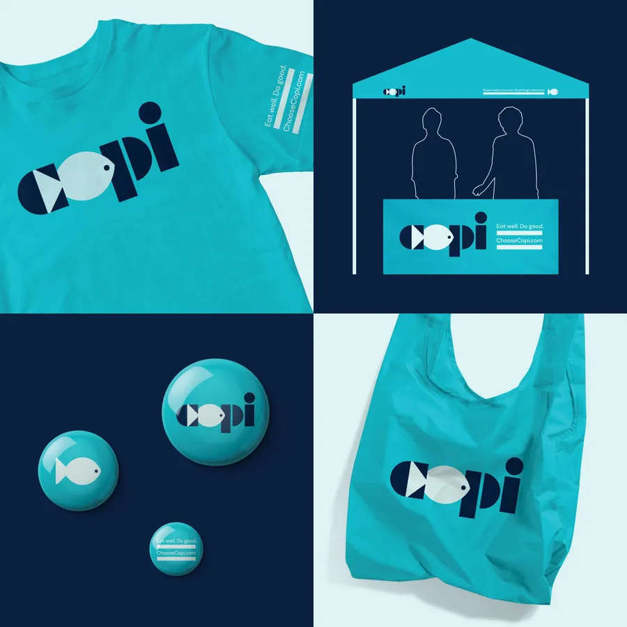
Simple and fun, the Copi logo contains a not-so-secret message. The forward-facing fish is created using the negative space within the ‘c’ and letter-space reserved for the ‘o.’ The fish centers vertically within the geometric letterforms inspired by the Futura Black typeface. The stencil form balances hard-working, utilitarian aesthetics with a playful feeling through its assembly of simple semi-circles, triangles, and rectangles. This stencil approach allows each letter to be its maximum weight. The heaviness of the logo aligns with the physical qualities of these fish that can weigh over 100 pounds, reach five feet in length, and each lay over a million eggs per year.
Formerly known as
So-called ‘Asian carp‘ — made up of 4 species of carp — are in fact low in contaminant levels and compare well with other popular fish in terms of purity. A top-feeder (as distinct from common-carp), Asian carp has other positive attributes, including tender and mild meat that is high in protein and contains beneficial Omega-3 fatty acids.
A name that jumps
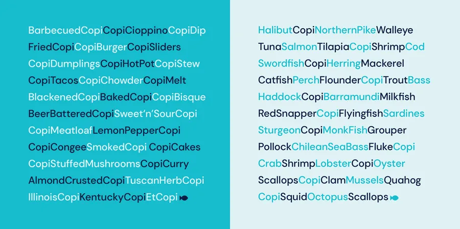
The name Copi distinguishes itself from the established pool of fish names. It jumps from the sea of seafood names. The name also offers elasticity. It easily accommodates product extensions, recipes, menu items and regionality.
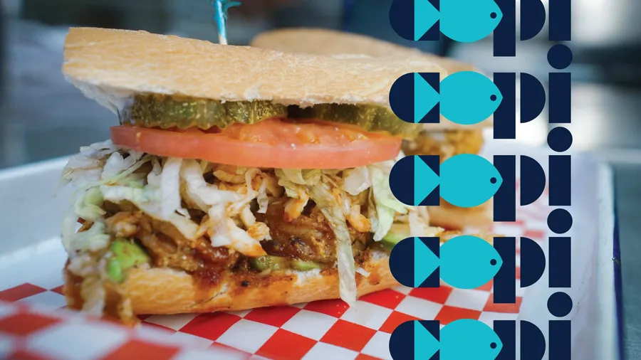
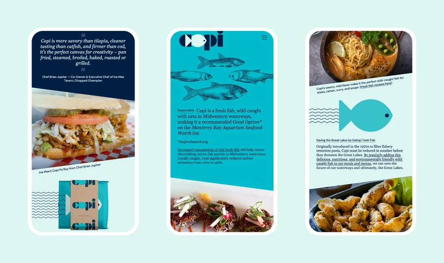
Chef Brian Jupiter’s Copi Po’ Boy served at Chicago’s Ina Mae restaurant
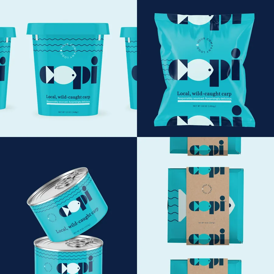
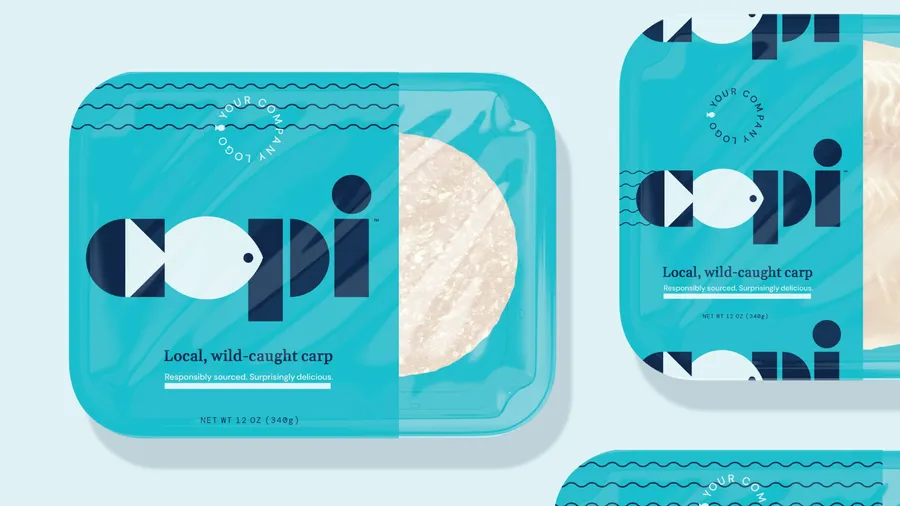
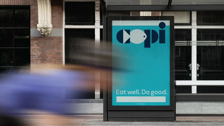
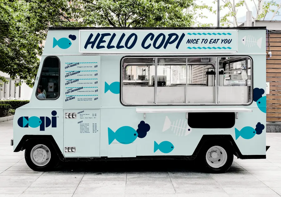
The Story of Four Fishes
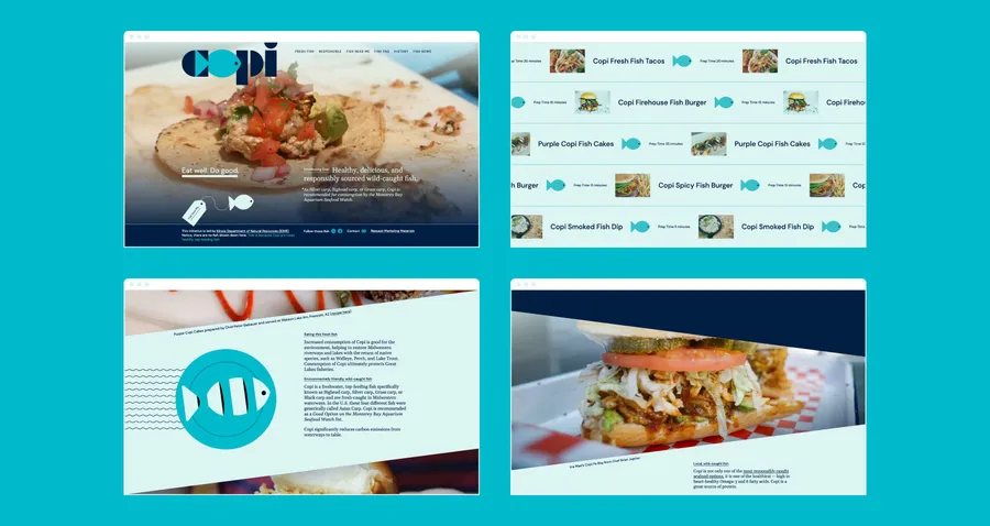
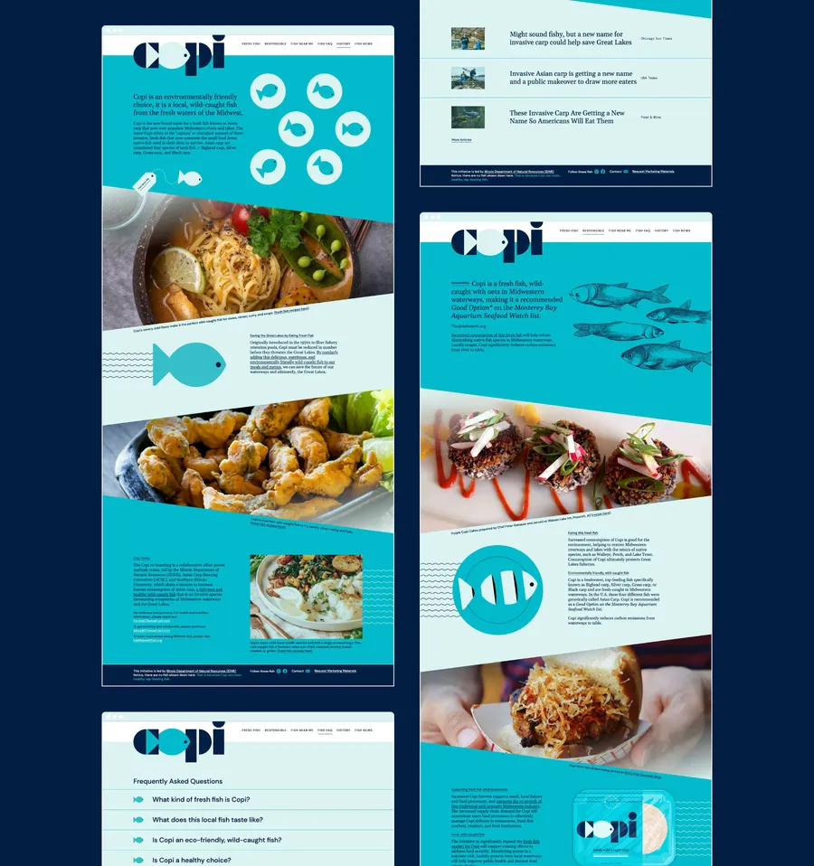
ChooseCopi.com tells the story of this globally-loved, healthy, delicious, and responsibly sourced wild-caught fish. The site will serve as the hub for where to buy Copi and popular Copi recipes, and will provide key nutritional and environmental facts.
What is in a name, anyway?
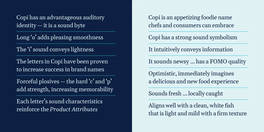
Meet Copi ... Copi is derived from the word ‘copious,’ meaning ‘abundant’.
The name Copi possesses dimension on many critical communications levels — from telling an important brand story relevant to consumers, to quickly building brand equity, to capturing the fascination of the media and influencers who will create news and start conversations.
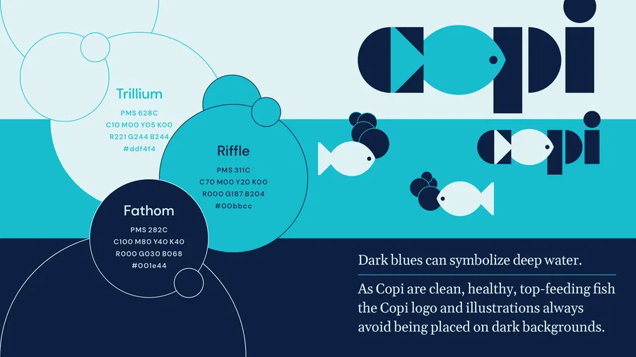
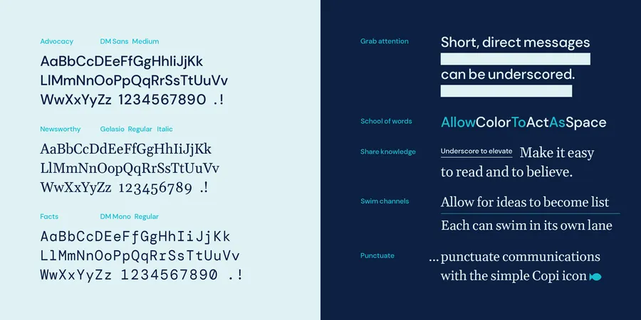
Typographic rivers ... lakes and streams
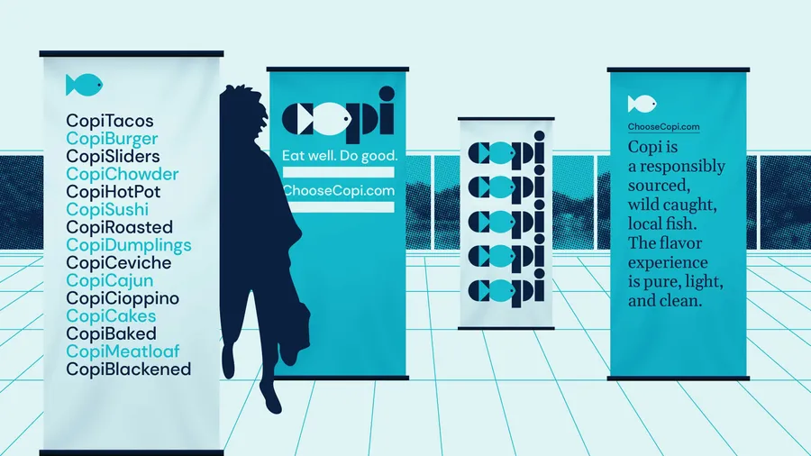
The Copi brand uses 3 supportive typefaces. The bookish Gelasio is the typeface the identity system uses to tell the fish’s story; DM Sans, a highly geometric sans-serif that the identity uses for more direct and advocacy related messages; and DM Mono, a monospace typeface that Copi uses to conveys facts, data, and source information about these fish. All the fonts used in the Copi visual identity are open-source and available to anyone, making beautiful typography free and accessible to anyone (governmental departments, grocery markets, restaurants) connected to the project.
Fin
Copi is invasive to local waterways, and their increased numbers have greatly reduced native species. By eating this fresh fish, you’re not only eating well, you’re doing good by helping to restore natural waterways and protect the Great Lakes.