STA Branding
- Credits
-
Bud Rodecker
Design Direction, Design
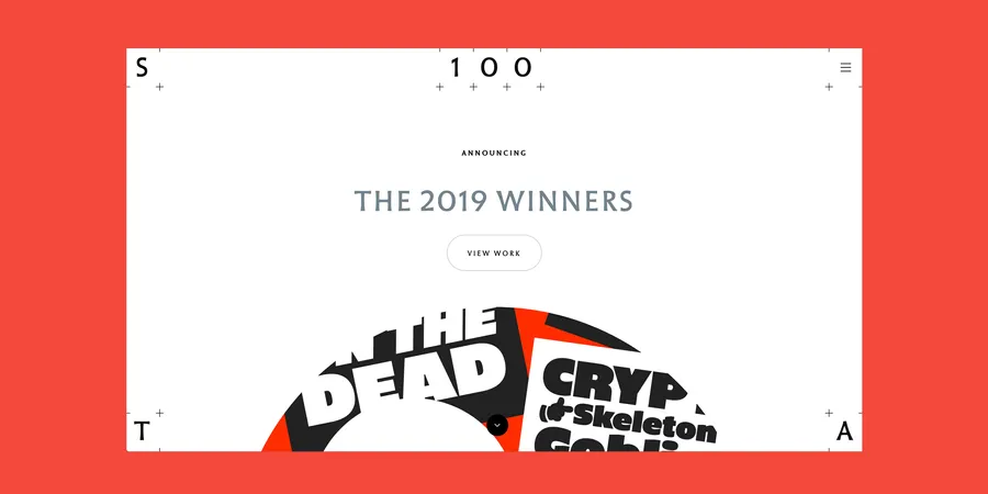
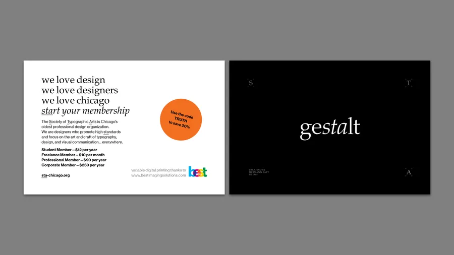
While Bud Rodecker was on the board of the Society of Typographic Arts Chicago, he instituted a new graphic identity system for the organization. The goal of the redesign was to differentiate the organization from AIGA and TDC and better represent the STA’s unique membership.
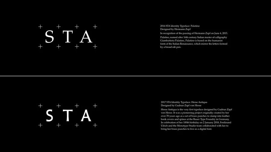
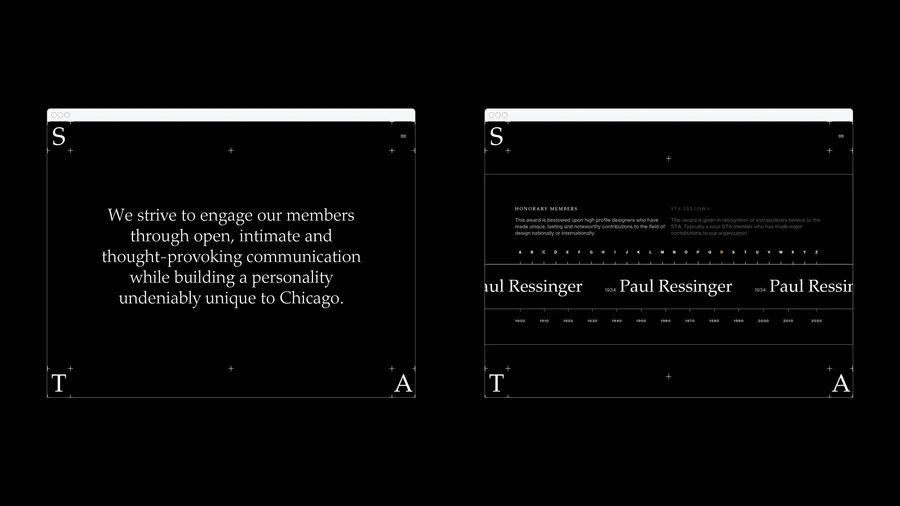
The identity reimagines the logo and associated system as an exhibition platform for typographic design. The frame of registration marks serves as a frame for a wide variety of typefaces. Each year, the board would select a new typeface to feature as the organization's identity. The logo would be updated, and all new materials would use that typeface.
The first year featured Palatino in honor of Herman Zapf who had recently passed. The following year featured Hesse Antiqua as an achievement of special note, being published on the 100th birthday of Gudrun Zapf von Hesse who designed it 70 years prior.
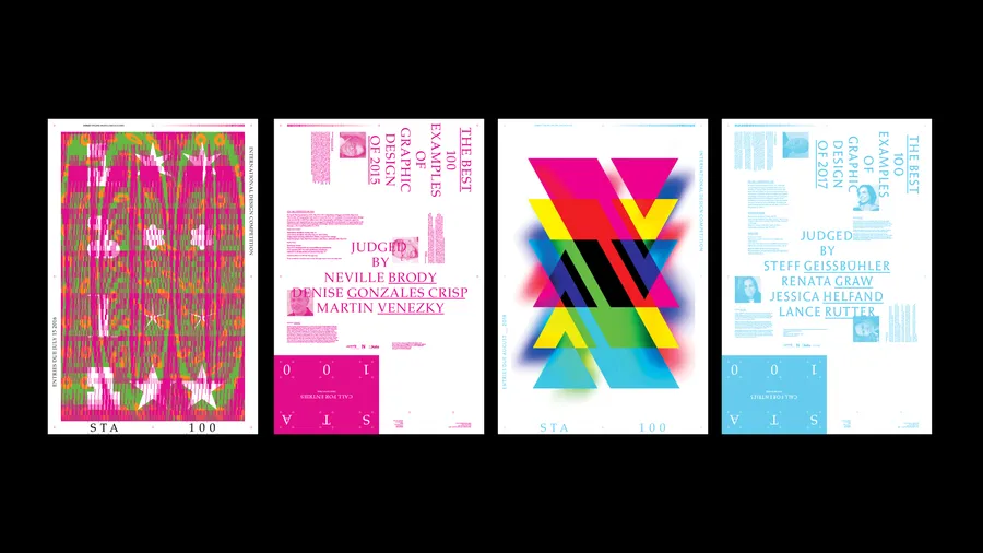
From left to right
1-2: Kyle Green and Zach Minnich
3-4: Anette Lenz