North Union Identity & Website
- Credits
-
John Pobojewski
Design Direction, Strategy, DesignCheryl Kao
DesignAlex Roper
Web Development
- Also
Brick Visual
Renderings
North Union is an 8-acre, 3.5 million GSF mixed-use development in downtown Chicago encompassing eight residential high rises, retail/restaurant destinations, and two urban parks. Developer JDL came to Span with a name, a vision, and even a sketch of the logomark they wanted to use for the project.
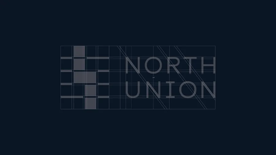
The refined logo builds on the sketch based on the overall site plan for the property. Each project phase from south to north ”fills in” the missing lots defined by Chicago’s horizontal street grid. Custom letterforms based on FF Mark create a perfectly-balanced wordmark. The messaging concept behind “A Community Together” defines the development’s role of uniting the Old Town, River North, and Gold Coast neighborhoods.
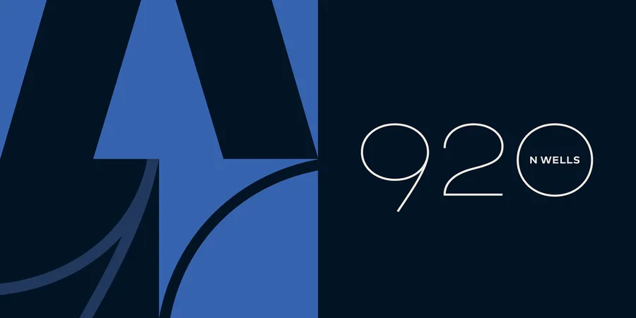
Span also developed the brand strategy for each property as well as the website for the overall project. Since each of the properties would be marketed by their individual street addresses, five custom numeral sets were created, all drawn upon the same structure. This, combined with a shared approach to patterning, allows each individual property to speak individually while always pointing back to the same central vision of North Union.
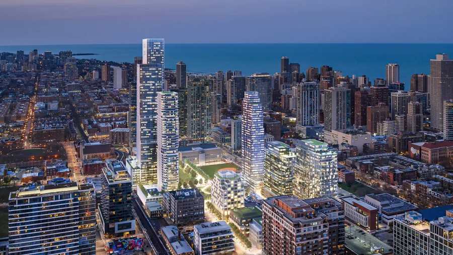
Renderings by Brick Visual art directed by Span
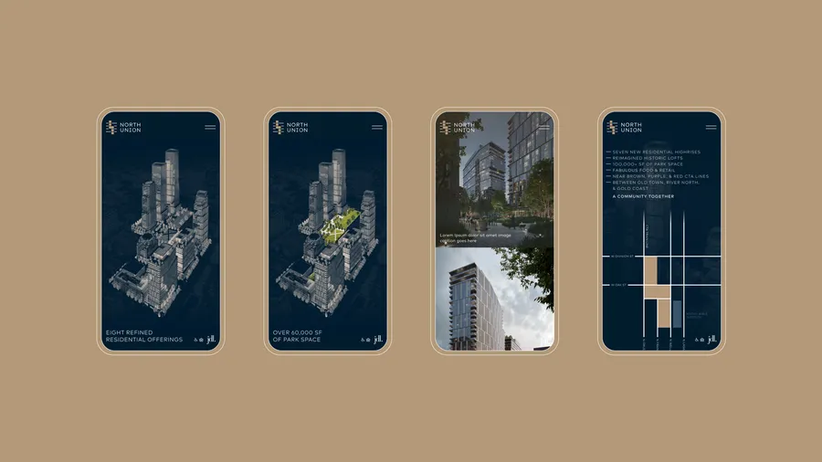
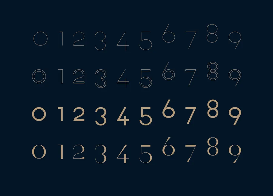
Five unique numeral sets allow each individual property to be distinctly branded yet united under the North Union vision.
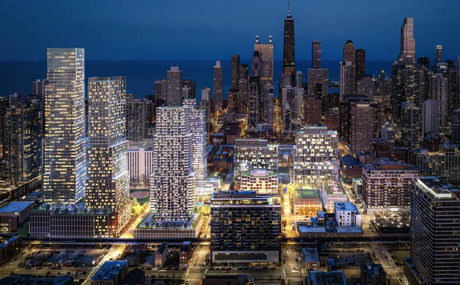
Renderings by Brick Visual art directed by Span
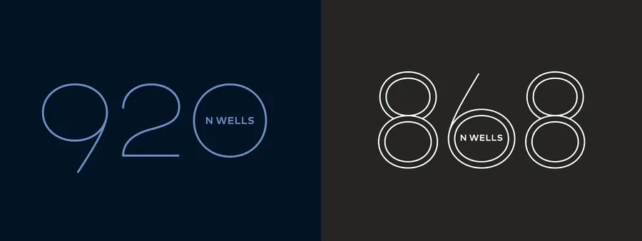

920 North Wells and 868 North Wells, the project’s phase 1 properties, add custom patterning and color palettes to their custom numeral logotypes. Each pattern is built within the same square grid of the logo.
