La Grange Park Brand Identity
- Awards
- STA100—2026
- Credits
-
John Pobojewski
Concept, Design Direction, StrategyValeria Bernal
Concept, Design, Design ResearchDesirée Solenberger
Design Research
Rooted in community. Designed with purpose.
Located just 20 minutes west of Chicago, La Grange Park was founded in 1892 by five pioneering families on rural farmland. From the start, the village set out to carve its own identity—distinct from its immediate neighbor, La Grange, and the surrounding suburbs.
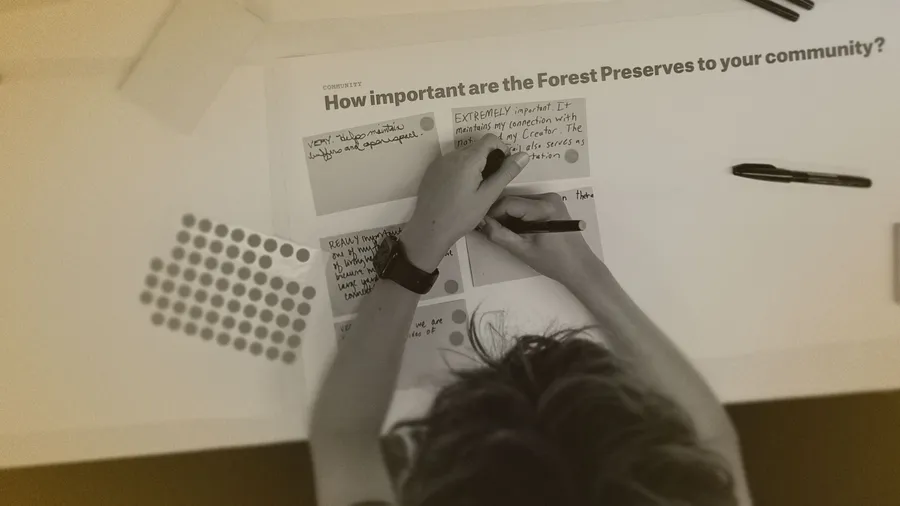
That ethos is behind the bold new visual identity and streetscape toolkit by Span, led by John Pobojewski. The process was deeply collaborative: 114 residents shared their voices through surveys—online and in person—shaping the outcome across four key themes: Aesthetic Preferences, History, Community Culture, and Wayfinding.
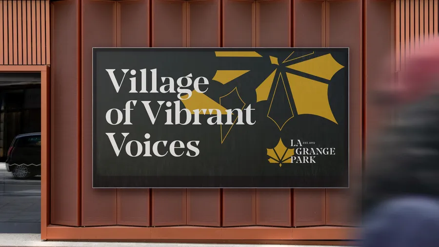
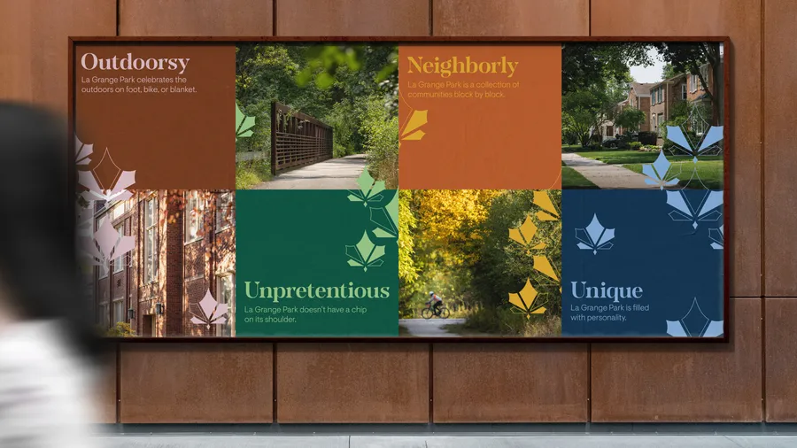
Span’s brand is built from this feedback from residents, centered around an ethos statement, guiding principles, and brand traits that speak to who La Grange Park is at its core. A unifying brand voice emerged: “a village of vibrant voices.” It captures the municipality’s unique spirit—rooted in tradition, alive with individuality.
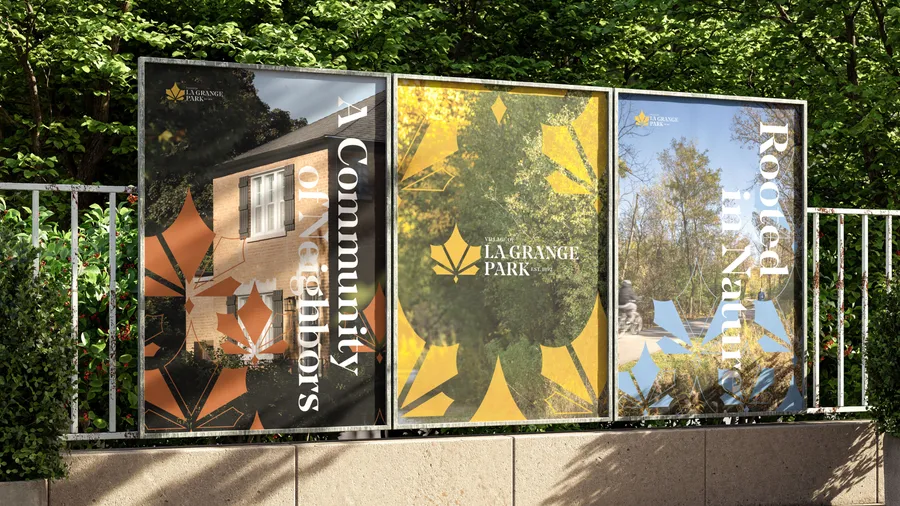
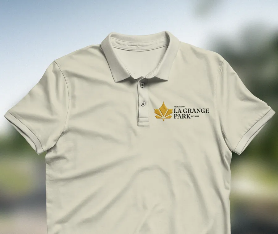
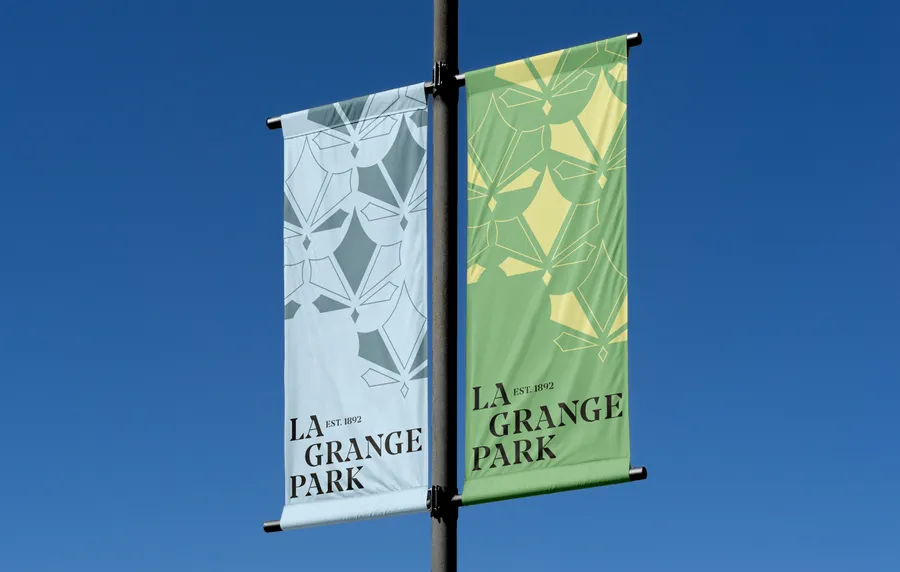
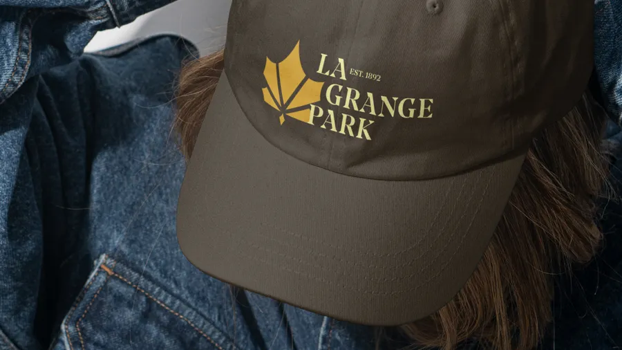
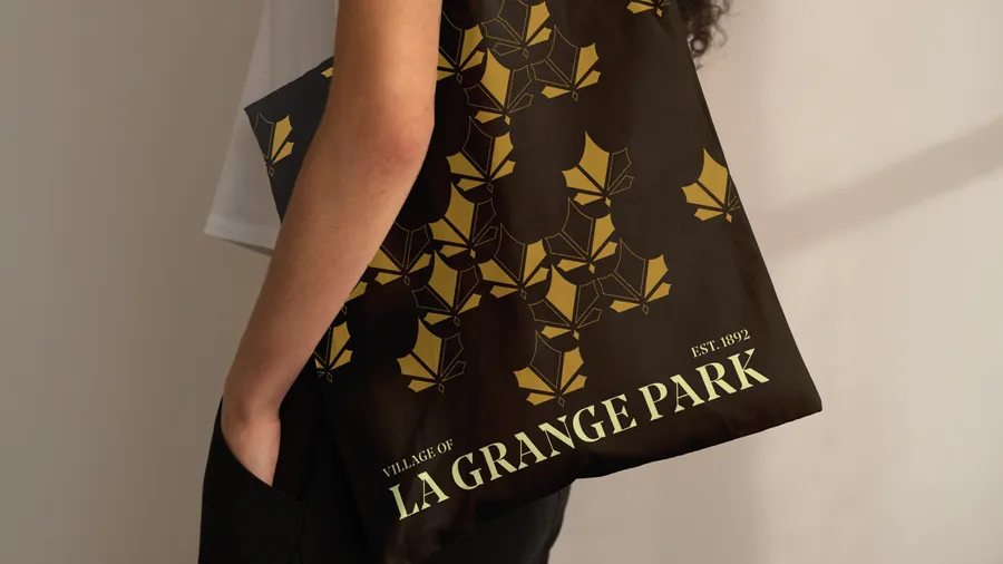
Surrounded on three sides by six forest preserves, La Grange Park’s relationship to nature was at the heart of the community. Span’s response was to deconstruct the maple leaf as motif—a tree common to the area. The new logo merges heritage and environment, symbolizing both the five founding families and today’s deep connection to nature. Multiple maple leaf patterns add richness and texture, echoing the layered beauty of the forests that inspire them.
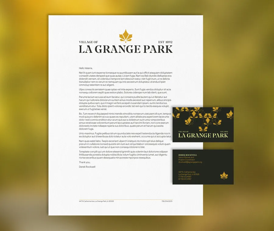
The typography for the identity pairs a high-contrast serif—classic yet contemporary—with a clean sans serif for utility and accessibility. Four typemarks allow the village to strike the right tone, from formal to friendly, across different communications. The color palette is pulled straight from the forest floor—earthy, seasonal, and always in motion. Each brand application plays with these elements, adapting colors, patterns, and typemarks to fit both message and moment.
”Span’s thoughtful, detail-oriented approach, including the research they conducted into our community’s history and character, helped ground the project in what makes La Grange Park unique. They demonstrated strong communication skills with all stakeholder groups—from the Village Board and staff to residents and local businesses—helping shape a vision that truly reflects who we are." — Maggie Jarr, Deputy Village Manager, Village of La Grange Park