Illinois Humanities Website
- Credits
-
Nick Adam
Concept, Design Direction, Strategy, Design ResearchCheryl Kao
DesignDanielle LeComte
Web DevelopmentLauren Viera
WritingAvery Branen
Design ResearchValeria Bernal
Design Research
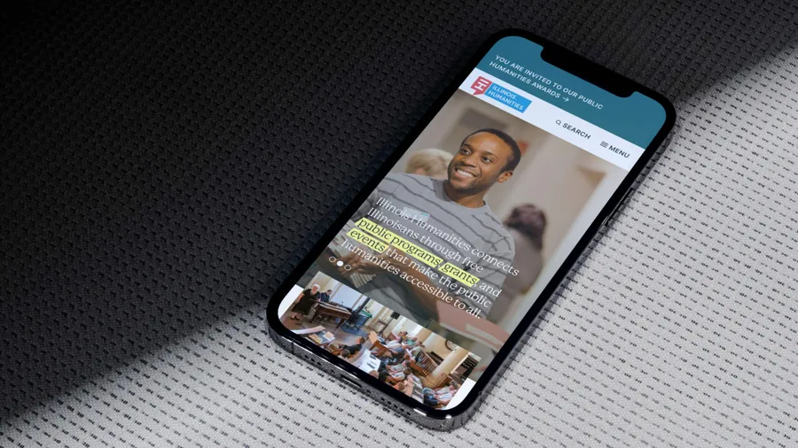
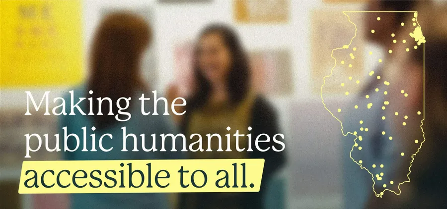
As Illinois Humanities approached their 50th anniversary, they worked with Span on a complete website overhaul that enhanced accessibility, improved user experiences, and provided greater editing capabilities. Illinois Humanities is a statewide nonprofit organization that fosters conversation, reflection, community building, and civic engagement. They achieve this by offering free public programs, grants, and educational opportunities for all residents of Illinois.
Before the design phase began, Span facilitated seven focus group discussions to ensure that Illinois Humanities and the design team comprehended the experiences and preferences of their users. These focus groups included current grantees, event participants, donors, staff, and board members. Themes that emerged from these discussions related to navigation confusion, accessibility, and fostering a sense of belonging.
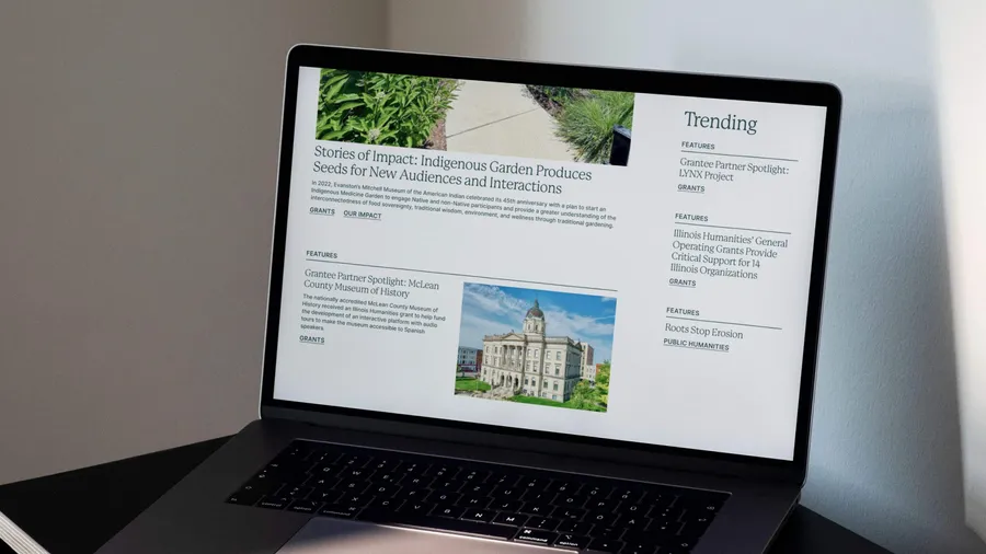
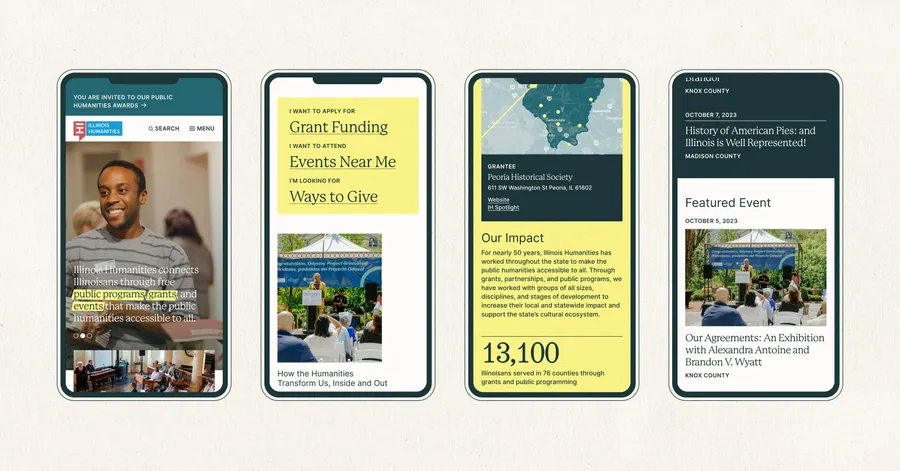
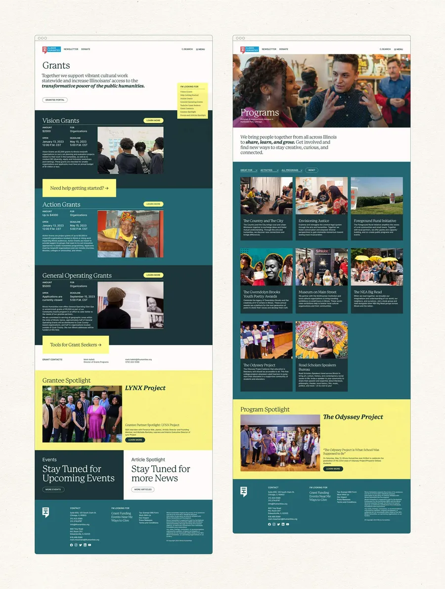
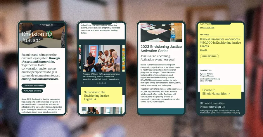
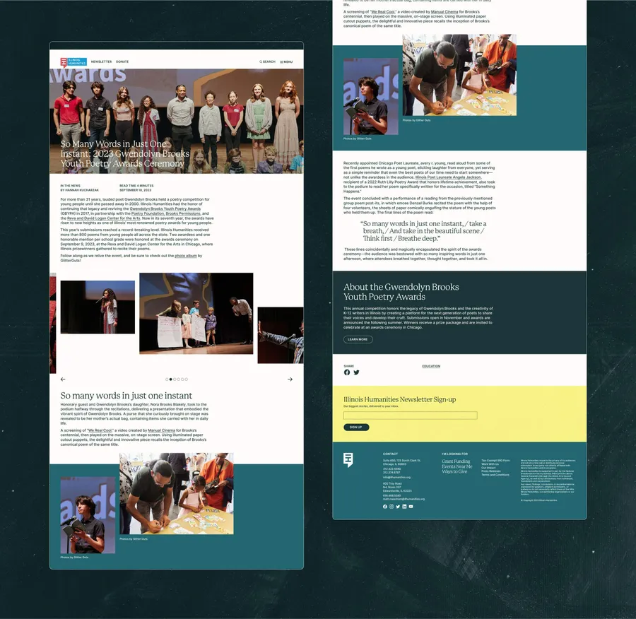
To help users navigate and find the content they need, Span designed an intuitive navigation system that incorporates multiple shortcuts throughout the website and within content-rich pages. Users can now easily navigate the site. Span’s color and typographic hierarchy system addressed accessibility issues, reduced reader fatigue, and added warmth. Given Illinois Humanities’ commitment to creating inclusive spaces, Span’s approach to photography and visual media consistently showcases and enhances documentation related to their organization, programs, and events. Span built the new IlHumanities.org website using a page-builder approach on the Craft CMS, allowing the client's team to tailor each piece of content and page to suit the subject matter.
In terms of aesthetics, Span’s design emphasizes warmth, community, and a nod to regional and humanities-related themes. The color palette avoids pure black and white, providing a softer look while allowing photography to stand out. This approach draws inspiration from the designers of Chicago’s New Bauhaus and Mies van Der Rohe’s architectural style. Each content block of the website emphasizes a horizontal layout, subtly referencing prairie-style design and architecture. The website’s primary typeface, Mackinac, was chosen for its readability and softened edges, taking inspiration from the type designed by Illinoisan Oswald Cooper in the early 1900s, a figure considered one of the greatest type designers in North America. Small design touches related to the humanities include a subtle paper texture, highlighter-like annotations, and a post-it note-like menu that accompanies users as they scroll through deep pages.