First Lady Boat Tour Visual Brand Identity
- Client
- First Lady
- Community
- Entertainment
- Hospitality
- Awards
- STA100—Judge’s Choice
- Credits
-
Nick Adam
Concept, Design Direction, Strategy, Design, Naming StrategyKevin Moreland
Design, AnimationTom Mulhern
Strategy, Design Research, Naming StrategyAmanda Scotese
Design ResearchKathleen Hinkel
Photography
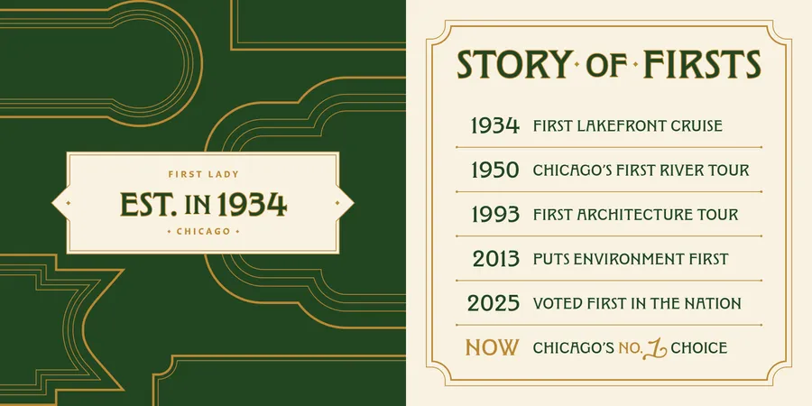
For nearly a century, Mercury Cruises and First Lady have offered Chicago’s most iconic waterway experiences. Most notably, they partnered with the Chicago Architecture Center to create the world-renowned Chicago Architecture Center River Cruise aboard First Lady. Now considered the No. 1 boat tour in the country.
Despite pedigree, both boat operators faced a shifting landscape as the Chicago River became increasingly crowded with competitors. They brought on Nick Adam’s team at Span to help chart a new course, refining their position and crafting a brand that honors their 90-year legacy. The goal: to set a new standard for Chicago’s cultural and tourism landscape.
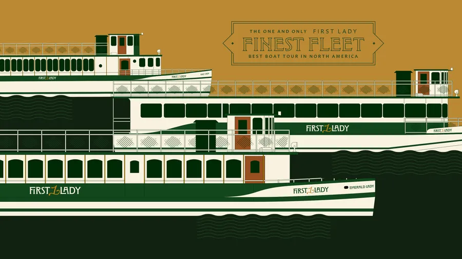
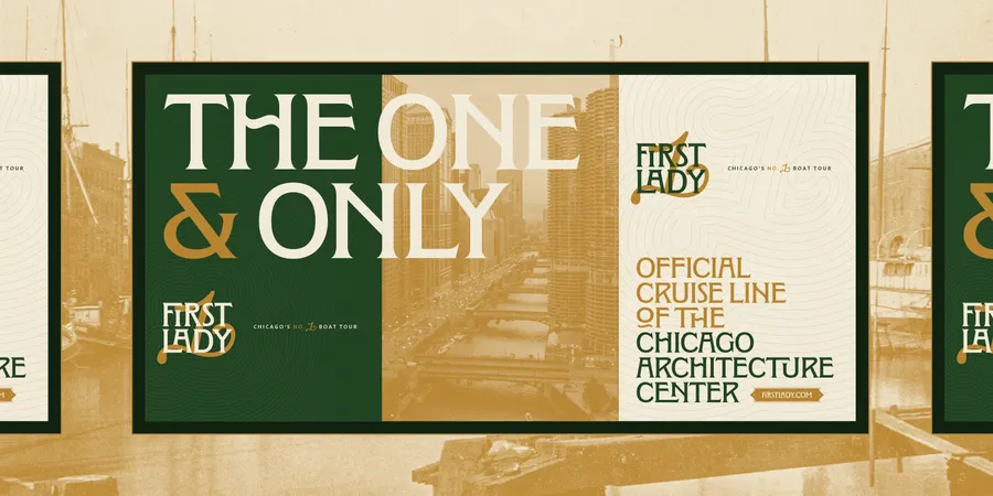
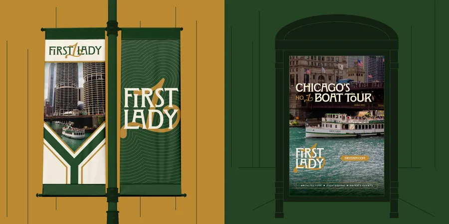
We began by simplifying the name. From Chicago’s First Lady Cruiseline and Mercury Skyline Cruises, to the more resonant, flexible First Lady. From there, we developed a visual identity that bridges heritage and modernity. Channeling both the utility of the working river and the refined character of the vessels themselves.
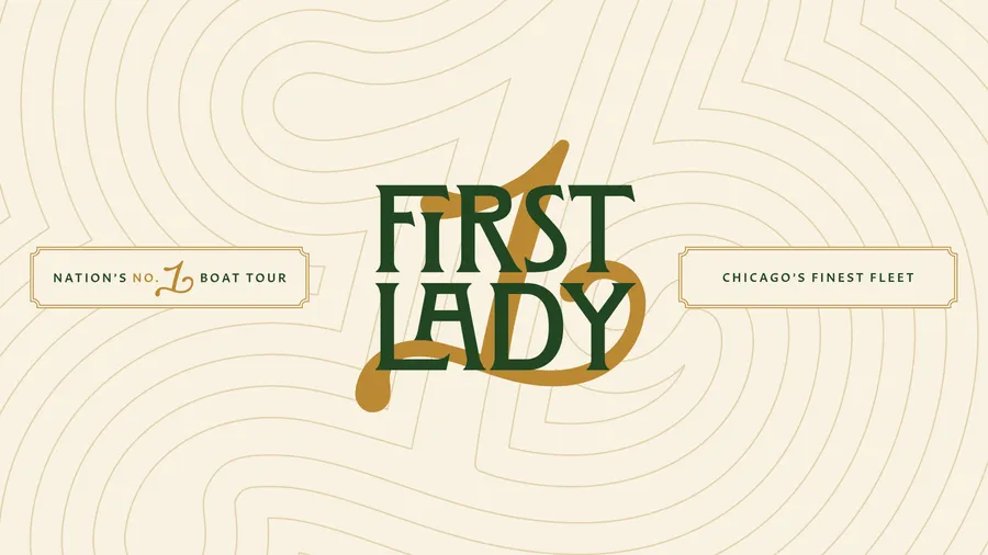
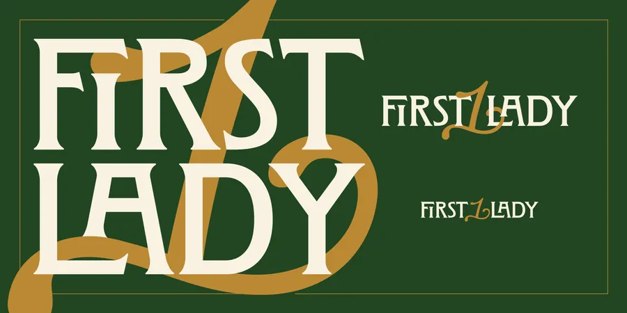
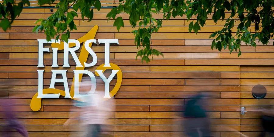
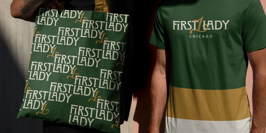
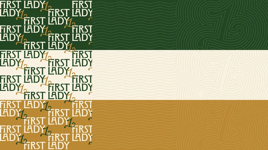
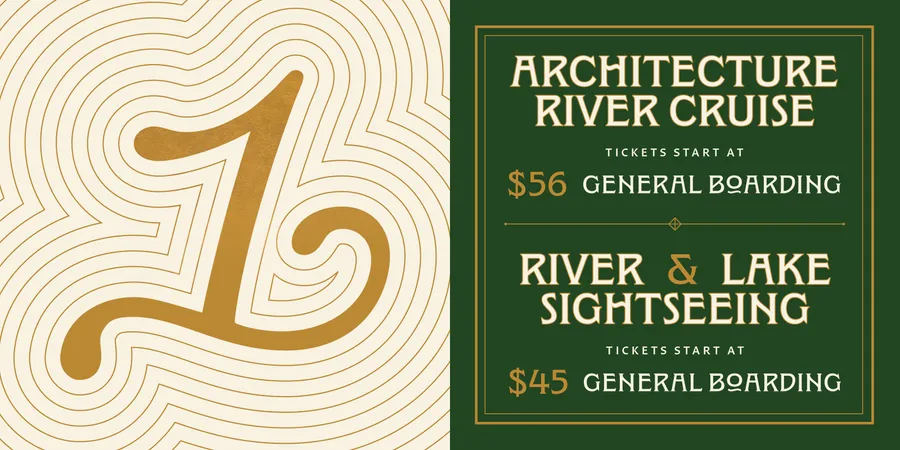
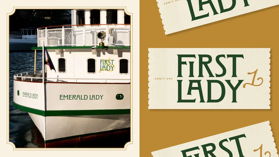
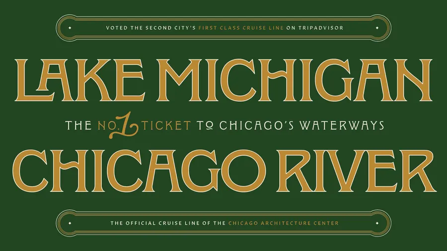
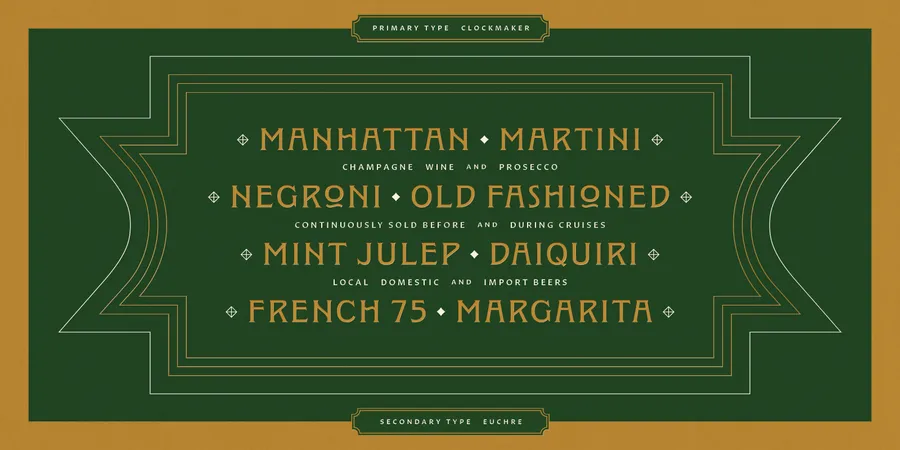
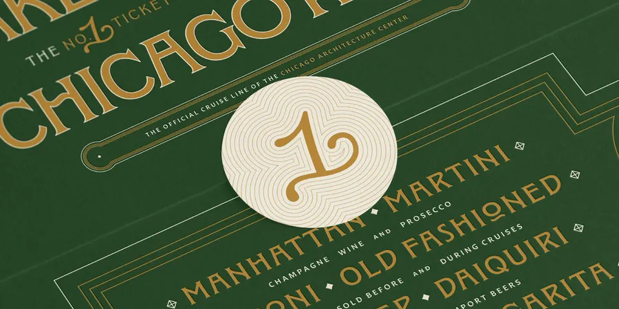
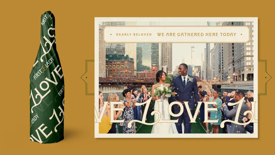
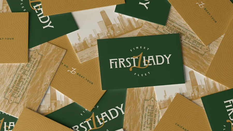
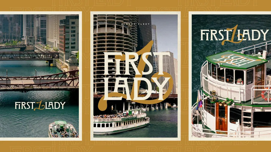
At the heart of the new identity is a custom logotype based on Clockmaker, a lavish typeface inspired by Elandkay and the architectural lettering traditions of Louis Sullivan and Frank Lloyd Wright. We refined its letterforms to merge Victorian curves, Art Nouveau grace, Prairie-style form, and Art Deco precision—creating a typographic expression of Chicago’s rich design lineage. A signature swash numeral 1 flows like waves and wind, integrating seamlessly into the logotype or standing alone as a monogram. Paired with Euchre, a Chicago-designed typeface full of charm and sparkle, the system balances Midwestern elegance and grandeur with a tone that feels sophisticated yet approachable.
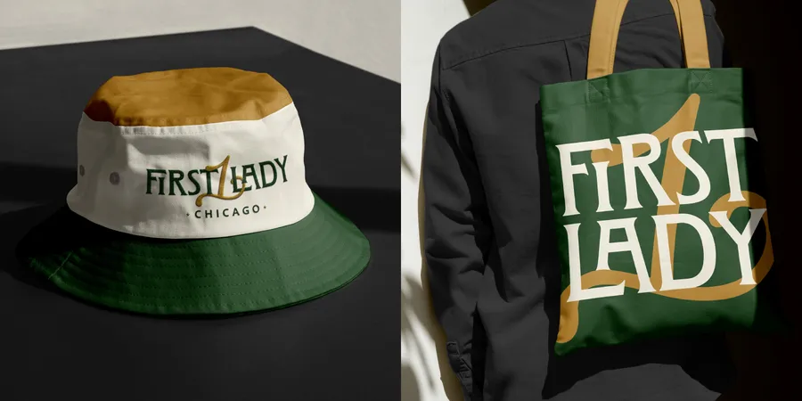
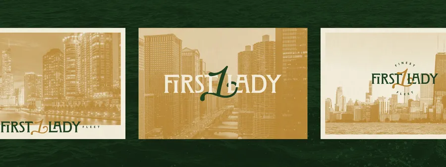
The vessels’ signature green and gold livery became the foundation of the refreshed color palette—elevated, amplified, and extended system-wide. We designed a suite of decorative plaque borders, intricate rule lines, and custom guilloché patterns that evoke both water and currency—offering a sense of timeless craft and detail.
From Rebrand to Record-Breaking
Following our rebrand, First Lady has seen a surge in national recognition—earning the #3 Best Experience in the U.S. on TripAdvisor’s Best of the World list and the #1 Boat Tour in the country from USA Today readers cementing their position as an industry leader.
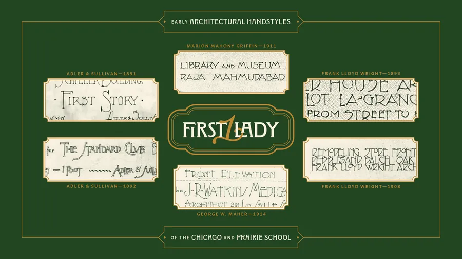
Our First Lady logotype draws from the ornamental lettering traditions of Prairie-style architects—merging the flowing forms of Louis Sullivan, the geometric clarity of Frank Lloyd Wright, the bold symmetry of Marion Mahony Griffin, and the stylized detailing of George W. Maher.
By grounding the identity in architectural heritage and typographic craft, First Lady now claims its rightful place—not just as a tourism provider, but as a cultural fixture.
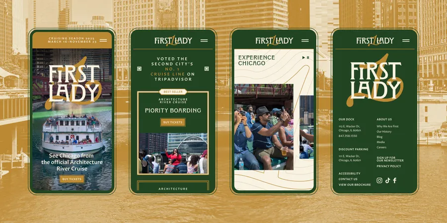
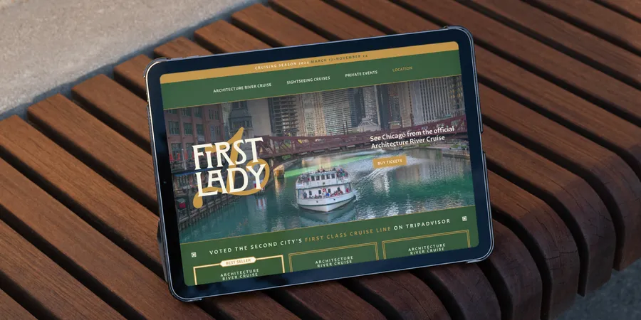
During the rebrand we redesigned and redeveloped the First Lady’s website from the hull up, translating its new identity into a refined, functional, and heritage-rich digital experience. Built on Craft CMS with custom tools, real-time ticketing, and graceful design details.
The First Lady website case study can be found here.
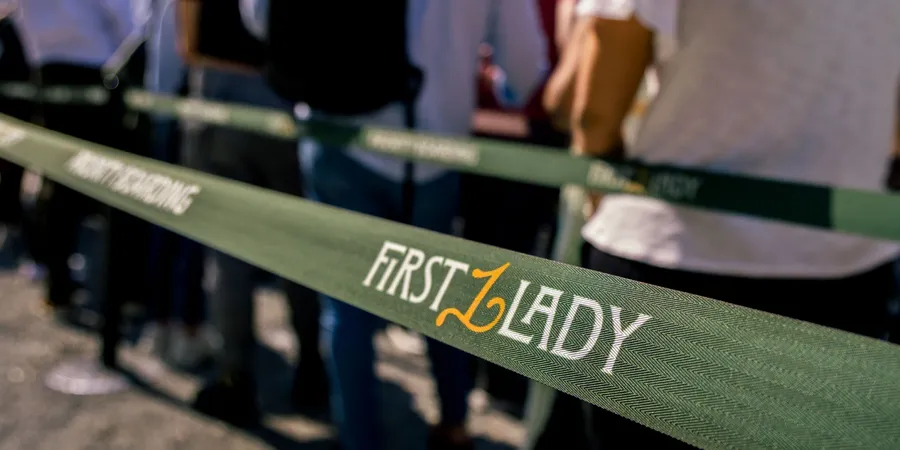
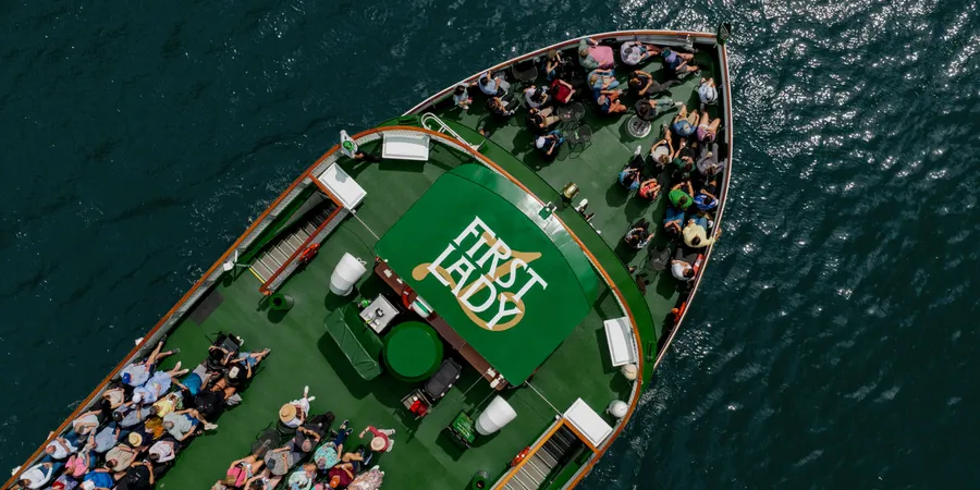
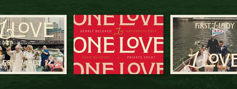
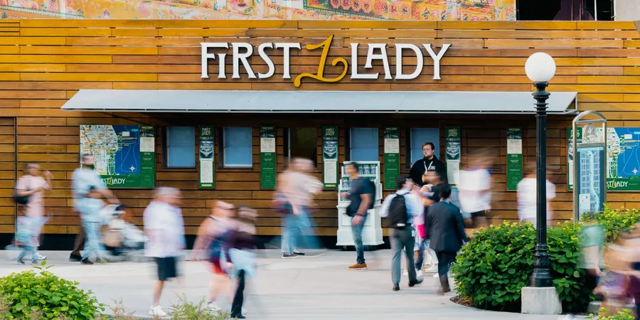
Images of the First Lady rebrand, found across social media.
More Than a Tour. A Cultural Landmark.
Rebranding First Lady wasn’t about chasing trends or creating spectacle. It was about honoring one of Chicago’s true cultural institutions—and helping it rise above the noise with clarity, distinction, and grace.
In a saturated marketplace, First Lady offers something no one else can: a masterclass in hospitality, an education in architecture, and an unforgettable perspective on the city itself. The new brand system makes that distinction unmistakable—on the dock, on the water, and in every guest’s memory.