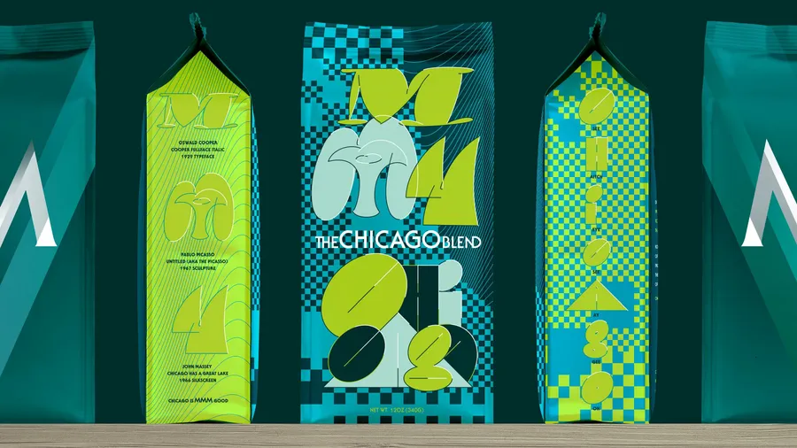
The Chicago Blend Packaging
- Client
- Design Museum of Chicago
Metropolis Coffee
- Community
- Cultural
- Restaurant
- Retail
- Awards
- STA 100 2023
- Credits
-
Nick Adam
Design Direction, Design, LetteringAvery Branen
Design, IllustrationTanner Woodford and Kevin Reader, Design Museum of Chicago
Curatorial Team
- Also
Tony Dreyfuss, Metropolis Coffee
RoasterEric Lu, Design Museum of Chicago
Documentation Photography
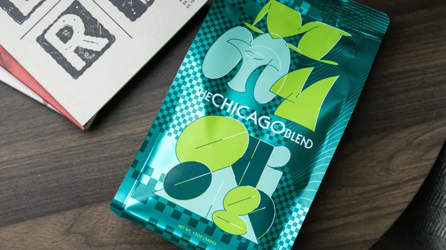
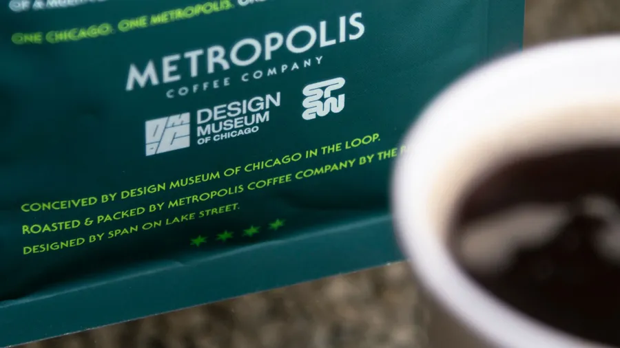
The Chicago Blend catalyzes Chicago’s vibrant creative scene. With each bag purchased, you contribute to funding the Design Museum of Chicago — a nonprofit dedicated to free, inclusive public programming serving artists and designers from diverse backgrounds, neighborhoods, and age groups. Crafted as a medium roast, this unique blend was conceptualized by the Design Museum of Chicago, carefully roasted by the Metropolis Coffee Company, and brought to life through design by Span.
In the pursuit of crafting The Chicago Blend, the Museum and Roaster embarked on a journey to reimagine the conventional CPG (consumer packaged goods) approach to transcend the confines of brand-focused narratives. Instead, they thought of the experience of brewing coffee at home, recognizing that a bag of coffee holds the potential to infuse creativity into someone’s day. The result is a bag that stimulates the senses and ignites inspiration. Span’s unconventional packaging design embodies the spirit of playfulness inherent in the act of creation. Each element offers a captivating Chicago story that could be read as a didactic of how we got here.
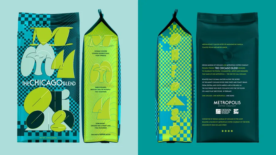
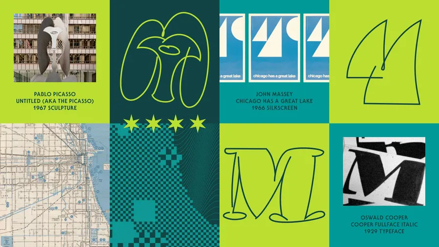
The checkered backdrop pays homage to Chicago’s modern metropolis roots, the grid system created by Edward Brennan and James Thompson. This is done in a graphic manner that nods to Thomas Miller’s iconic 7-Up package he designed at Goldsholl. The prominent squares denote the locations of Midway (MDW) and O'Hare (ORD) airports, resembling a map with the eastern boundary of Lake Michigan. The undulating lines of the lake draw inspiration from Susan Jackson Keig’s Aspen installation and the photograms György Kepes created after immigrating to Chicago.
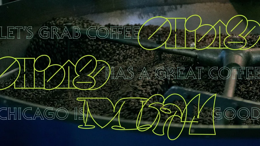
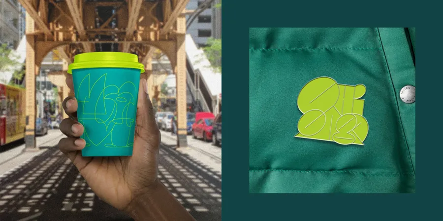
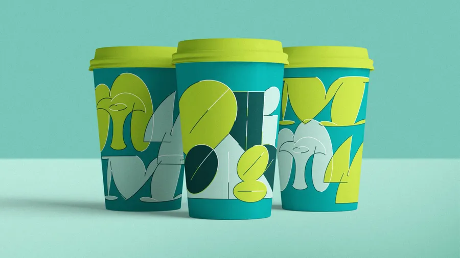
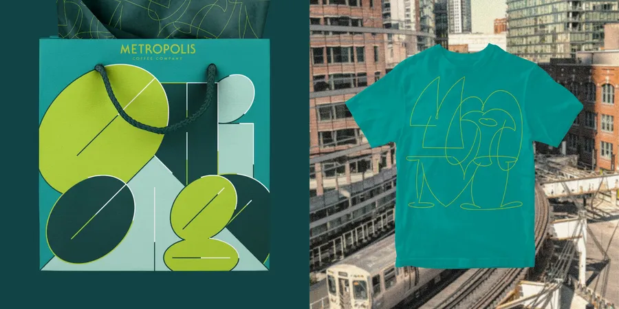
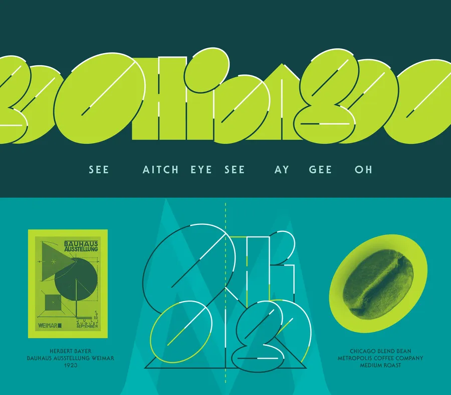
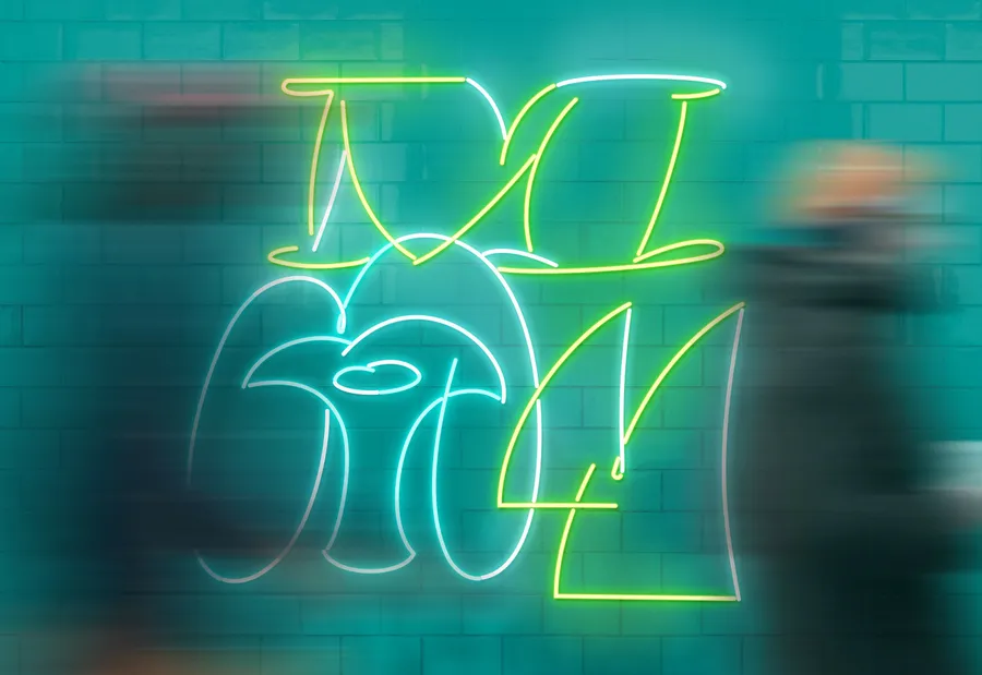
The playful bubble letters spelling ‘Chicago’ find inspiration in two distinct sources: László Moholy-Nagy’s innovative South Prairie Avenue New Bauhaus school and the stylish, spray-painted names that grace the streets and trains of Chicago. Echoing the iconic ‘M’ of Metropolis Coffee’s branding, three spirited ‘M’s are lightheartedly rendered, referencing a range of Chicago aesthetics – from Oswald Cooper’s 1929 Cooper Fullface to John Massey’s sailboats and Pablo Picasso’s monumental 50-foot, cor-ten steel sculpture.
Even the smallest details have a thread pulled from Chicago’s fabric. The careful type-setting on the back of the bag emulates the style that Professor Emeritus Philip Burton affectionately terms “the zipper rag.” The reflective, metallic bag mirrors Tomoko Miho’s Great Architecture in Chicago poster that was silkscreened onto aluminized paper. — Nick Adam
Embracing the richness and intricacies of Chicago’s design community and history, this bag transcends the conventions of brand allegiance and transactional exchanges. It becomes a tangible testament to the celebration and empowerment of Chicago’s creative ecosystem, invigorating the spirit of innovation with each brew.
