SoNu Graphic Identity
- Client
- Smithfield Properties
- Community
- Real Estate
- Services
- Branding
- Interactive
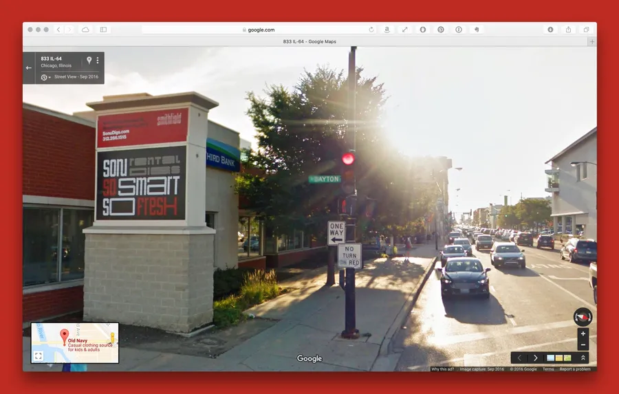
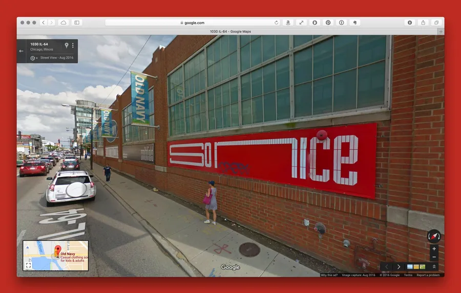
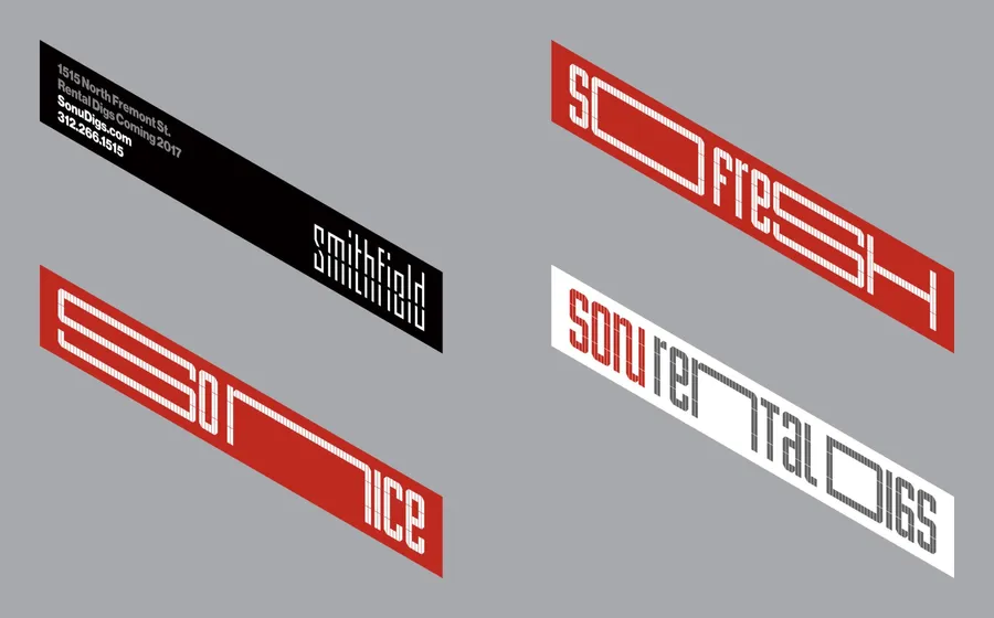
- Environmental Signage
- Naming
- Awards
- STA 100 2016
- Credits
-
Bud Rodecker
Concept, DesignJohn Pobojewski
ProgrammingGoldray
FabricationSkyline Design
FabricationBest Imaging Solutions
Fabrication
Designed while at Thirst
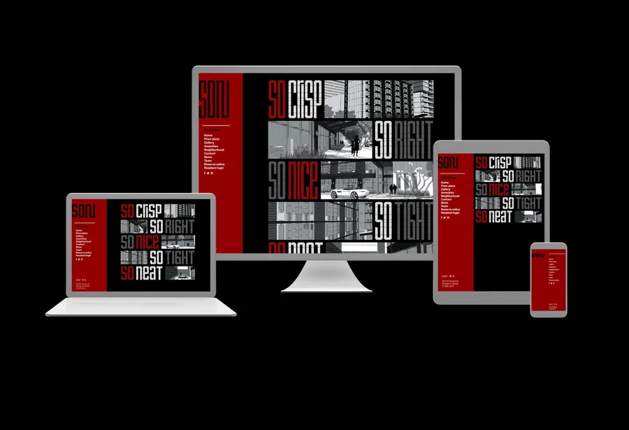
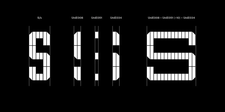
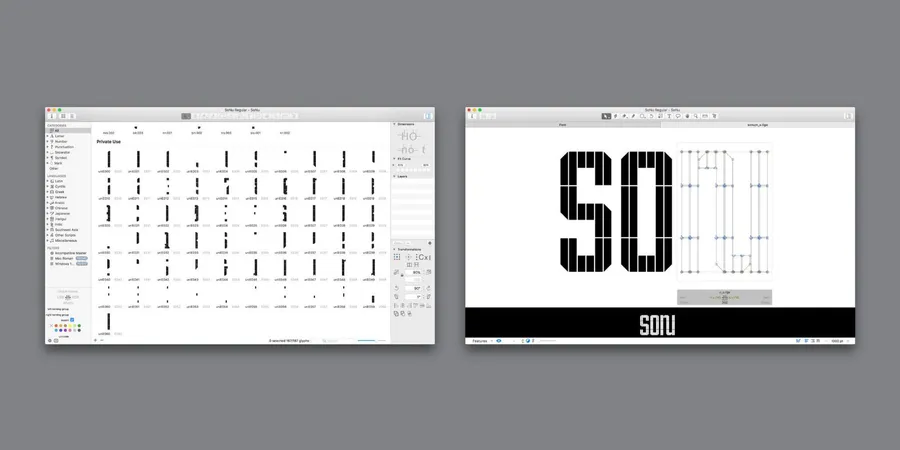
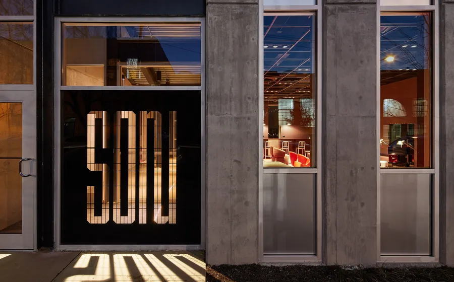
SoNu Digs is Chicago’s first micro-unit building. Efficient living at SoNu means everything is within arms reach. Bud Rodecker led the Thirst team to create an identity that takes inspiration from the building's architecture and the 1927 type sample of Fregio Mecano. The type is built from modular units allowing it to expand and contract into tight spaces. It comes in three heights, Tall, Regular, and Short. Each height nests together to build a wall of typography.
The modular typeface comes in three height variations, and is set using a custom programmed indesign script. Users are able to select the number of units that are assembled creating the letterform.