Pizzeria Bebu Brand Identity
- Credits
-
Bud Rodecker
Concept, Design Direction, Design, Typeface DesignRick Valicenti
Design DirectionSuzie Shin
Design
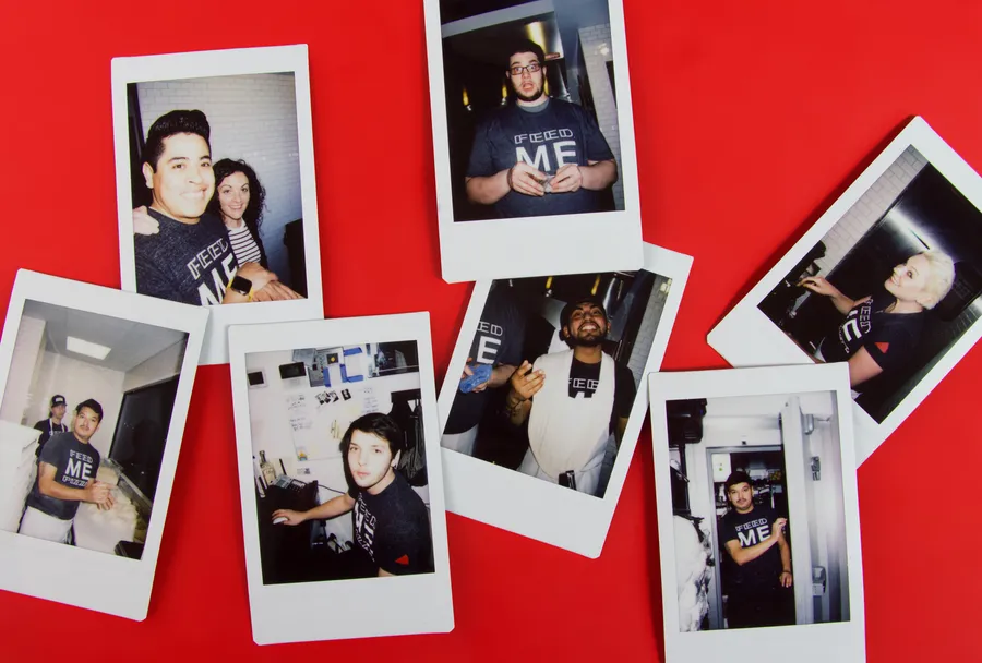
Designed while at Thirst
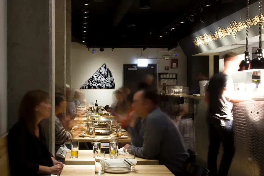
Bebu pizza is a fresh take on classic thin-crust pizza, and exemplifies Entertainment Smith's philosophies: when it comes to food, there is no one true way; and service rules above all.
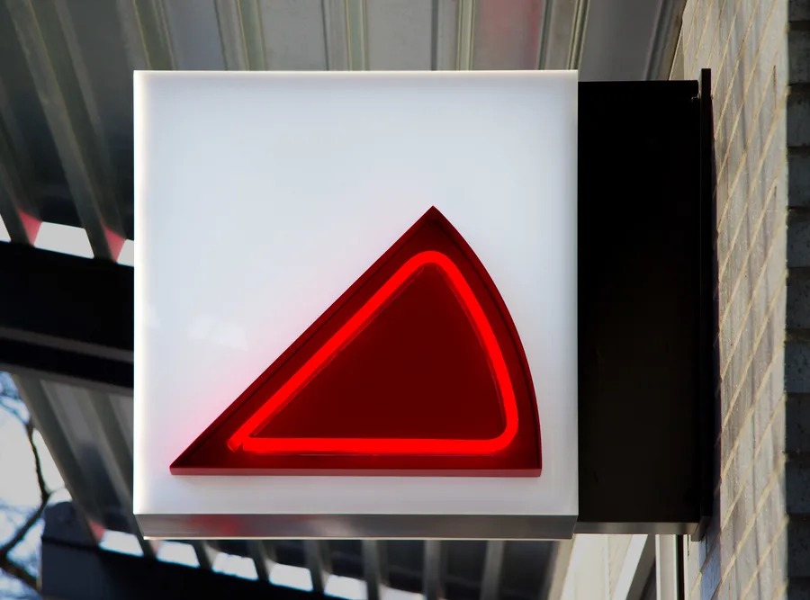
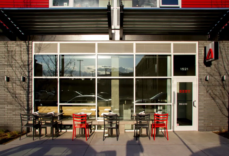
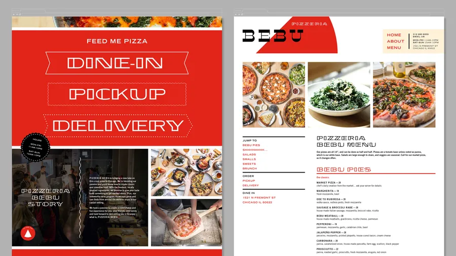
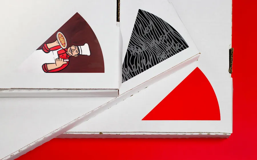
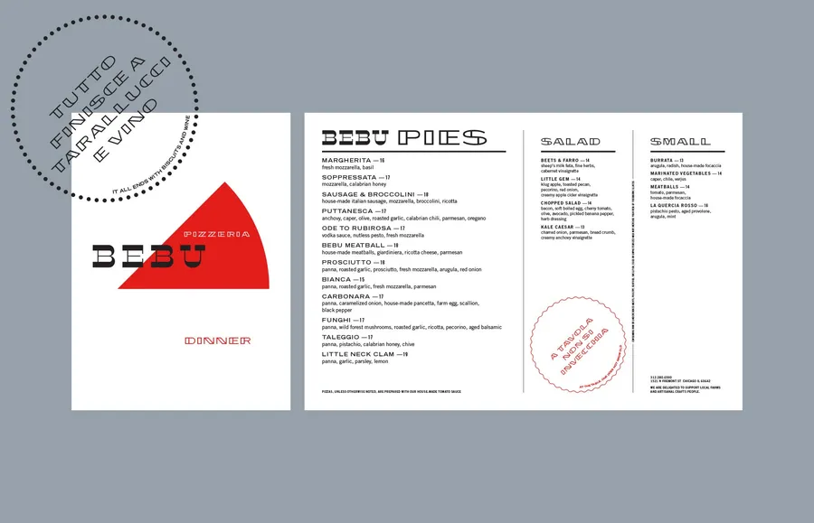
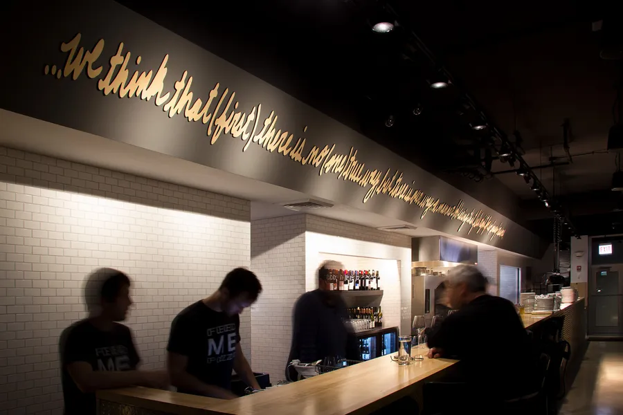
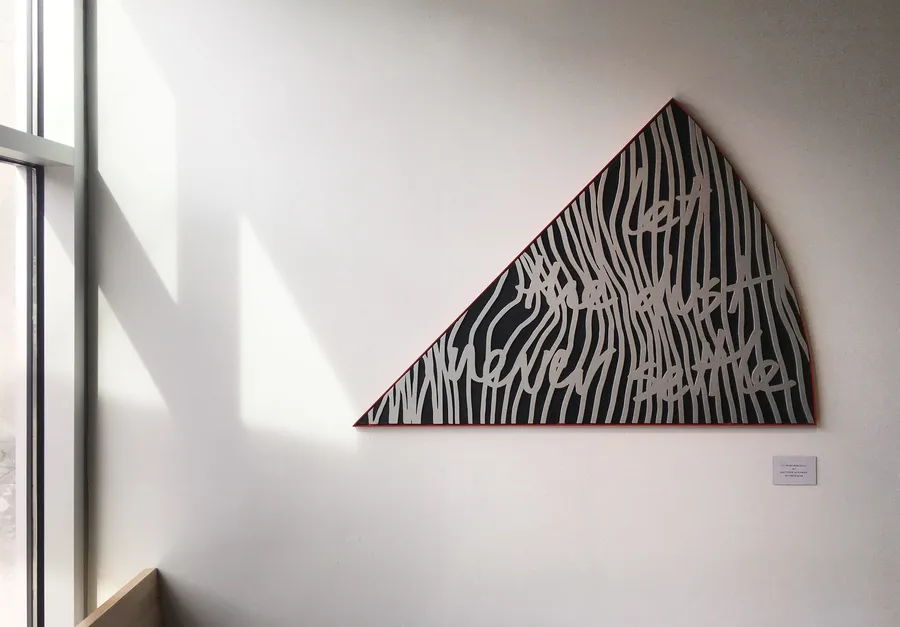
While at Thirst, Bud Rodecker created an identity system that is a new take on Italian iconography with fresh ingredients. The base of the logo is the red wedge, topped with an “Italian” reverse stress typeface, and custom lettering for “Pizzeria.” While the parts aren't authentic Italian ingredients, when combined they represent the Bebu way.
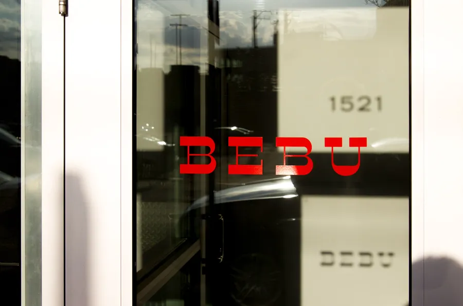
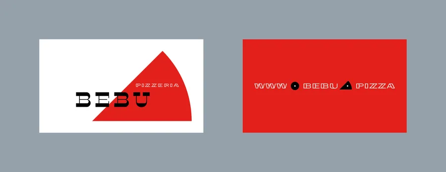
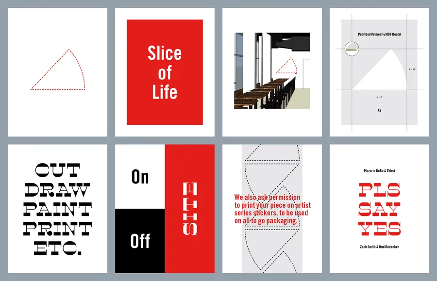
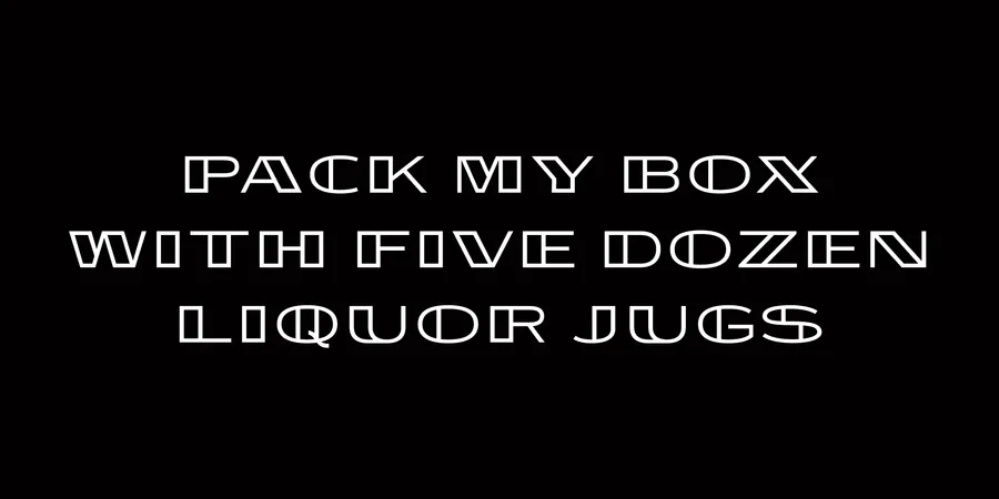
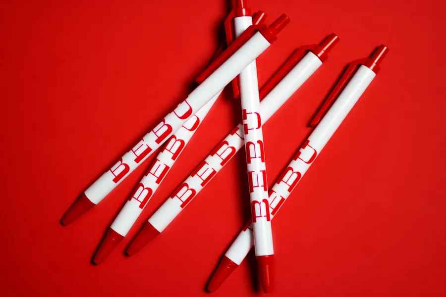
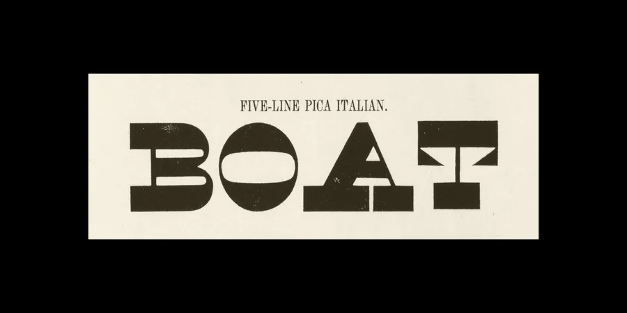
The type selection for "Bebu" is Arbor by Vllg a reverse stress typeface. Reverse stress typefaces are also sometimes categorized as Italian, although their origin in Italy is questionable. Most likely, they were labeled Italian as a marketing gimmick to sell fonts. Image courtesy of "I Love Typography"
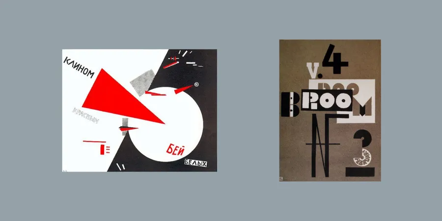
Like Bebu pizza, the graphic identity acknowledges that the way we do things doesn’t have to follow all the rules. The red wedge is inspired from "Beat the White's with the Red Wedge"… if you look closely, it looks like a mouth eating a slice of pizza.
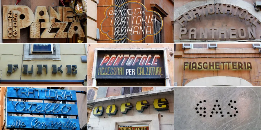
In searching for the right typographic voice, we referenced Italian signage and typography. Courtesy of this Flickr set by id29.
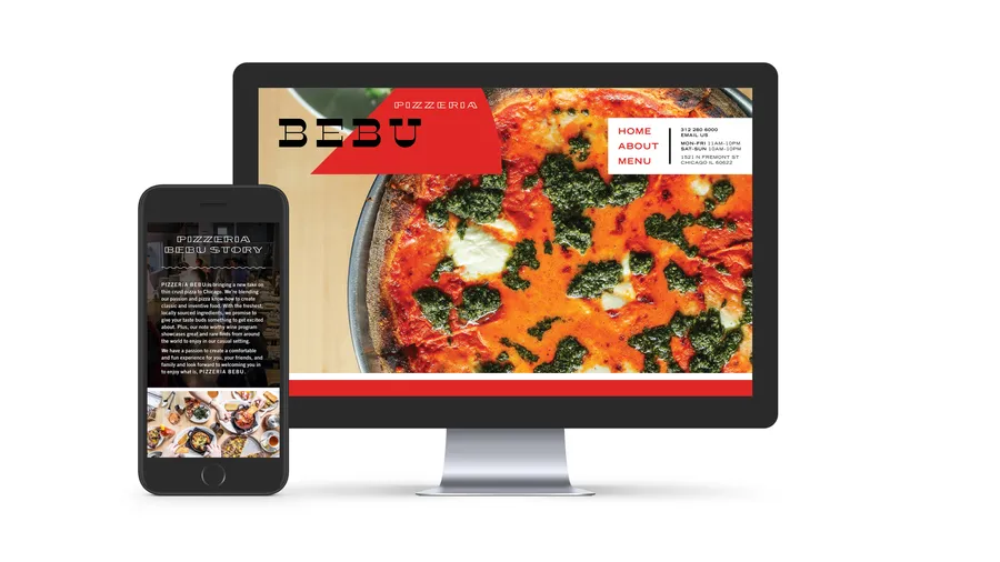
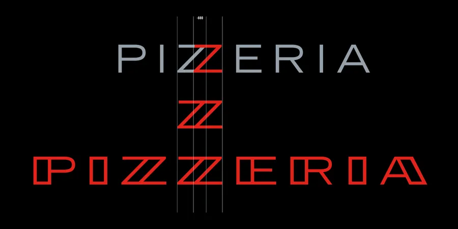
"Pizzeria" is set in a custom typeface that uses American ingredients with an Italian flair. The discovery of a new stressed sans serif letterform came by overlapping two Zs of Trade Gothic Extended, a classic American Typeface. From there we extended it to an uppercase alphabet for Pizzeria Bebu's secondary typography.