Slow & Low: 2025 Lowrider Festival Identity
- Client
- Slow & Low: Chicago Lowrider Festival
Navy Pier
- Community
- Cultural
- Entertainment
- Civic
- Services
- Awards
- STA100—2026
- Credits
-
Nick Adam
Design Direction, DesignKevin Moreland
Design, AnimationAlec Hudson
IllustrationLauren M. Pacheco, Peter Kepha, Edward Magico Calderon
Curatorial Team
- Also
Ferny Ruiz, Alfonso Monroy, Carmen Ordoñez, and Melissa Reyes
2025 Day of Photographers
Edward Magico Calderon, Max Herman, Nick Lipton, Katrina Nelken, Mike Pocious
Design Media Photographers
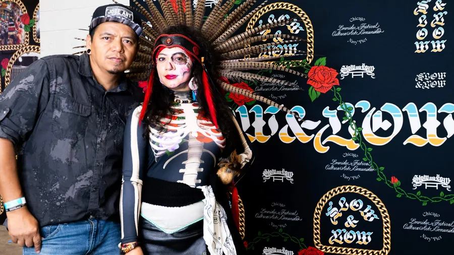
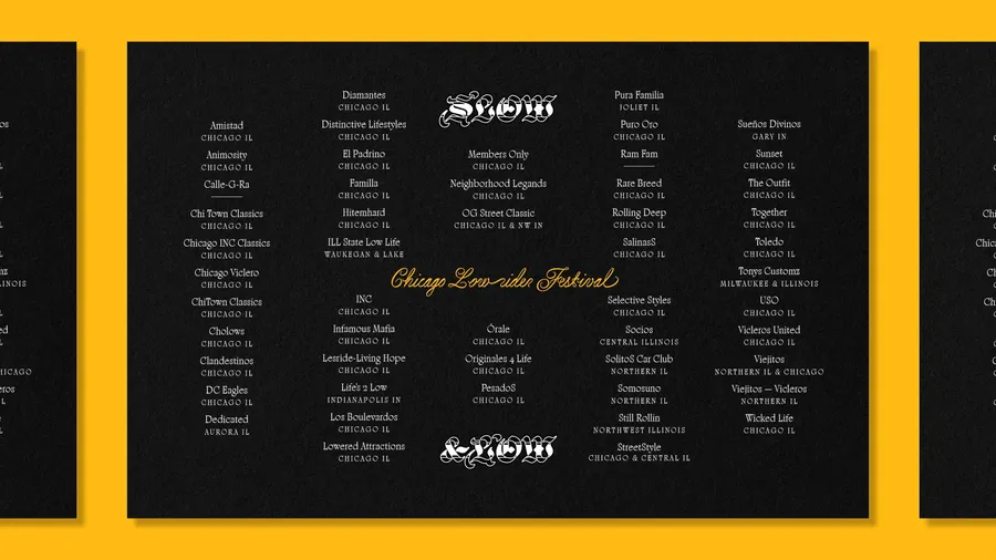
Sunlight on chrome, prayer in paint. Lowriding is more than customization; it is an American and Chicano art form built from devotion and design. In 2025, the question was blunt: hide or shine? During Hispanic Heritage Month, Slow & Low turned Navy Pier into a civic space for a living culture—so it could shine without dilution and without fear. Curators Lauren M. Pacheco, Peter Kepha, and Edward Magic Calderon united more than sixty car clubs, and Span partner Nick Adam led a civic-scale brand identity carrying a multigenerational voice.
The festival is a public exhibition authored by the community it serves. As scrutiny around Latino identity intensified, the brief demanded courage and care. Our stance was bold and reverent. Not kitsch. Not trend-chasing. Community authorship and access first so celebration could take center stage.
Design that breathes
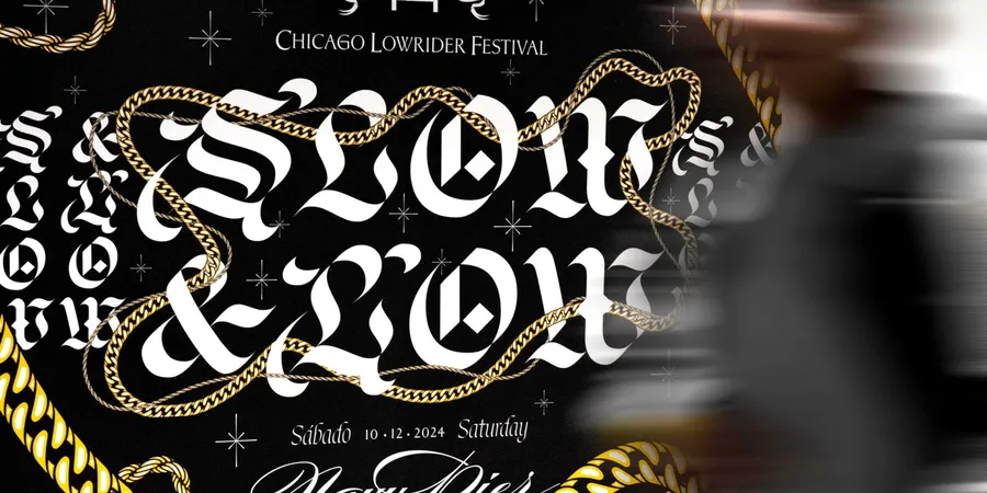
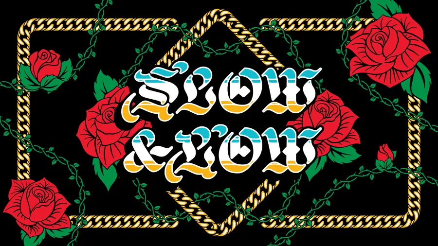
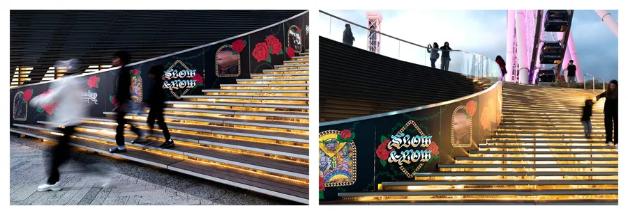
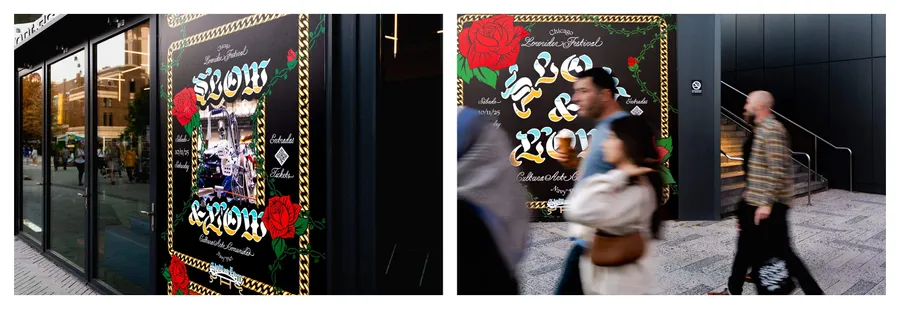
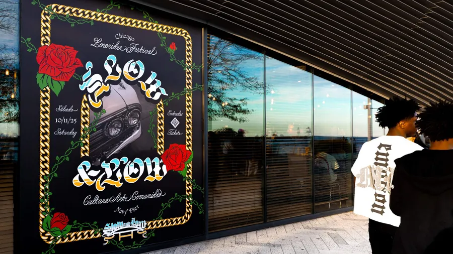
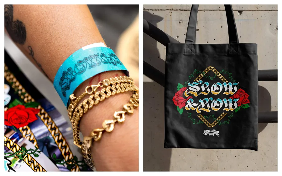
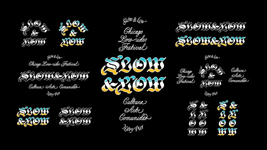
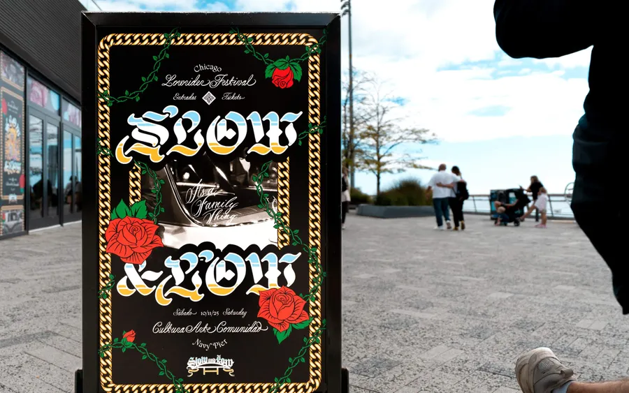
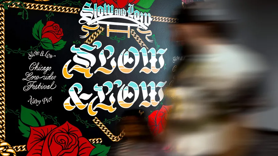
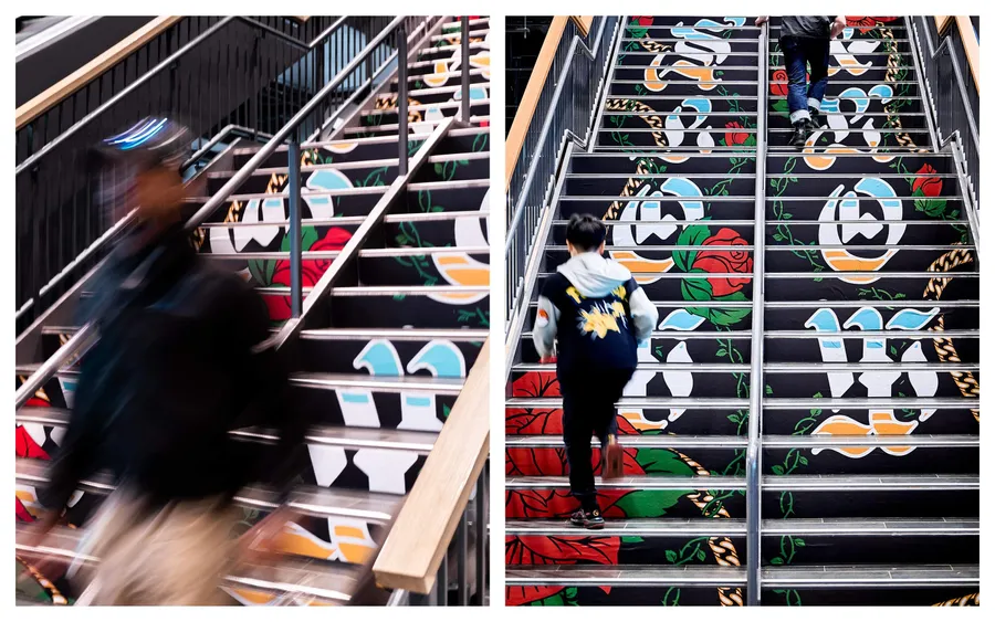
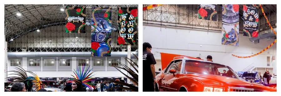
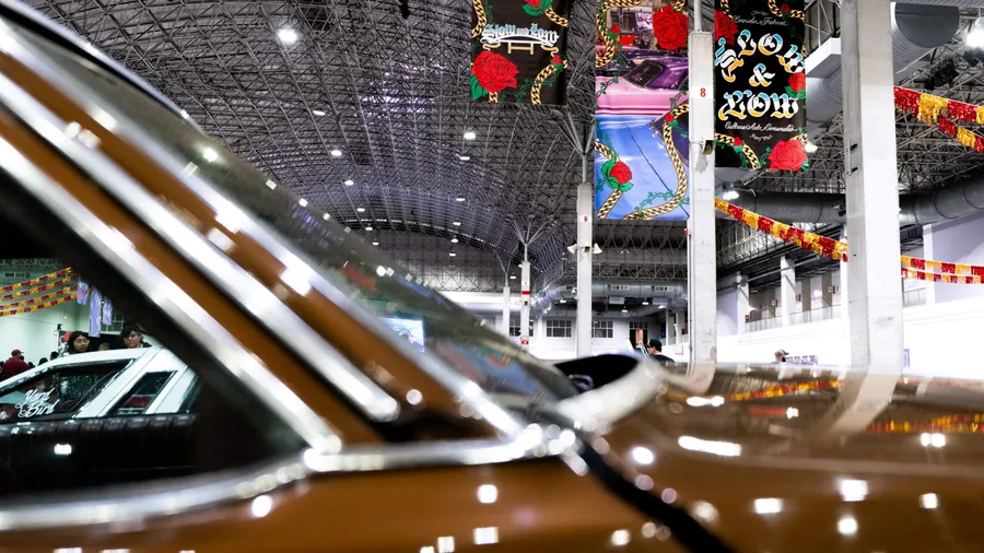
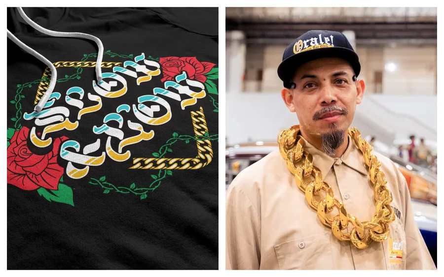
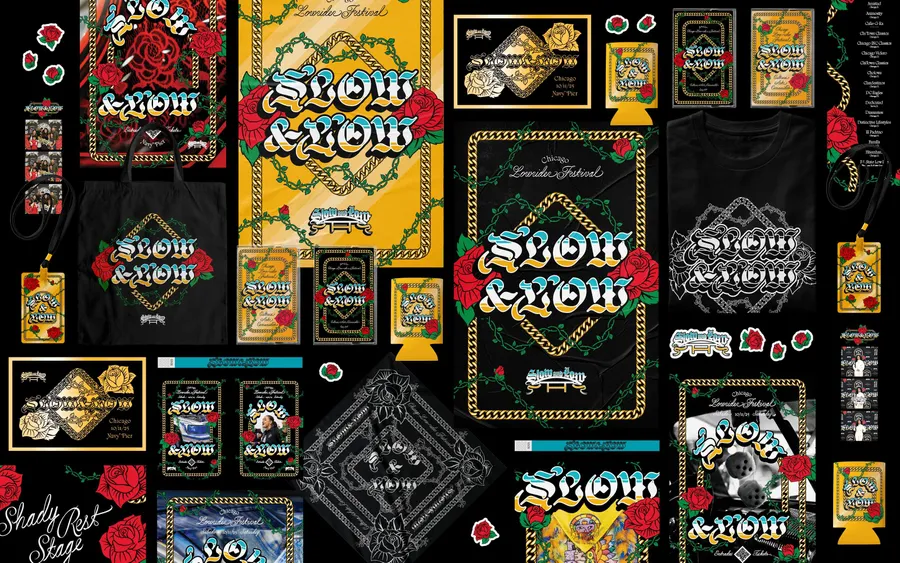
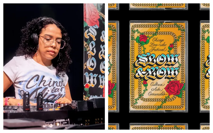
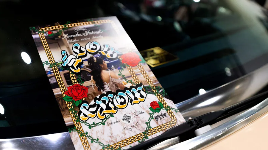
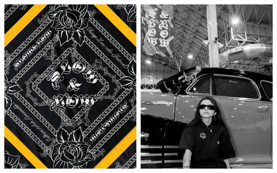
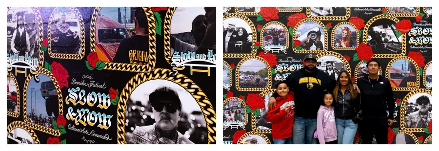
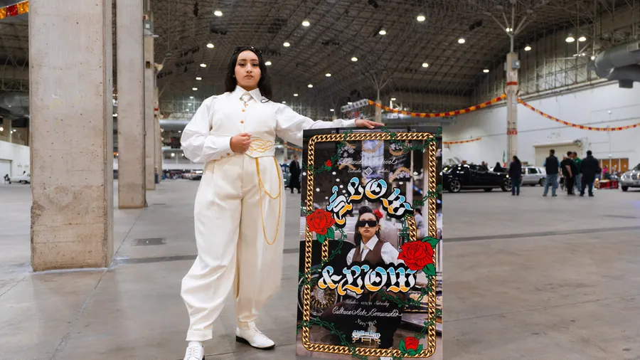
The chain remained from the 2024 exhibition as a symbol of lineage and strength, but this year we let roses bloom and vines climb. In Chicano traditions, roses carry love, family, and faith, including Marian imagery. We drew four—bud to bloom—because four generations often stand together at the festival.
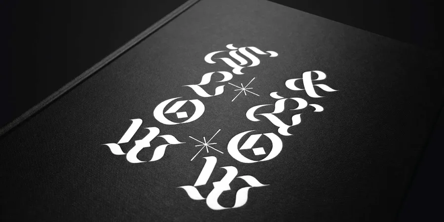
Type that remembers
The curators brought Teen Angels into the conversation—a magazine that taught a generation how Chicano culture looked and read. To honor that lineage without copying it, we turned to Sharp Type, whose catalog leans into expressive hand styles—blackletter bones, script virtuosity, calligraphic warmth all akin to the lettering found in lowrider art. We customized Respira to soften with marker warmth and added a blue-to-yellow fill that feels like sunset on chrome. A nod to lowrider murals and 1980s Chicago graffiti without pastiche—reverent yet defiant, soft not fragile. To round the voice, we paired Cordier Script for the pinstriped, hand-lettered feel and Rosalie for an ornate sense of grace.
A civic stage for belonging
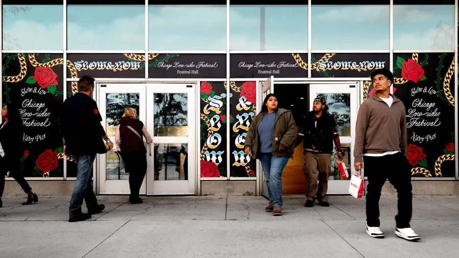
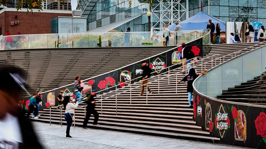
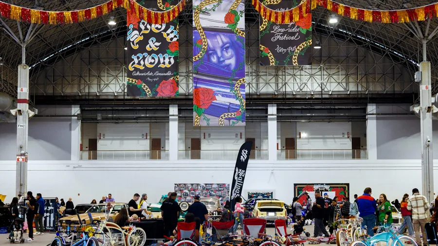
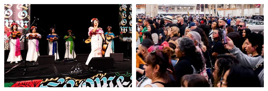
Across a half-mile campus, fifteen supergraphics framed portraits and gatherings. The nARCHITECTS WaveWall became a public gallery for reflection. More than 1,000 feet of banners, wall wraps, and stage scrims anchored the site. Bilingual messaging welcomed families. Wristbands, plaques, posters, bandanas, totes, shirts, koozies, and dashboard plaques were designed to be taken home. When people raced to grab a sign at day’s end, it was devotion, not theft.
Impact
Within hours, more than sixty clubs filled 170,000 square feet of exhibition space. Thousands of people came in a single day. ABC, Chicago Suntimes, and WBEZ covered pride and heritage. Car clubs stood proud with their families and communities at a time when gathering can be scary. Warmer letters, bolder color, and photos guests take that carry belonging home.
A living system
What endures is a civic identity authored with the community—strong enough to carry love and resistance, and soft enough to let roses grow through gold.
Photographers Ferny Ruiz, Katrina Nelken, Alfonso Monroy, Carmen Ordoñez, and Melissa Reyes documented the day.