Chicago Lowrider Festival 2024 Exhibition Identity
- Client
- Slow & Low: Chicago Lowrider Festival
Navy Pier
- Community
- Cultural
- Entertainment
- Civic
- Services
- Branding
- Environmental Signage
- Credits
-
Nick Adam
Design Direction, DesignKevin Moreland
DesignAlec Hudson
Design
- Also
Lauren M. Pacheco, Peter Kepha, Edward Magico Calderon
Curatorial TeamEdward Magico Calderon, Max Herman, Nick Lipton, Katrina Nelken, Mike Pocious
Photographers
Slow & Low is Chicago’s largest independent arts festival, drawing a diverse, multigenerational audience to celebrate a uniquely American art movement born of the Chicano community. As the Midwest’s premier lowrider festival, Slow & Low is deeply rooted in art, tradition, and community, blending culture and family into a singular arts experience. Far more than a car showcase, it unites metalworkers, painters, upholsterers, textile artists, mariachis, DJs, and folkloric performers in a vibrant display of creative expression.
Founded in 2011 in Pilsen by curators Lauren M. Pacheco, Peter Kepha, and Edward Magico Calderon, 2024 marks Slow & Low’s third collaboration with Nick Adam’s team at Span, resulting in the festival’s most significant turnout yet, with over 15,000 visitors in a single day. Over the past three years, Navy Pier has been the iconic backdrop for Slow & Low, with car club members likening the experience to the “Grammys” of the lowrider community.
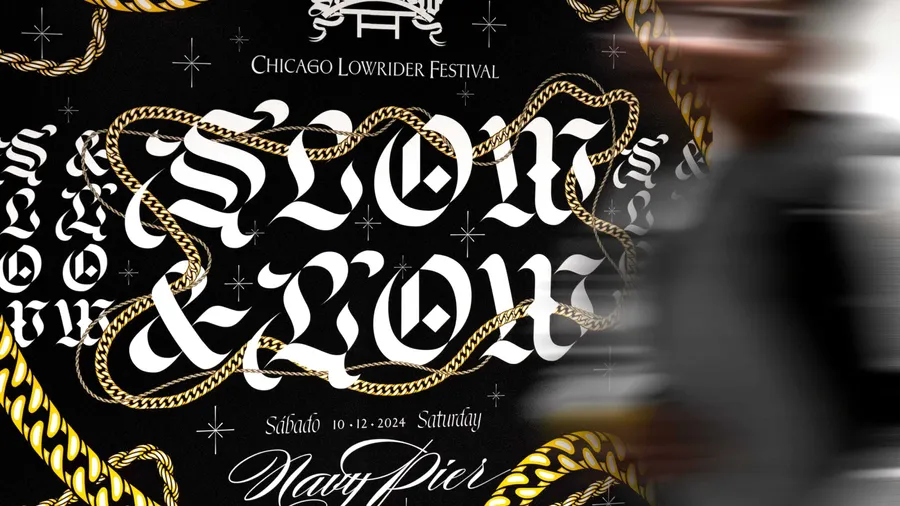
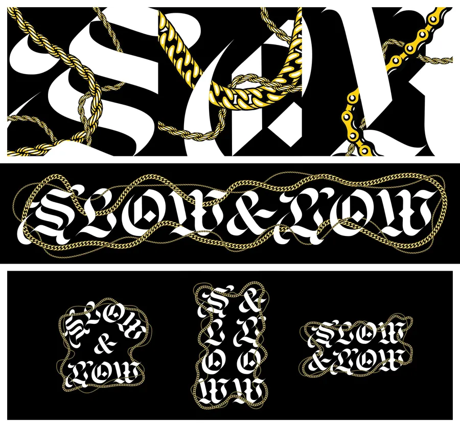
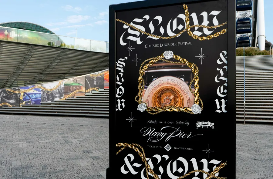
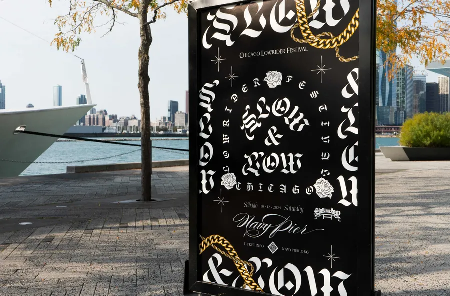
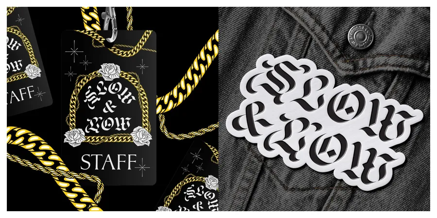
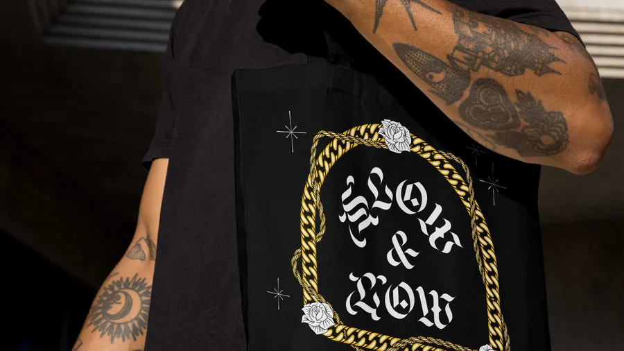
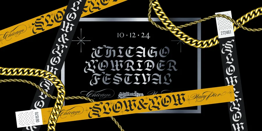
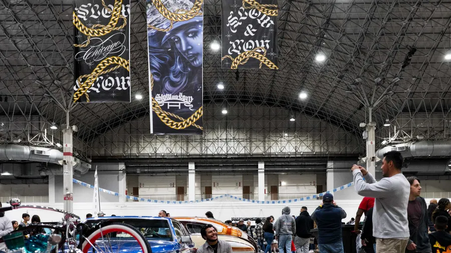
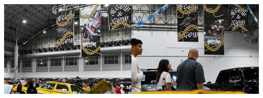
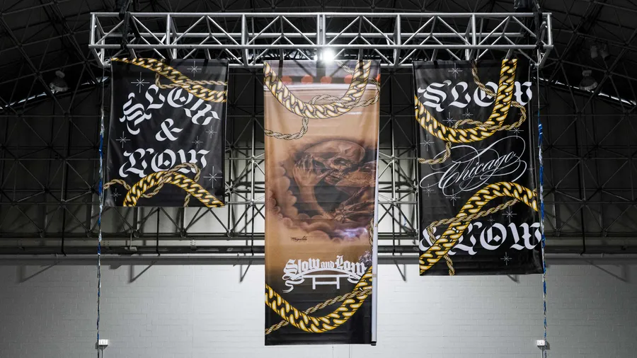
For the 2024 festival, Span collaborated closely with the curators to craft a gala-like visual identity. This process began with co-founder and curator Peter Kepha’s sketches of chain motifs in archway form, symbolizing growth and achievement—ideals central to Kepha’s life in the Chicano community.
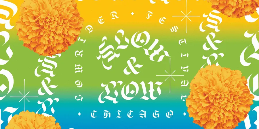
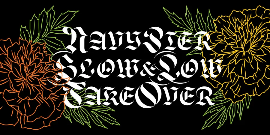
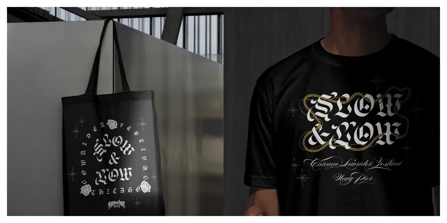
The 2024 Slow & Low identity that Span designed amplifies a story of exquisite craftsmanship and celebration, drawing inspiration from the intricate artistry of lowrider culture. The typographic palette features a customized version of Lucas Sharp and Wei Huang’s blackletter typeface, Respira. Adding a layer of joyful elegance this scribe-like blackletter is complemented by Alejandro Paul’s Burgues Script, based on master calligrapher Louis Madarasz’s work. Rounding out the collection is Lucas Sharp’s limited edition Sharp Freehand, a calligraphic typeface inspired by the master letterer, Oscar Ogg and Sharp’s Greenstone that is connected to the tradition of tombstone carving. Together, from chains to script, the festival identity offers a striking, refined edge that mirrors the masterpieces showcased at Slow & Low.
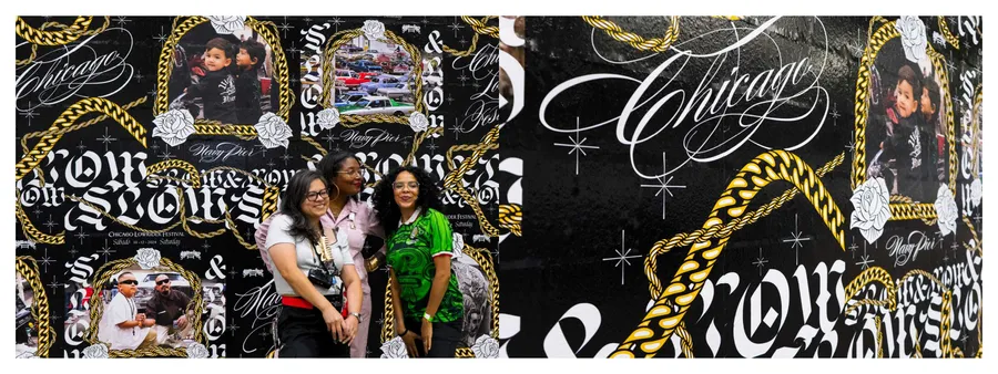
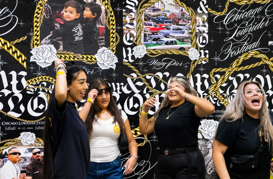
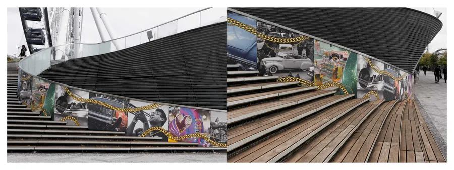
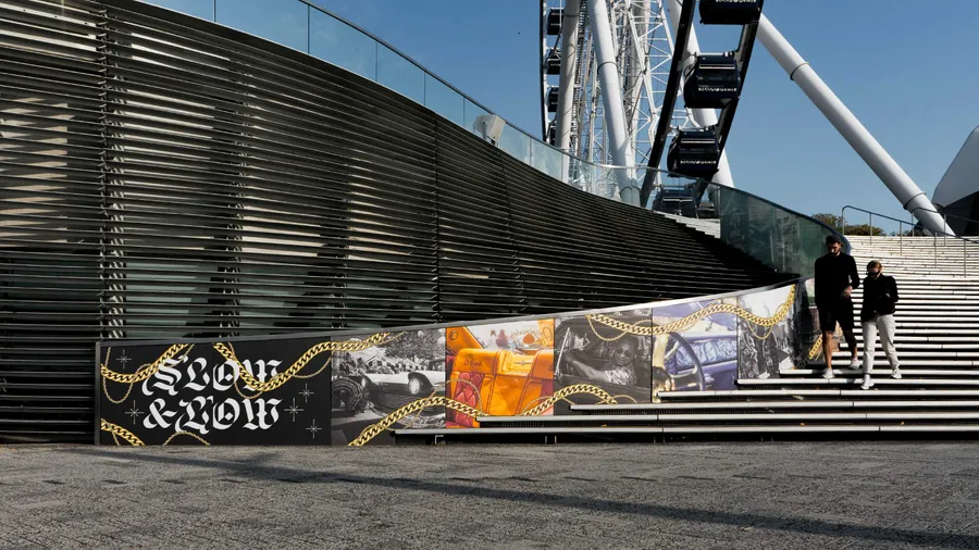
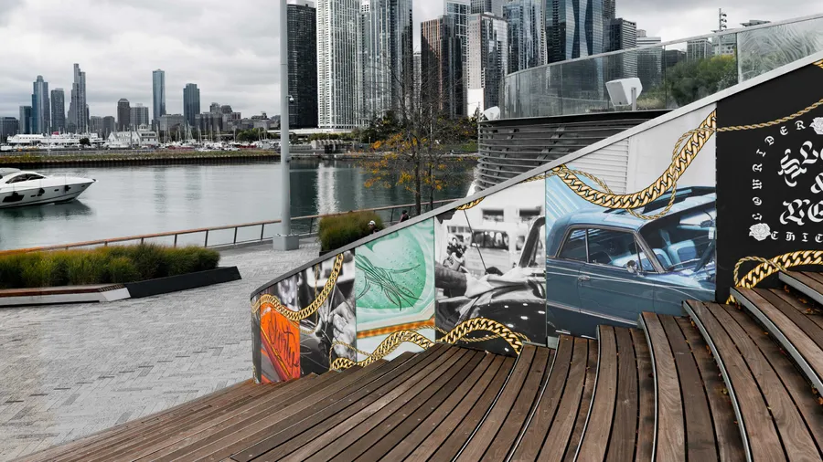
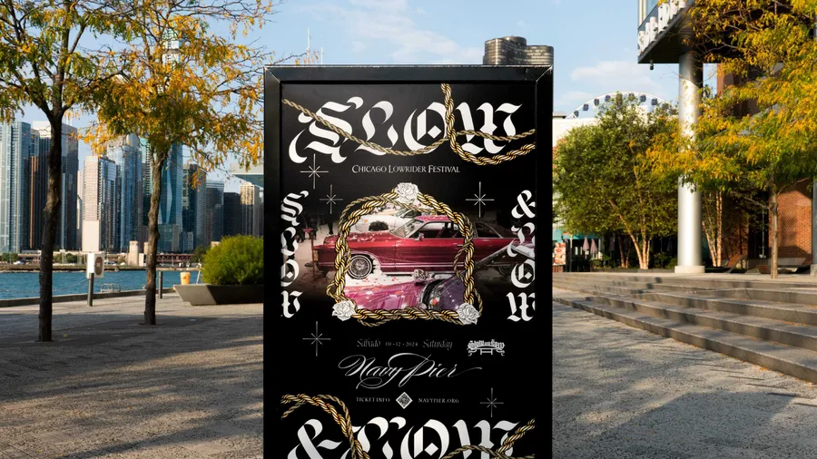
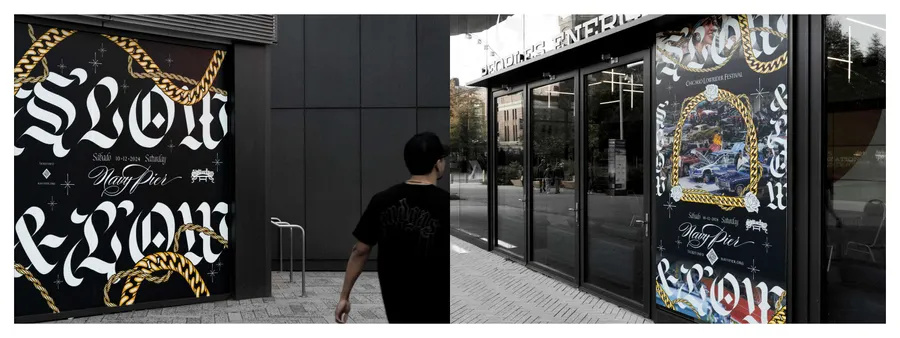
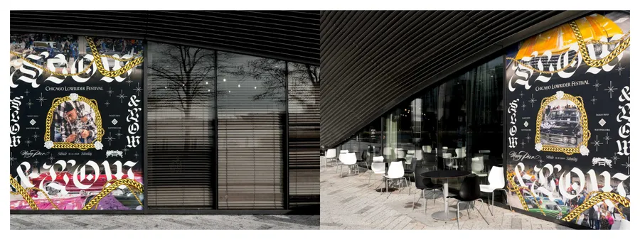
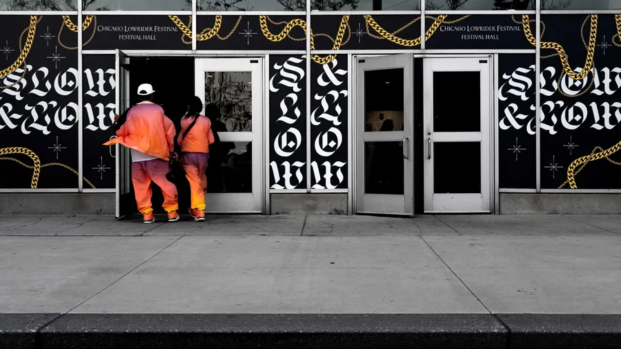
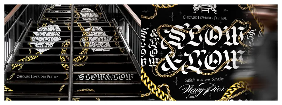
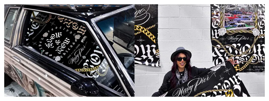
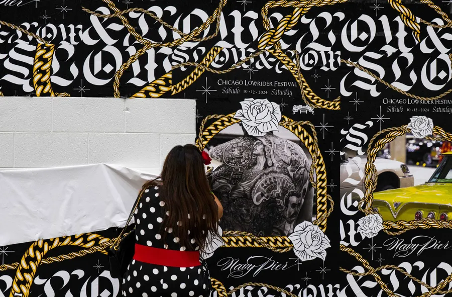
At the festival's close, attendees participate in removing the signage, and selecting artifacts to bring home as unique pieces of art.
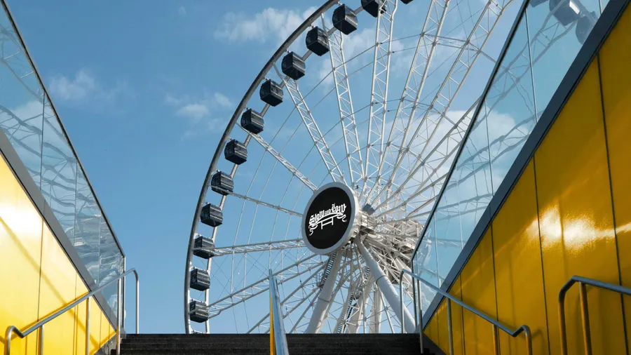
As a mark of authenticity and a welcoming symbol for the lowrider community, the original Slow & Low plaka, designed by Peter Kepha, is proudly displayed on Navy Pier’s towering Ferris Wheel.
