Nazareth University Brand Identity
- Client
- Nazareth University
- Community
- Academic
- Services
- Branding
- Research
- Art Direction
- Illustration
- Credits
-
Nick Adam
Design Direction, DesignBud Rodecker
Design Direction, DesignAvery Branen
DesignGrace Song
DesignElizabeth Zapata
Vice President Marketing and CommunicationsDanny Schuman
Strategy
Nazareth University (formerly Nazareth College) recently achieved university status as it approaches its 100th anniversary. To commemorate this milestone and embrace its evolving presence, Nazareth engaged Span to create a new comprehensive visual identity system. This system pays homage to the institution’s legacy while reflecting its actions and values.
Established in 1923 by four Ph.D. nuns, Nazareth has always been recognized as a hub for exceptional change-makers. Over the past century, the university has transformed into an inclusive community of learners from diverse backgrounds and faiths. As Nazareth embarks on its next century, aligning its identity with its dynamic community became a priority.
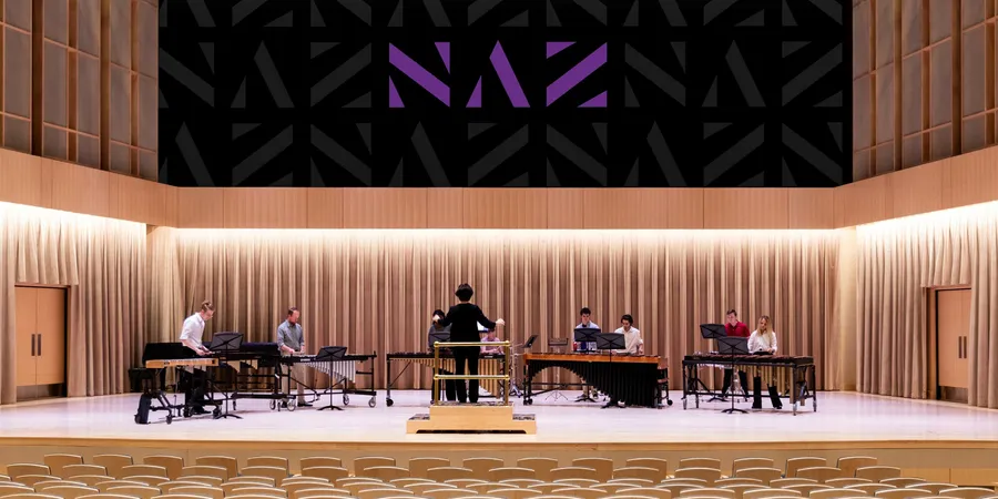
Span transformed the school’s visual brand by transforming the design process. In a one-week intensive, Chicago’s Span chose to work from Nazareth’s home and set up its studio on the New York campus. This act of radical inclusivity allowed the design process to share space in the halls of students and faculty. In dialogue with the students, Span heard about the Nazareth experience while learning that amongst friends, Nazareth is referred to as Naz. These three letterforms came from the students and were a key strategy in how Span would transform the institution’s presence.
Hosting three town hall meetings daily, Span gained insights, feedback, and approvals that kept the project evolving. Seven unique directions were designed and presented within the first thirty-six hours. By day five, the University had consensus, and Span designed and delivered an identity system complete with a 215-page identity standards guideline document.
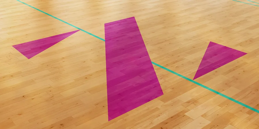
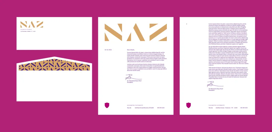
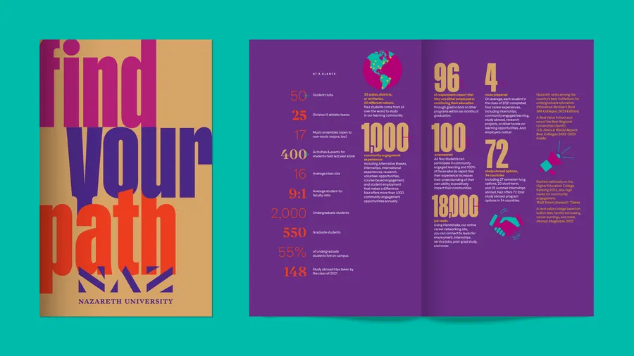
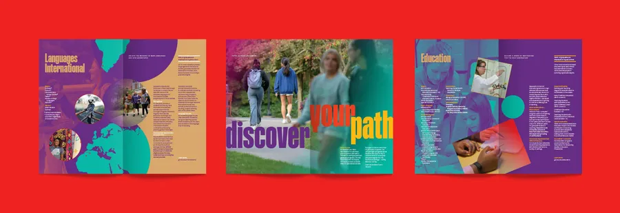
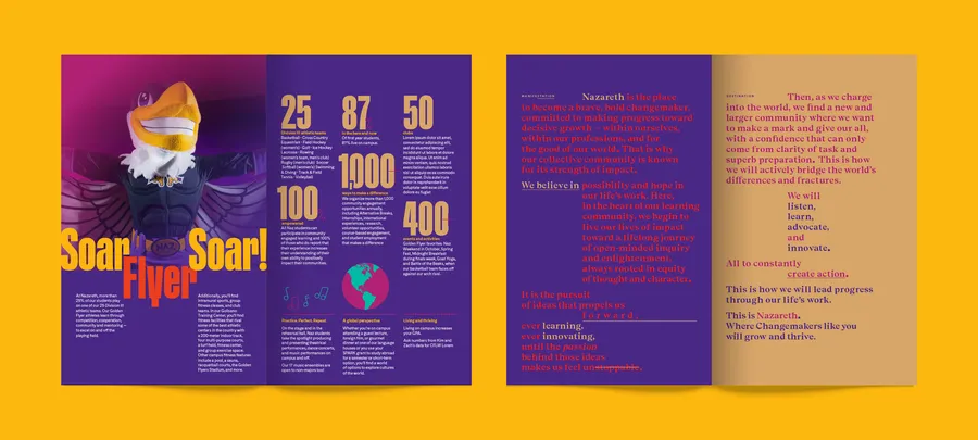
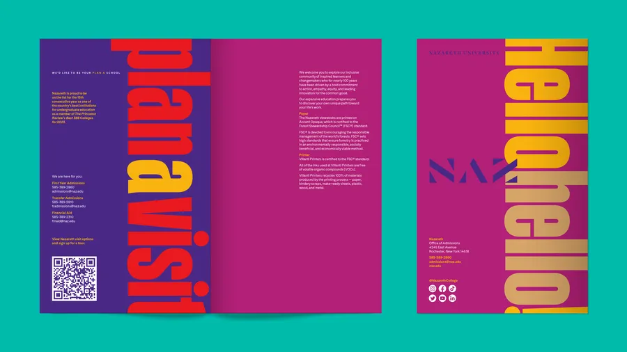
Beyond the identity system, Span created various photographic treatments, patterns, shapes, illustrations, and three viewbooks. These elements constitute a comprehensive toolkit for the internal design team, allowing for continued advancement for generations to come.
The Rebrand Delivered
Naz rebrand elevated its market position, driving a 44% increase in first-year applications, the highest in the school’s 100-year history, with applicants from all 50 states and 70 countries.


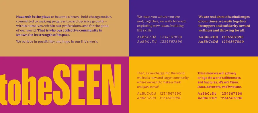

The university’s Purple and Gold colors were refined to honor Naz’s history and proud alumni. Simultaneously, the color palette was expanded and made more vibrant to express a broader spectrum of experiences.


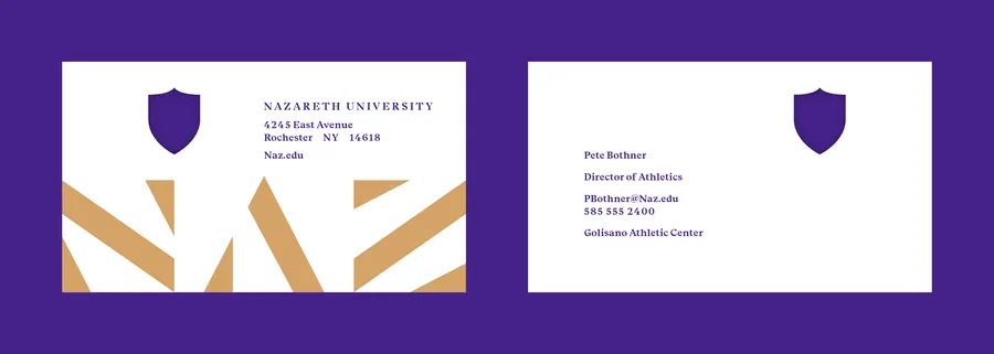

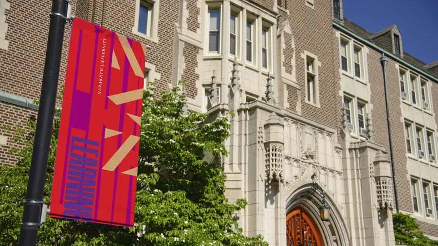

Span’s other dramatic departure from typical higher education branding was to reimagine the traditional academic shield – which evokes antiquated ideals of protection, separation, and militarization – as both a window and an inviting entrance into campus life and education.