Illinois Department of Human Rights Visual Brand Identity
- Client
- Illinois Department of Human Rights
Institute for Healthcare Delivery Design
- Community
- Civic
- Government
- Design
- Academic
- Wellness
- Healthcare
- Services
- Branding
- Credits
-
Nick Adam
Concept, Design Direction, Strategy, DesignKevin Moreland
Design, AnimationInstitute for Healthcare Delivery Design
Copy Direction
Human rights, made visible.
The Illinois Department of Human Rights was created in 1980 to give people one place to turn when they experienced discrimination. More than four decades later, the department faced an access problem. Many Illinoisans did not clearly understand what IDHR offered, what protections they had, or where to go for help. Its public presence felt bureaucratic, while the care and protection at the heart of its work were harder to see.
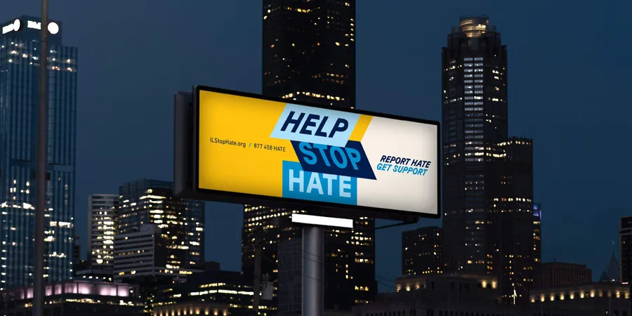
Following the success of Help Stop Hate, IDHR turned to Nick Adam’s team at Span to rethink how the department showed up in the world.
At a moment when public institutions were increasingly read through a political lens, IDHR needed to remain neutral and fair in its work without becoming vague about its purpose. The Illinois Human Rights Act makes that purpose clear: protect people from unlawful discrimination and promote equal opportunity across the state. We made that public promise the most visible part of the identity.
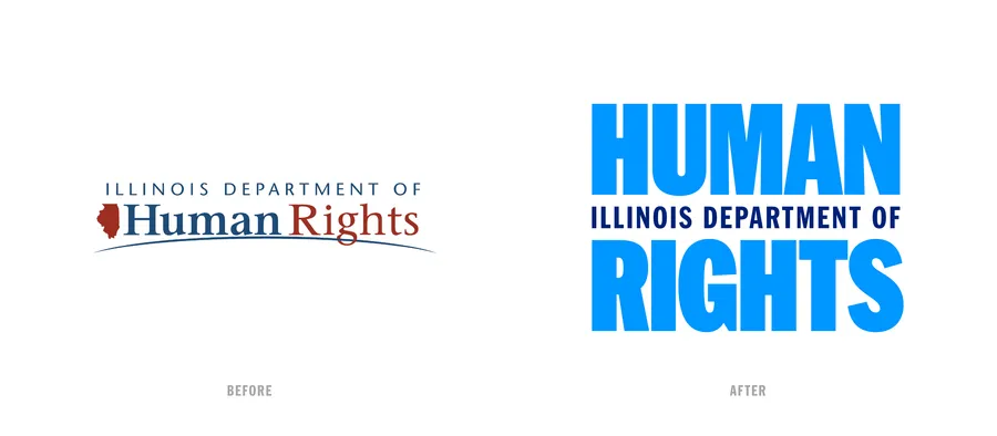
The new identity puts HUMAN RIGHTS before the institution. HUMAN and RIGHTS share the same width, creating the impression of an equal sign. In the abbreviated mark, IDHR stands directly on two equal bars. The bars draw from a deeply American visual language: part equal sign, part flag stripe, recalling a tradition of bold public graphics designed to make important ideas immediate. They extend through the broader system, organizing information, framing images, and holding language.
For more than a century, posters, placards, banners, newspapers, and declarations have carried movements for equality into public life. HEX Franklin, a contemporary interpretation of Franklin Gothic, connects the identity to that history of direct, distinctly American public typography.
People often come to IDHR unsure whether what happened was discrimination or what to do next. That made accessibility more than compliance. Type, color, hierarchy, and language were designed to make rights easier to understand without diminishing the authority of the law.
Built to act. IDHR has to work everywhere, from legal documents and websites to public hearings, Pride, Juneteenth, and the Illinois State Fair. Span built a 99-page system and production-ready tools so staff can respond quickly and consistently when the moment arises.
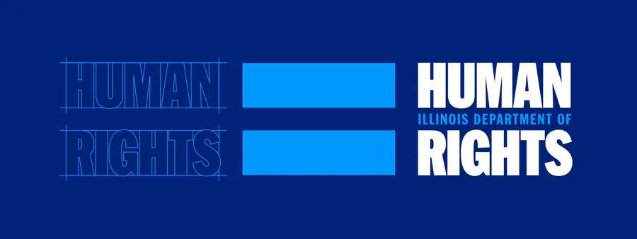
HUMAN and RIGHTS were drawn to the same width, with Illinois Department of between them, turning equality into the structure of the mark.
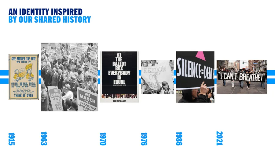
The visual brand identity is informed by a century of human rights actions:
1915 — Give Mother the Vote, We Need It. Rose O’Neill. Wikimedia Commons.
1963 — March on Washington for Jobs and Freedom. Warren K. Leffler, photographer. Library of Congress.
1970 — At the Ballot Box, Everybody Is Equal. Designer unknown. Gary Yanker Collection, Library of Congress.
1976 — Abortion-rights demonstration. Warren K. Leffler, photographer. Library of Congress.
1986 — Silence = Death. Designed by Avram Finkelstein, Brian Howard, Oliver Johnston, Charles Kreloff, Chris Lione, and Jorge Socarrás. Wikimedia Commons.
2021 — George Floyd protest, Minneapolis. Lorie Shaull, photographer. Wikimedia Commons.
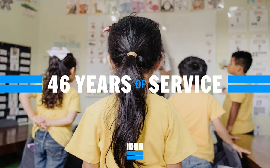
The abbreviated IDHR mark rests on two equal bars, carrying the idea of equality into its simplest form.
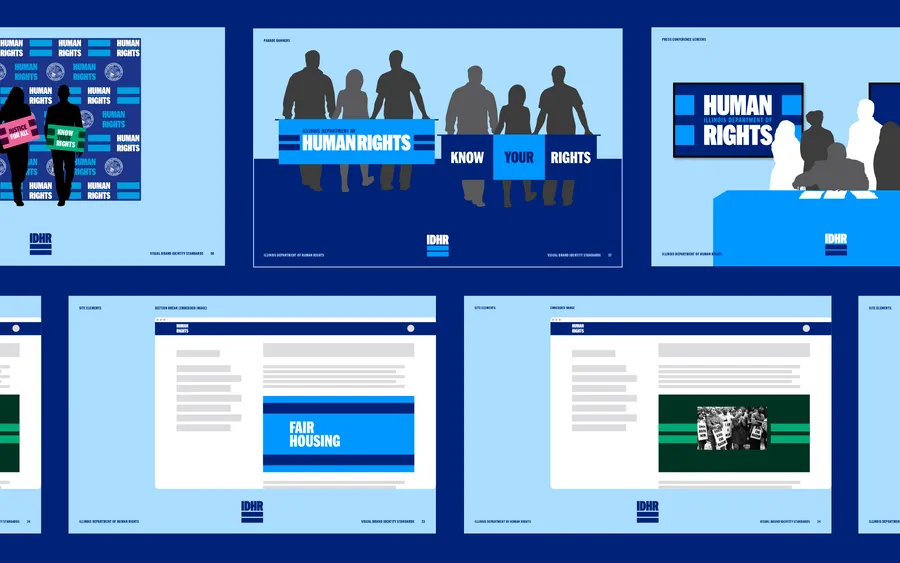
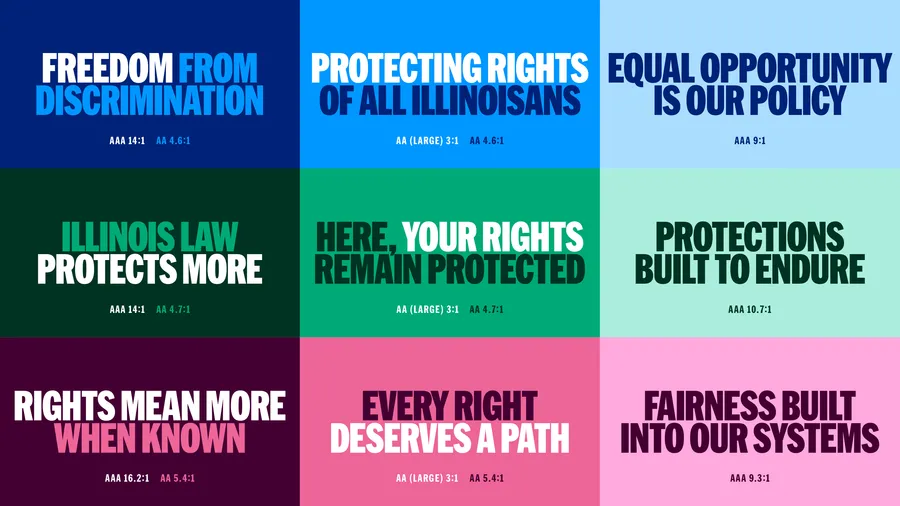
Accessibility was built into the identity from the start. Color pairings were tested for WCAG contrast, but the goal went beyond compliance: make rights easy to see, understand, and act on when clarity matters most.
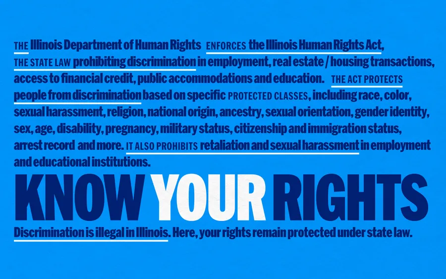
“Our goal was to create a brand that people could recognize, connect with, and immediately know our agency exists to protect their rights. Every Illinoisan should know they are protected under state law, regardless of who they are, who they love, or where they come from,” said IDHR Director Jim Bennett. “This rebrand helped make those protections more visible, more accessible, and more connected to the people we serve.”
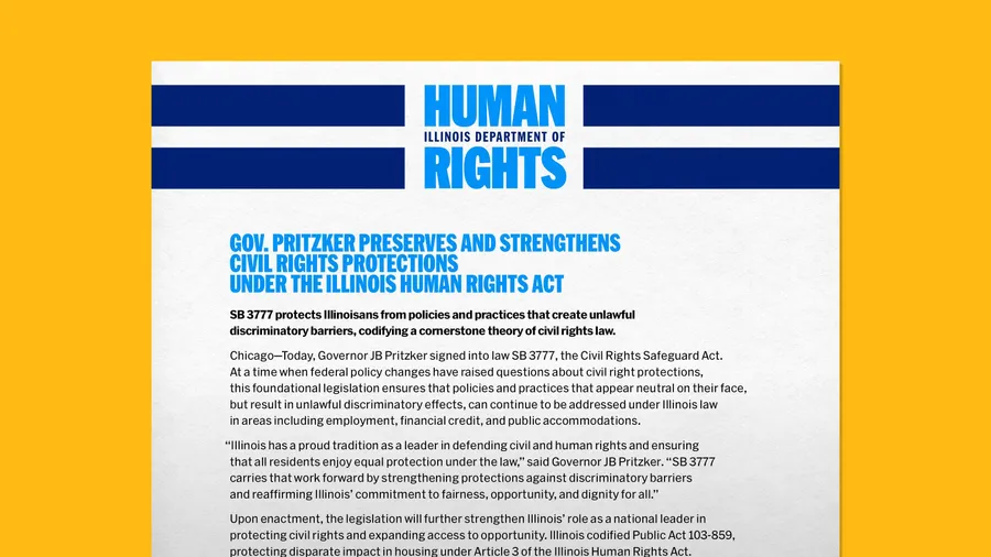
The letterhead was designed for the everyday work of government, including moments of consequence. It carried IDHR’s announcement of Governor Pritzker’s signing of the Civil Rights Safeguard Act, preserving disparate-impact protections in Illinois.
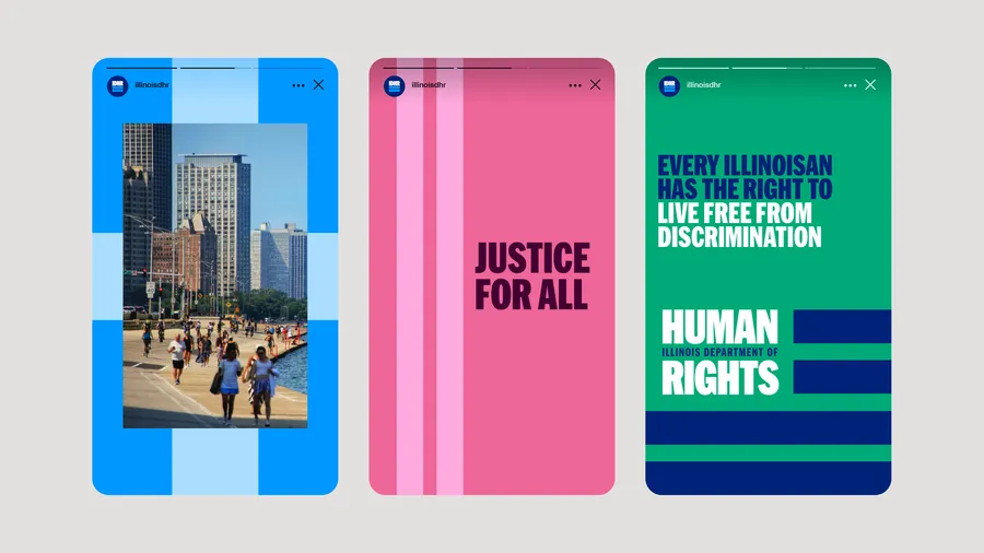
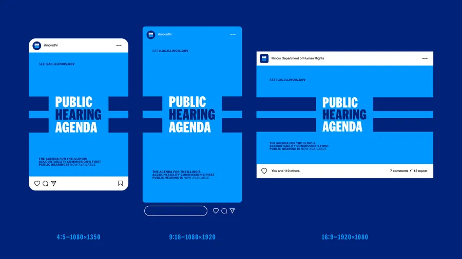
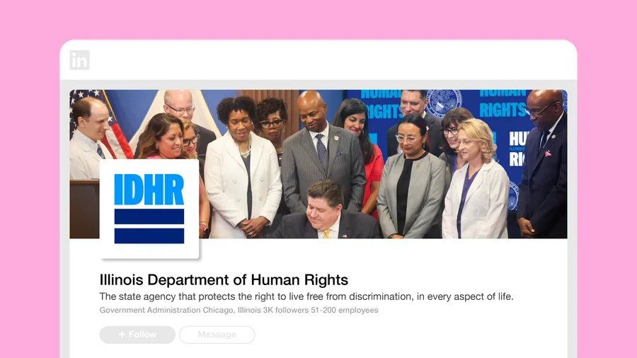
The social media toolkit was built as a rapid-response system, ready to edit and deploy across every major format, with established templates for announcements, photography, rights information, events, and urgent messages.
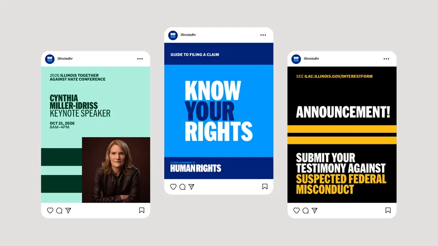
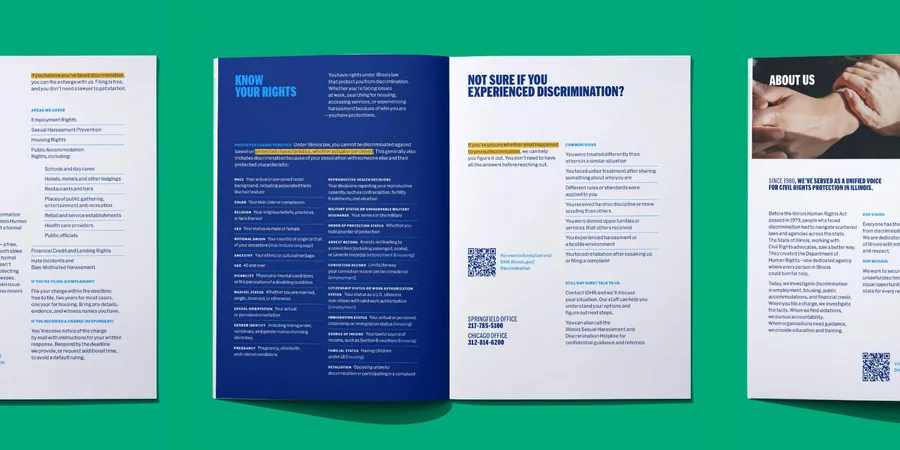
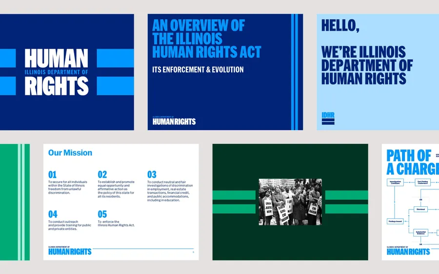
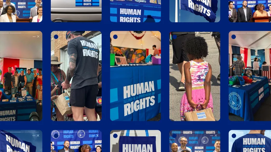
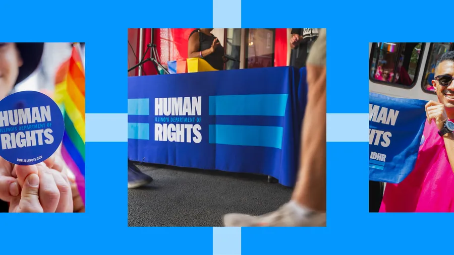
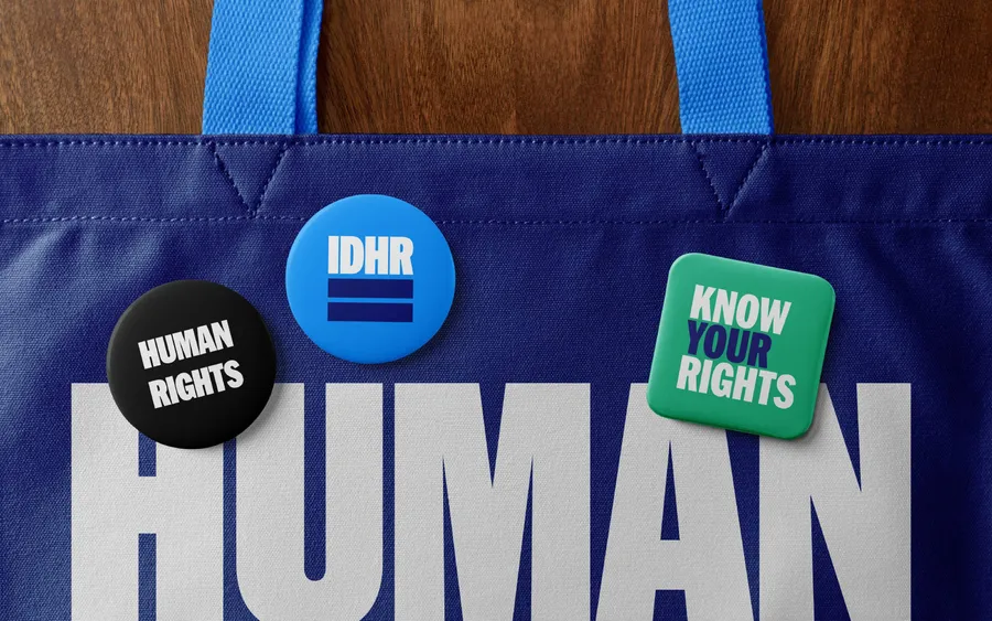
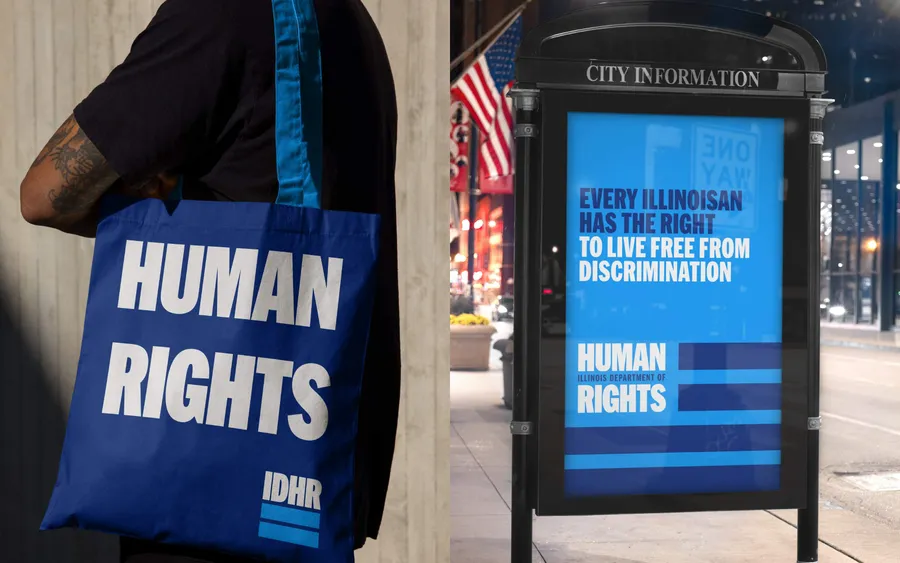
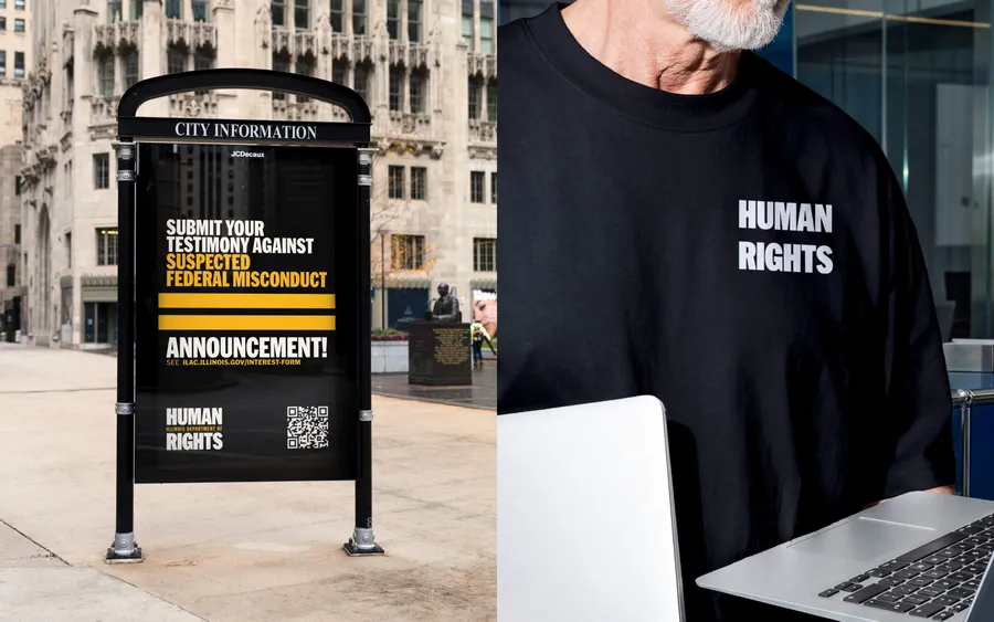
We designed the identity to move beyond government communications and into public life, putting rights information directly into people’s hands across Illinois.
Changing the subject.
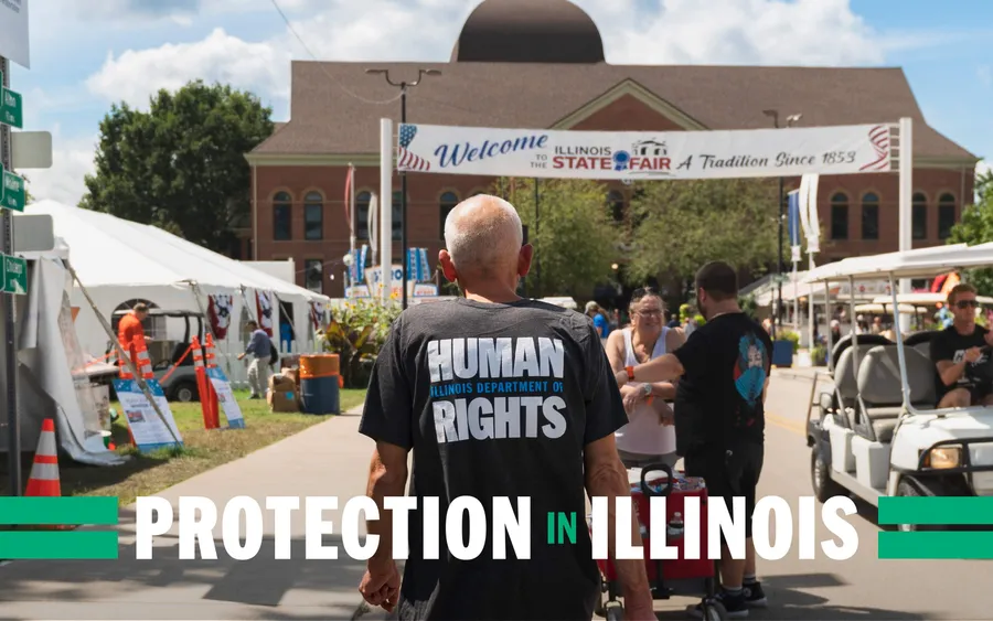
At the Illinois State Fair, IDHR staff noticed something changing. Conversations remained focused on rights. People came to the booth, picked up information, and asked: What are my rights?
The communications team reports that work now moves faster, with more engagement than they had ever seen before. Other state agencies have approached IDHR asking how they did it. The department’s Director travels Illinois wearing HUMAN RIGHTS across his chest. At Pride, people carried the identity alongside their own flags.
IDHR was created to make civil-rights protections easier to access. The new identity makes that promise visible again.