Devine & Co
- Credits
-
Bud Rodecker
Design DirectionValeria Bernal
Design
- Also
Wordmark by Fred Shallcrass at Frere-Jones Type
Illustrations by Wonder City Studio
Photography by Sarah Voigt
Typeset in Mallory by Frere-Jones Type.
Devine & Co. was founded on the belief that housing is essential infrastructure for thriving communities. Established in 2025, the New York-based developer partners with leading nonprofits, government agencies, and mission-driven organizations to create affordable, supportive, and transitional housing that delivers lasting impact for residents and neighborhoods alike.
Launching a new company required more than a logo. It needed a clear voice, a flexible identity, and a digital presence that could communicate both credibility and purpose from day one.
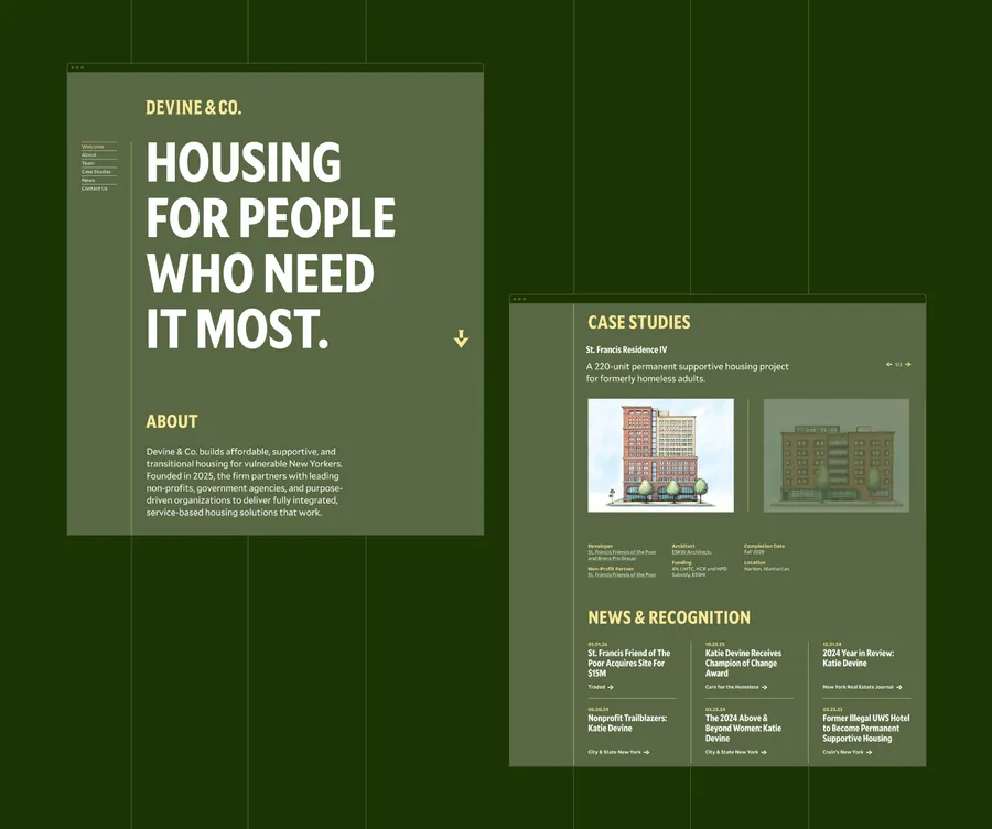
Working from a wordmark designed by Fred Shallcrass at Frere-Jones Type, Span expanded the identity into a complete visual system rooted in the same typographic rigor. Built around Frere-Jones' Mallory Compact and Mallory Condensed typefaces, the system balances precision with warmth, creating a visual language that feels both civic and contemporary. Restrained typography, generous space, and purposeful composition reinforce the firm's thoughtful, service-oriented approach while providing a flexible foundation for future growth.
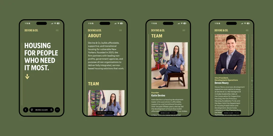
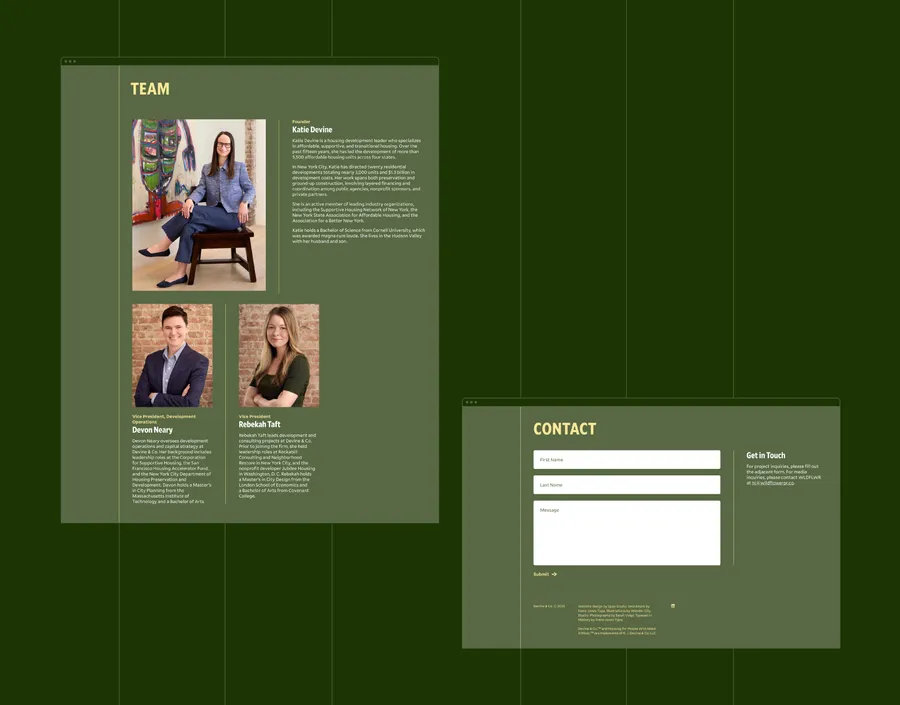
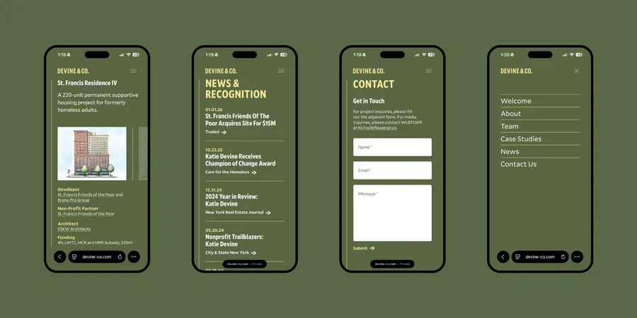
The project culminated in the design of Devine & Co.'s launch website, introducing the firm's mission and integrated approach to housing while establishing a framework that can evolve alongside the practice. Like the communities Devine & Co. helps create, the identity is designed for longevity: clear, resilient, and built to serve.