The Dylan Name, Identity & Website
- Credits
-
Bud Rodecker
Design DirectionAlyssa Arnesen
DesignValeria Bernal
DesignMarisa Cruz
DesignCollin Joyce
Web Development
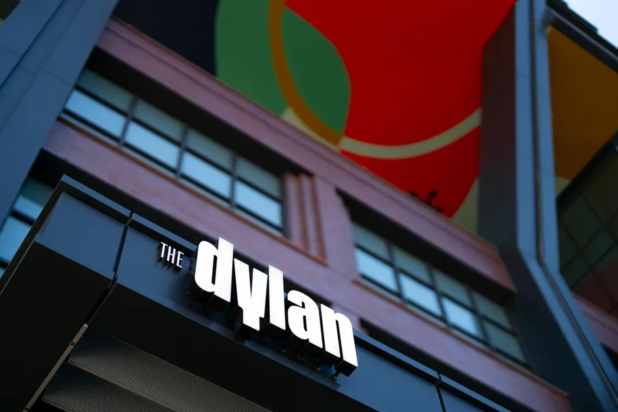
The Dylan is Sterling Bay's latest collection of vibrant high-end apartments in the heart of Chicago's Fulton Market neighborhood. Span was engaged to name these residences and create a visual identity that speaks to the energetic atmosphere of the surrounding area and The Dylan's welcoming, hospitality-inspired living that is catered to residents.
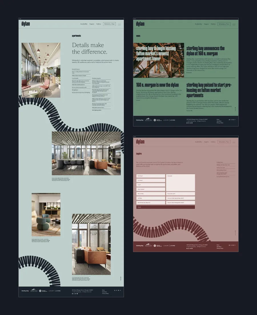
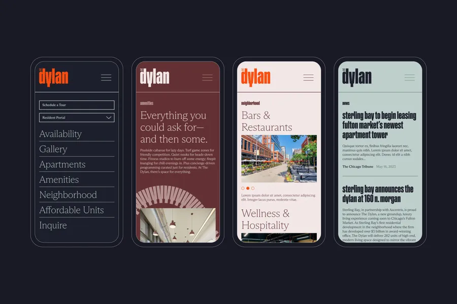
To create the identity system, we pulled inspiration from The Dylan's interior architecture and finishes, which are influenced by the industrial chic backdrop of Fulton Market and incorporate artistic elements of surprise and delight. Strong lines are complemented by soft curves throughout the building, both of which informed our identity system, logo design, and brand assets.
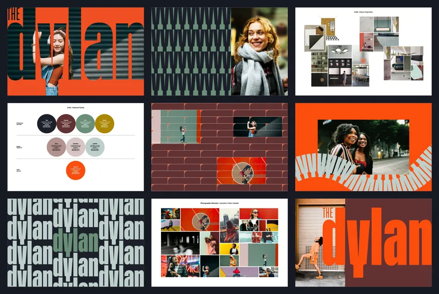
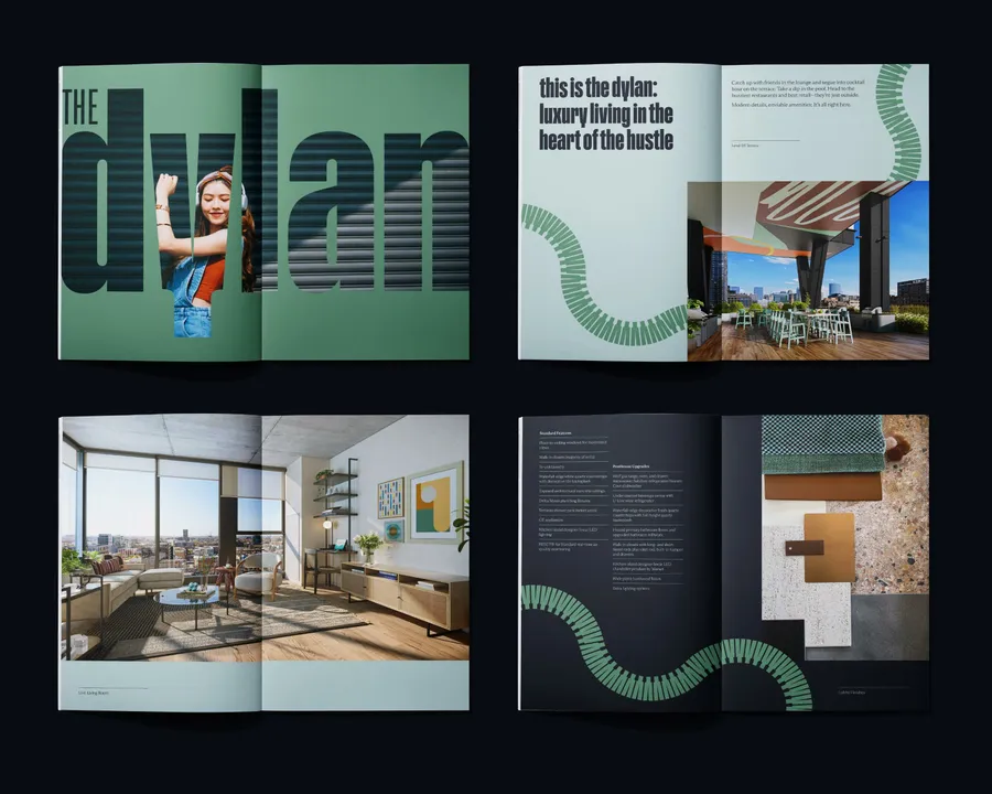
The graphic standards manual includes multiple patterns constructed from the logo in addition to photographic art direction.
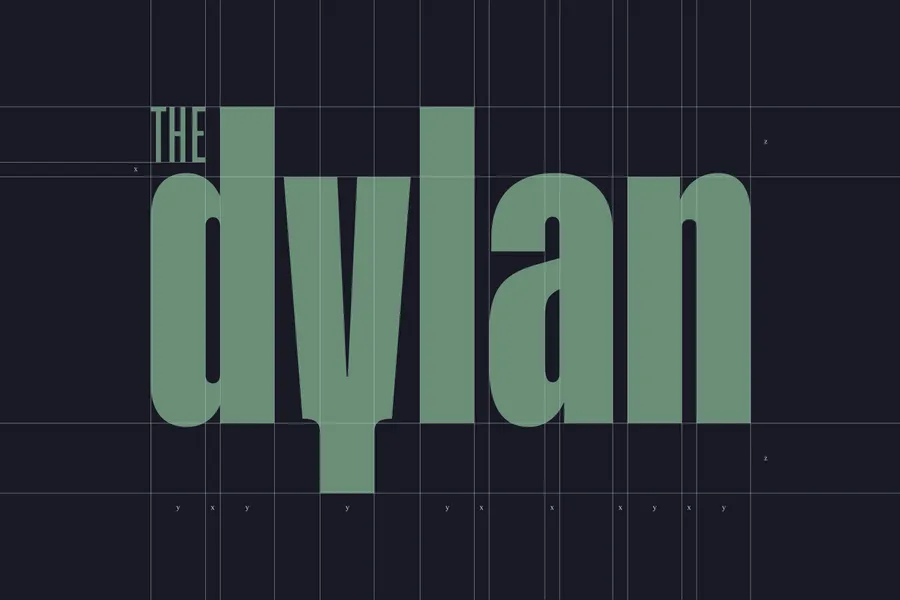
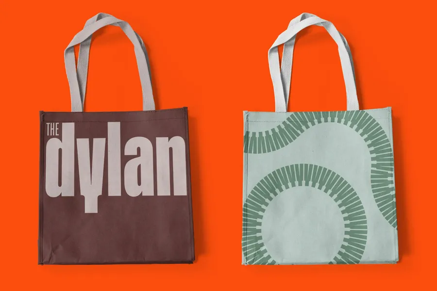
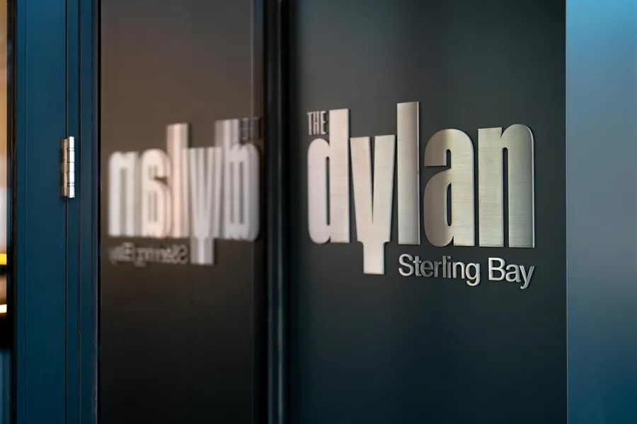
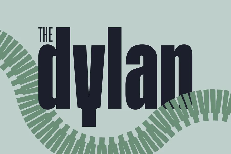
We customized letterforms from a cut of ABC Gravity for the primary logotype.

Some branded patterns are constructed from the 'Y' in The Dylan logo, which references the architectural Y-shaped columns that flank the outdoor amenity terrace.
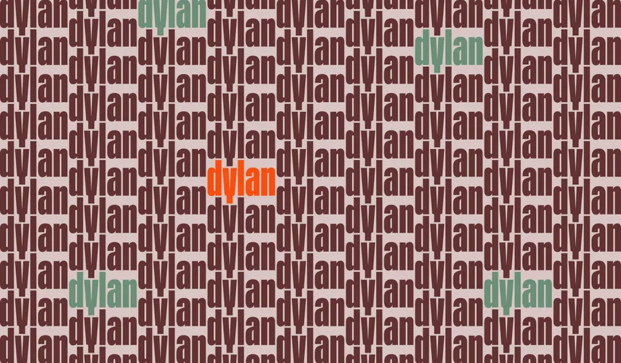
Other brand patterns allude to the brickwork on the building's exterior façade by stacking and interlocking the full Dylan logo.

The Dylan identity system was inspired by the interplay of strong lines and soft curves within the building's interior architecture.
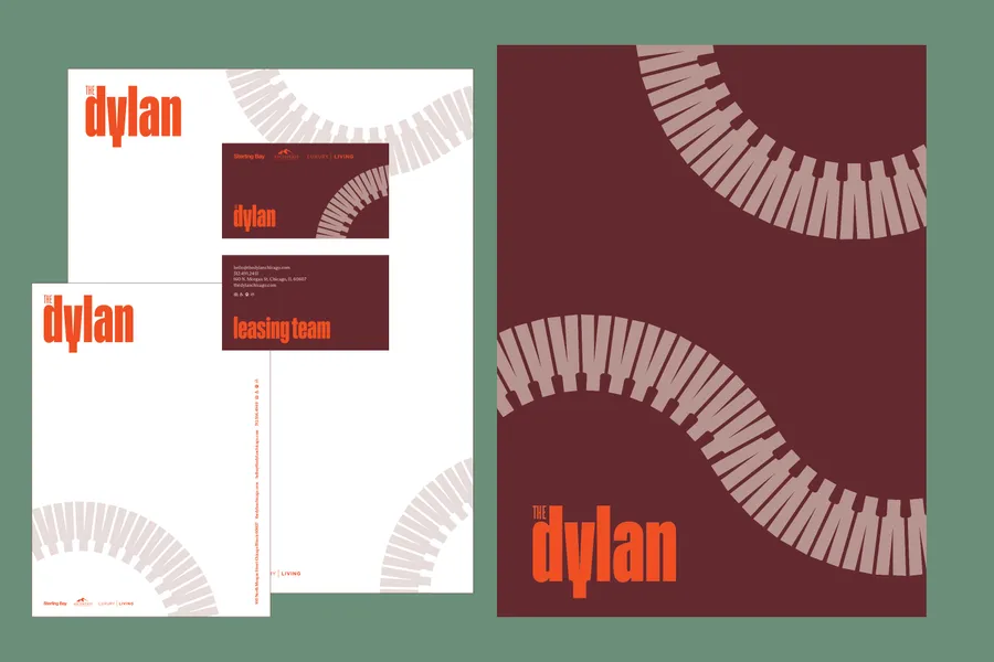
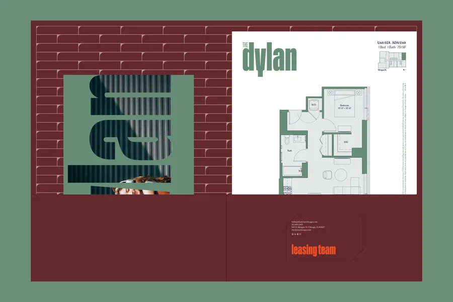
Patterned pocket folders hold floor plan inserts, rack cards, and a customized stationery set.

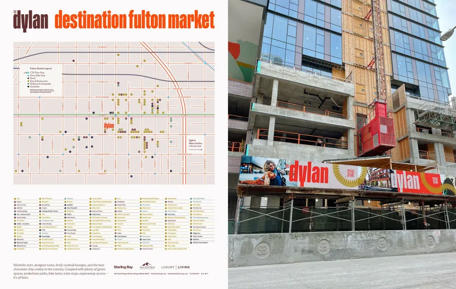
We created a branded Fulton Market neighborhood map that highlights the many points of interest within walking distance of The Dylan. We also designed a vibrant barricade and leasing center graphics.