Regional Transportation Authority Brand Identity
- Credits
-
John Pobojewski
Concept, Design Direction, Strategy, DesignValeria Bernal
Design, Animation, IllustrationKathleen Hinkel
Photography
The Regional Transportation Authority is responsible for coordinating the Chicago region’s transit system including overseeing financing and planning together with the three major transit operators: CTA, Metra, and Pace. Span was invited to refresh the brand identity for the organization in advance of announcing the RTA’s next strategic plan — a multi-year vision of how to achieve a safe, reliable, accessible public transportation that connects people to opportunity, advances equity, and combats climate change.
Span’s new brand reflects the agency’s focus on accountability, transparency, independence, and equity — four important goals identified during five separate workshops with stakeholder teams.
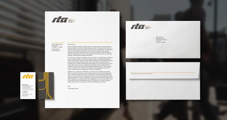
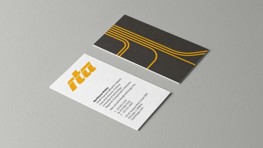
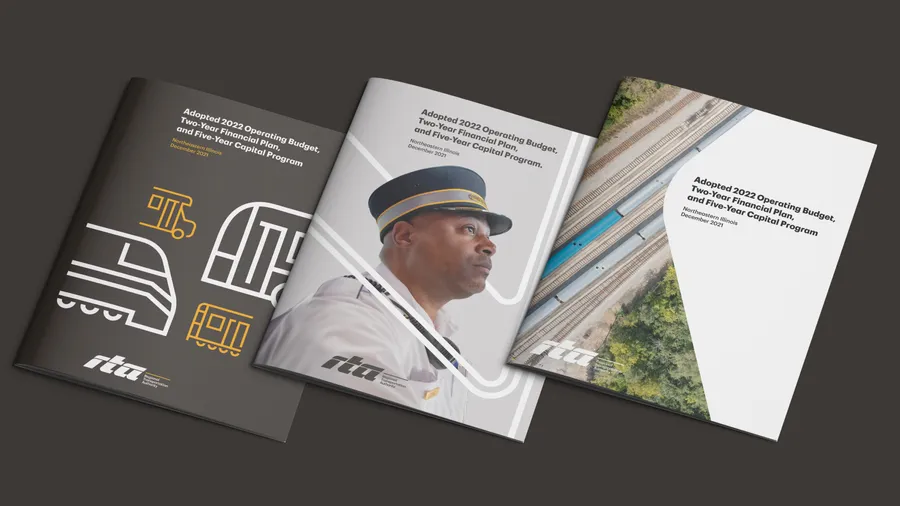
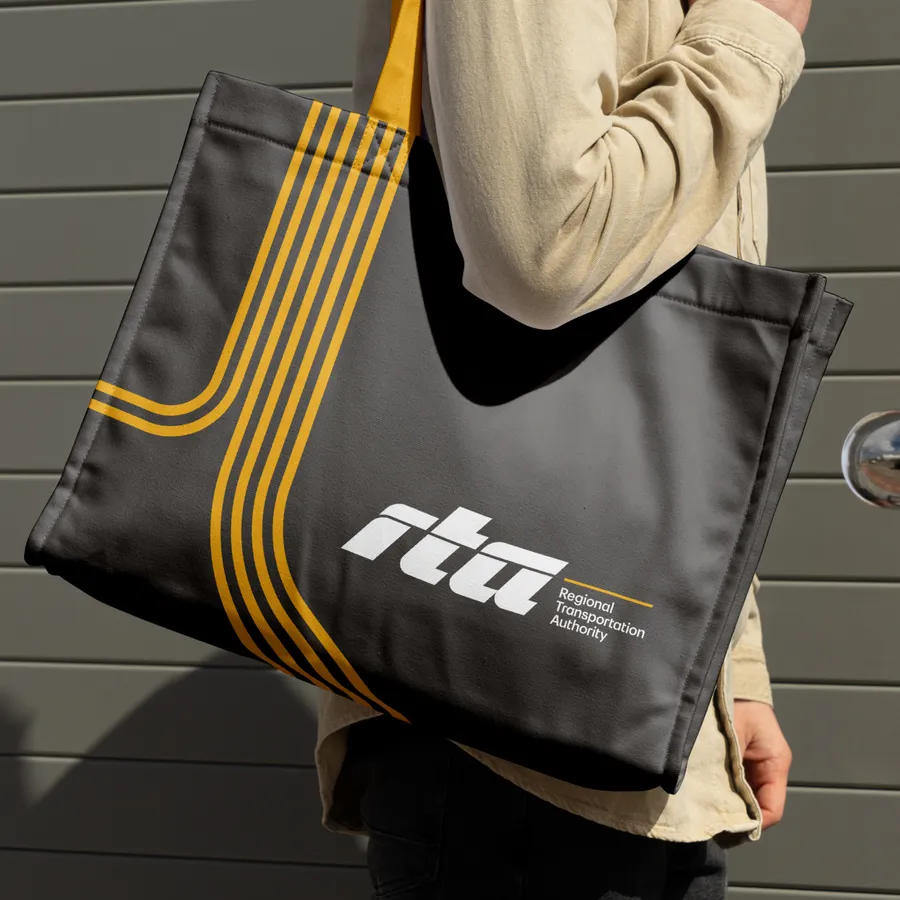
The logo is a solid monogram reflecting speed and strength with an ”overline” running through the characters like a train or bus pulling into the station. The typography is a customized version of Graphik by Commercial Type, a hard-working sans serif typeface selected for maximum recognition, with modified r, t, and a characters to better align with the visual language of the logo itself. The color palette is focused, using combinations that are ADA-compliant up to level AA+. Illustrative transit paths as well as an icon suite add additional visual expressions to represent all aspects of life around transit.
Span also collaborated with photographer Kathleen Hinkel to create an extensive image collection celebrating the incredible value of the region’s transit system to the six counties of Northeastern Illinois.
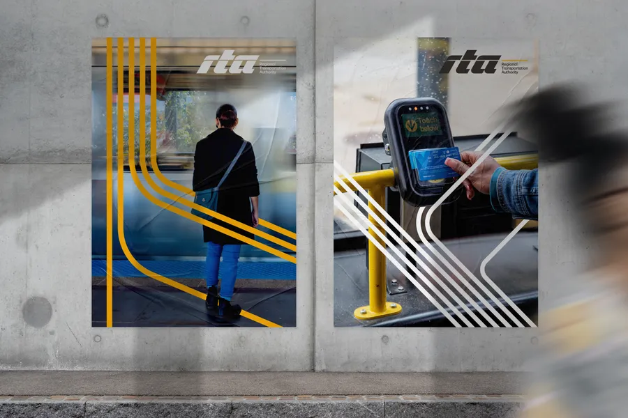
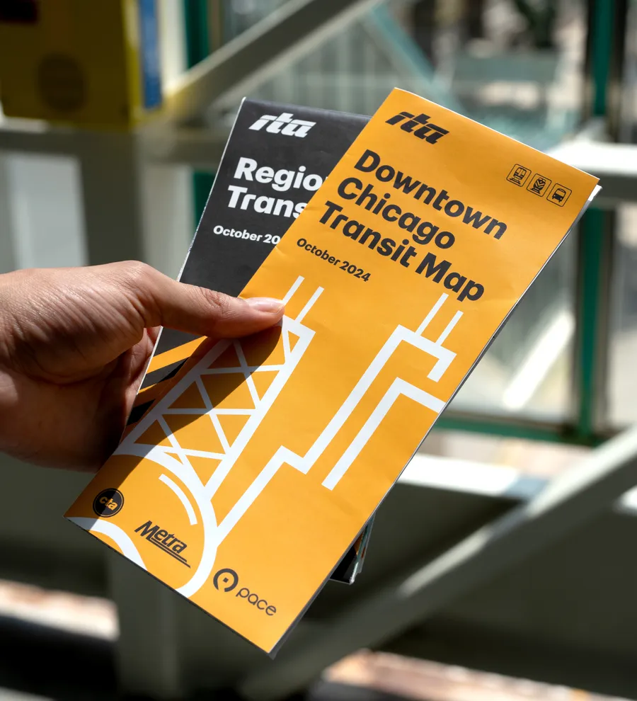
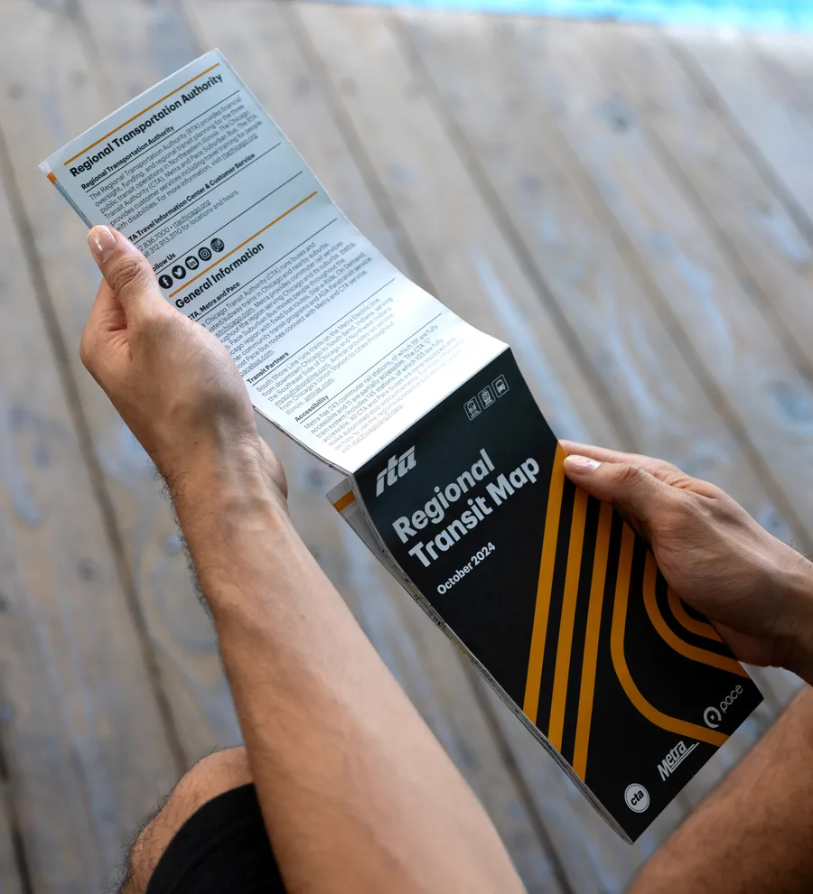
Illustrative transit paths are used as graphic elements throughout the visual identity
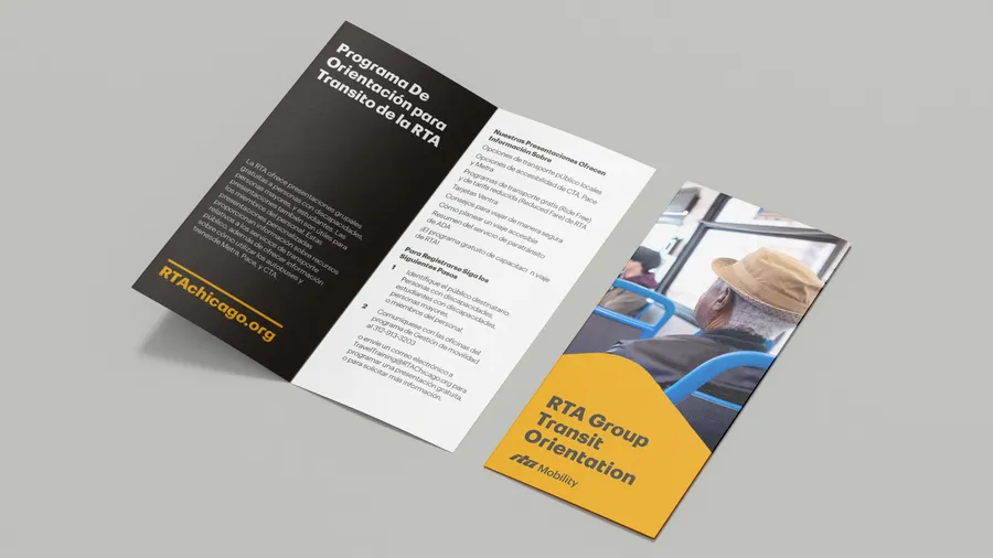
Christian Schwartz of Commercial Type customized the sans-serif typeface Graphik for the agency to better align with the form of the RTA monogram.
Social Media Templates
A custom icon library reflects all aspects of transit throughout the region


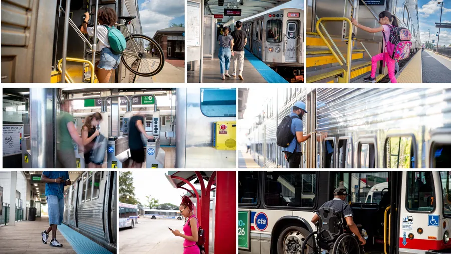
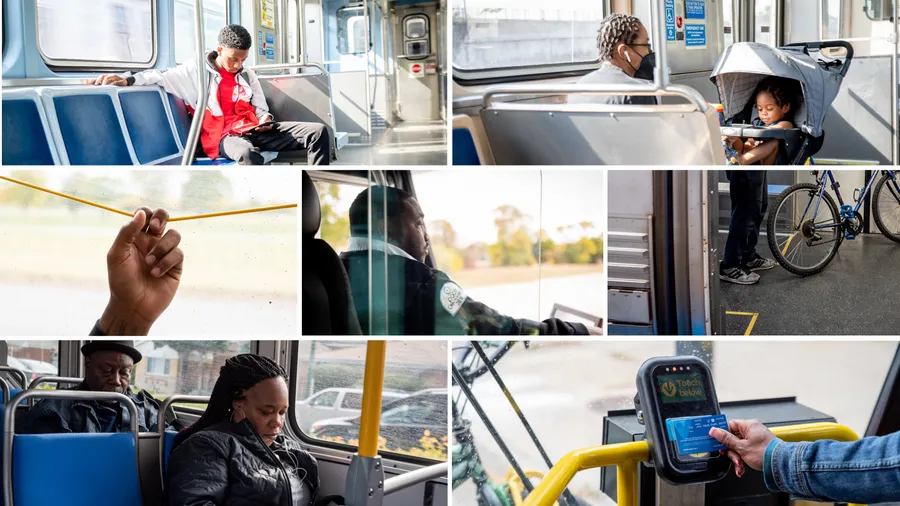

Photographer Kathleen Hinkel collaborated with Span to build an image library that represents life on transit across the Chicago region.
Infographic styles were designed for accessibility and clarity
