Columbus Museum of Art & Design Brand Identity
- Credits
-
Bud Rodecker
Design Direction, DesignNick Butcher
Design
CMAD was born from a belief that art and design can shape civic life. Originally founded as the Indianapolis Museum of Art at Columbus, it brought exhibitions and cultural programming to a city that was already redefining the role of architecture in public life.
In Columbus, where visionary leaders and the Cummins Foundation championed world-class design for schools, churches, and civic buildings, the museum became part of a larger experiment: the idea that creativity belongs to everyone. Now known as the Columbus Museum of Art & Design, the organization continues that legacy by supporting artists and designers through an ongoing grant process funding civically-minded projects in the region.
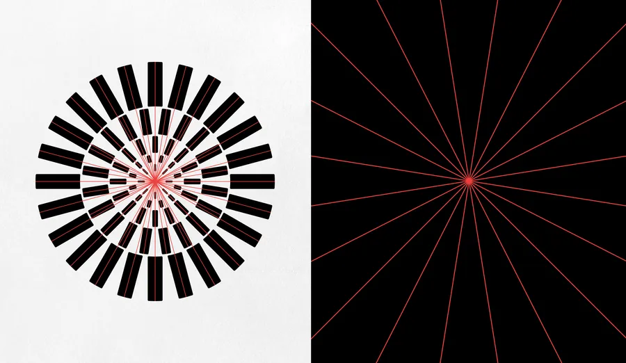
When Span was invited to reimagine the institution’s identity in 2025, we discovered a history defined by optimism, experimentation, and civic ambition. Drawing inspiration from CMAD’s original mark and the modernist spirit of Columbus itself, we created a flexible visual system built around radiant forms and the neo-grotesque typeface Forma.
The result is an identity that honors the past while looking forward—confident, open, and designed for a new generation of civic imagination.
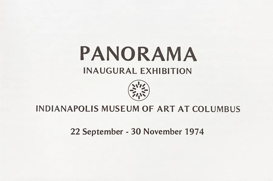
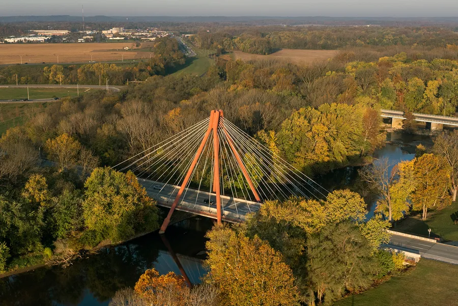
(Left) CMAD evolved from the remnants of the Indianapolis Museum of Art at Columbus. (Right) The Robert N. Stewart Bridge in Columbus, Indiana, an iconic landmark in this design-forward city.
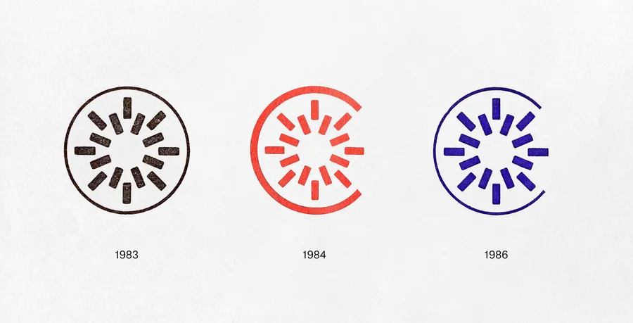
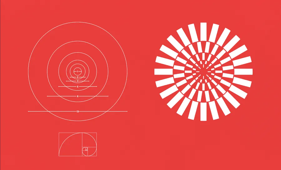
Our identity reimagines the institution's radiant icon as a structural undercurrent, built on the Fibonacci sequence. Its proportions begin small and multiply, each new form growing from everything that came before.
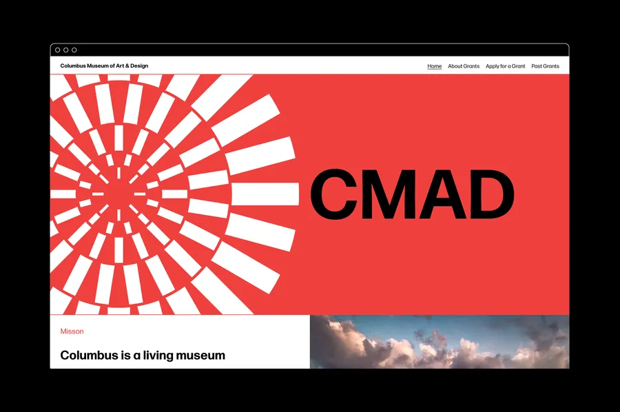
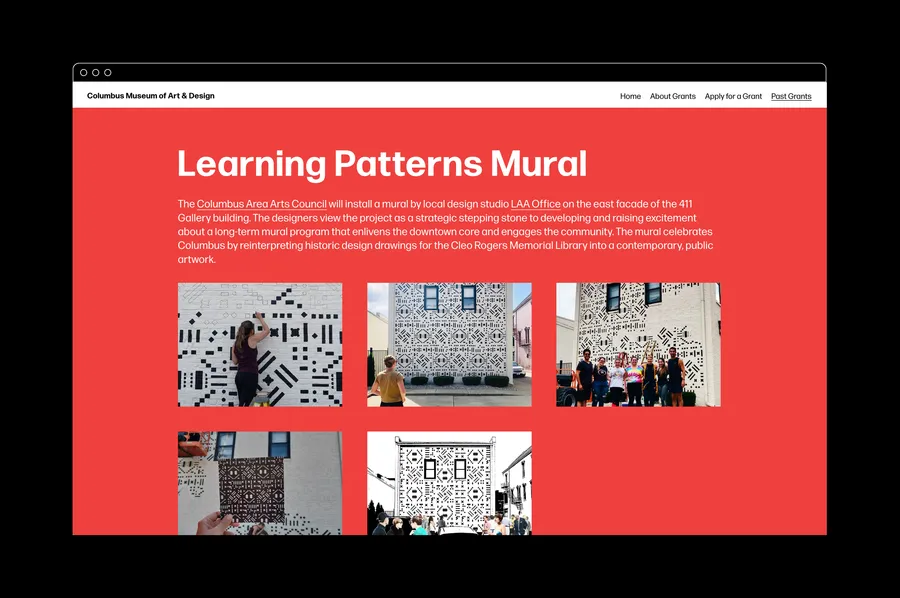
Our typographic system is built using Forma a neo-grotesque san-serif originally developed by Aldo Novarese and a team of designers at the Nebiolo foundry in Turin, Italy in the late 1960's. Forma was revitalized and digitized in 2013 by type designer David Jonathan Ross.
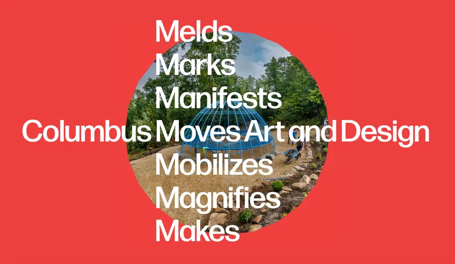
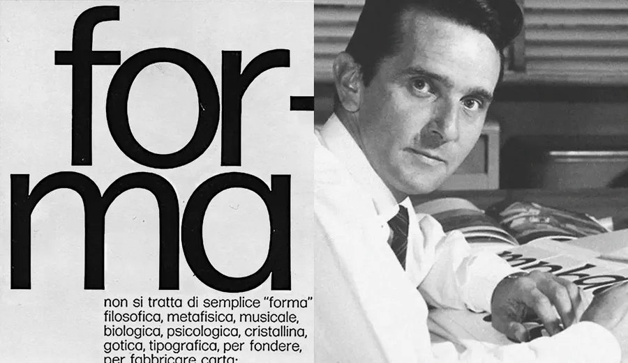
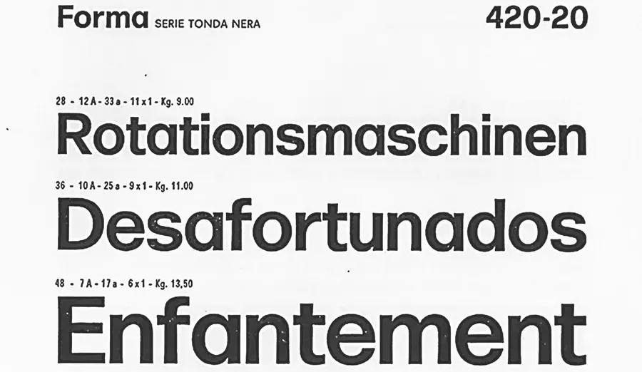

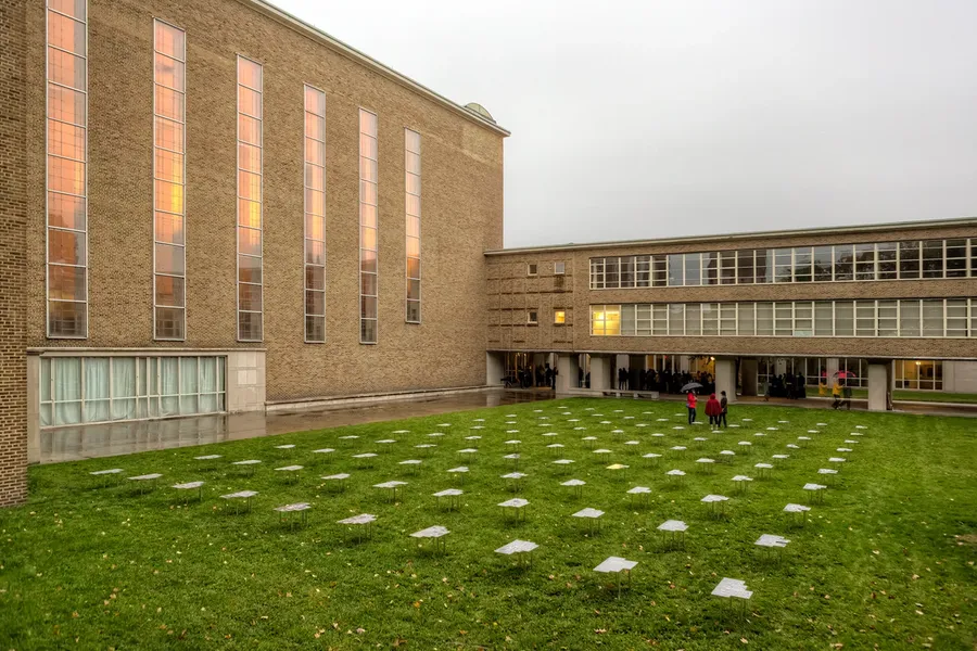
Photo by Tony Vasquez
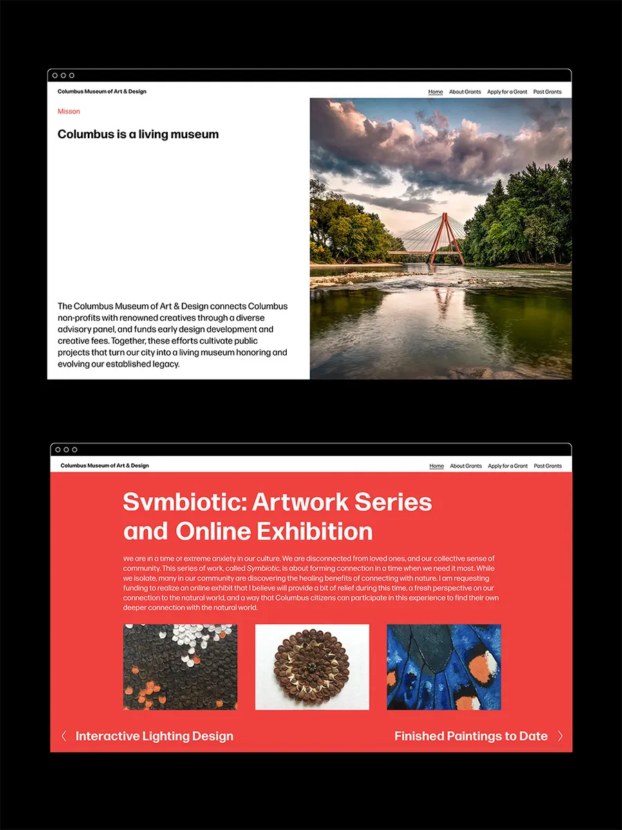
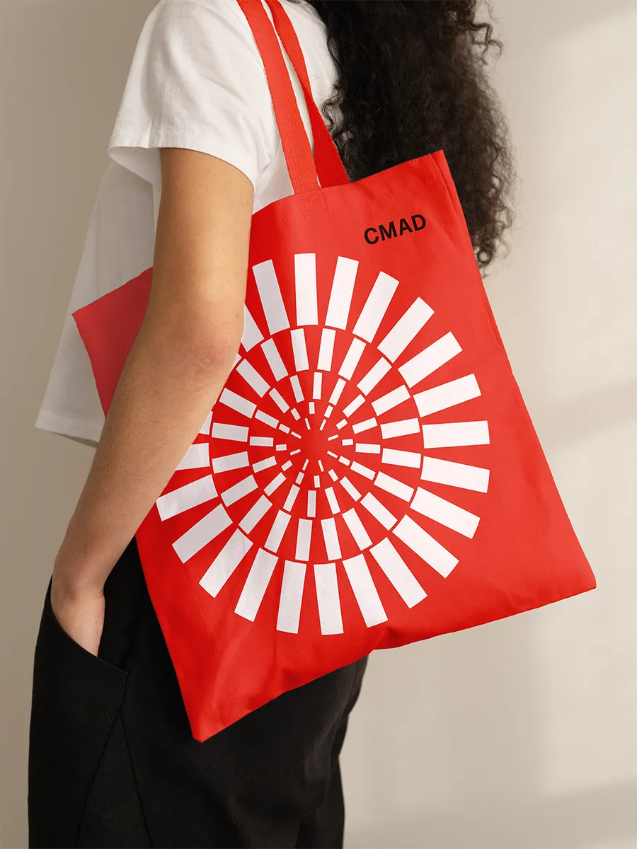

Image by Hadley Fruits