The Chicago Reader Identity Redesign
- Credits
-
Bud Rodecker
Design Direction, Design, Animation, Design ResearchNick Butcher
Design, AnimationCorianton Hale
Publication Creative Direction and Art Direction
The Chicago Reader has long been one of those rare institutions that doesn’t just report on a city, but helps define how that city sees itself. For more than fifty years, its voice has been sharp, independent, and unmistakably its own. Yet as the Reader expanded across platforms and formats, its identity needed to evolve without losing the cultural equity embedded in its past.
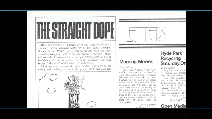
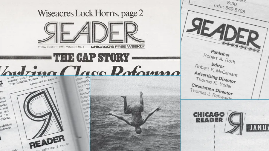
We partnered with the Chicago Reader and Noisy Creek to guide this evolution. Our work began by immersing ourselves in the Reader’s archives, studying decades of mastheads, typography, and production artifacts—from early newspaper layouts in the 1970s to later reinterpretations of the mark. This research revealed a lineage of small but meaningful typographic decisions that, over time, shaped one of Chicago’s most recognizable visual signatures.
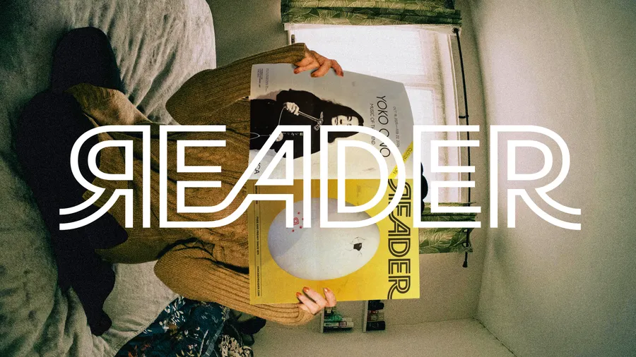
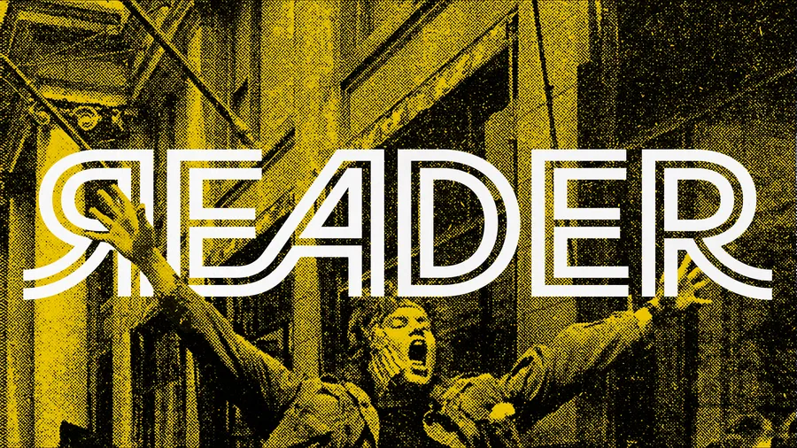
At the center of the identity is a meticulous redraw of the original Reader wordmark by Bud Rodecker. He corrected inconsistencies, refined proportions, and resolved optical imbalances while preserving the idiosyncrasies that give the mark its character. The result is a wordmark designed to perform across contexts—from print covers and editorial layouts to digital platforms, social media, street-level distribution boxes, and merchandise.
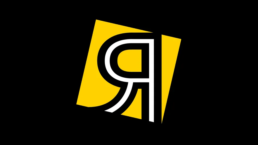
Supporting the wordmark is a flexible logo system that balances clarity with expression. The full wordmark serves as the primary identifier, while the iconic “R” operates as a secondary signal—used selectively to extend recognition without diluting the core identity. This system allows the brand to scale fluidly across applications while maintaining visual consistency.
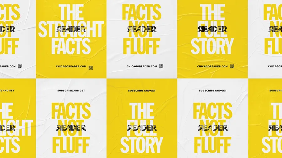
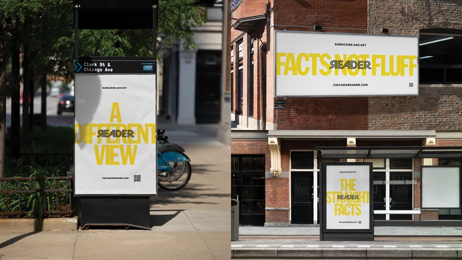
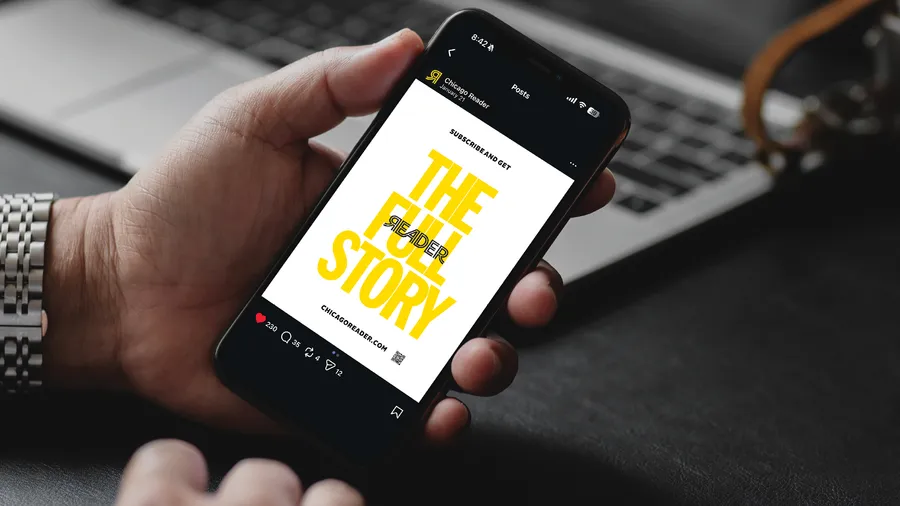
The broader visual language draws directly from the Reader’s legacy of bold design. A restrained palette anchored by its signature yellow creates immediate visibility in the urban environment, while typography and layout embrace the publication’s tradition of directness and editorial urgency. Campaign work extends this voice into the city, with messaging like “This is the start of something old” and “Facts, not fluff” reinforcing the Reader’s role as a trusted, independent perspective in Chicago’s media landscape.
The refreshed identity does not attempt to modernize the Reader by distancing it from its past. Instead, it clarifies and strengthens what has always made the publication distinctive. By returning to the source material and refining it with precision, we helped position the Chicago Reader for its next chapter—ensuring it remains as recognizable, relevant, and culturally embedded as ever.
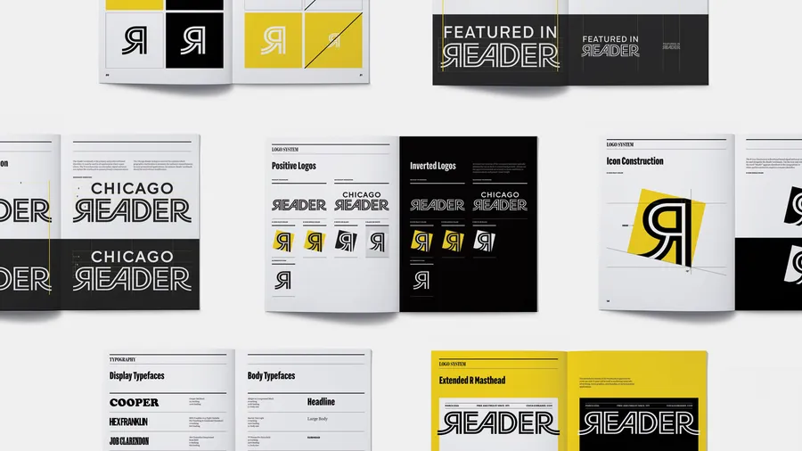
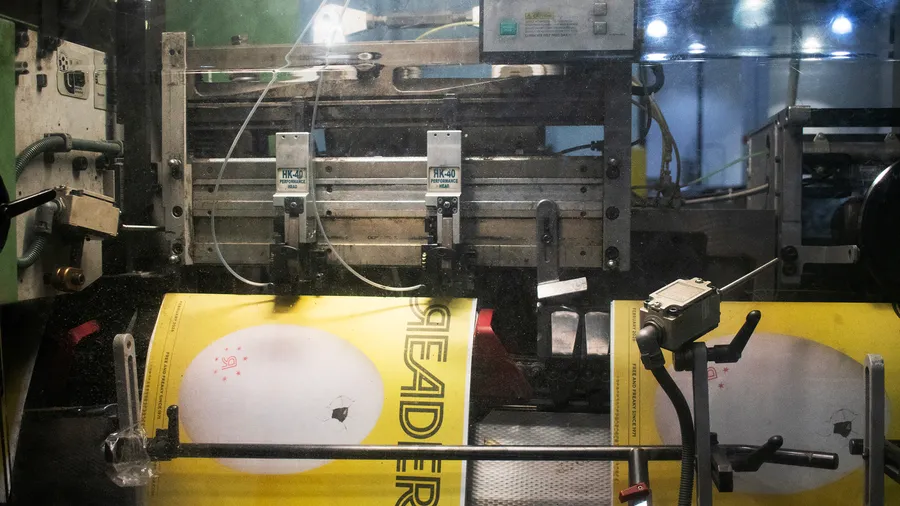
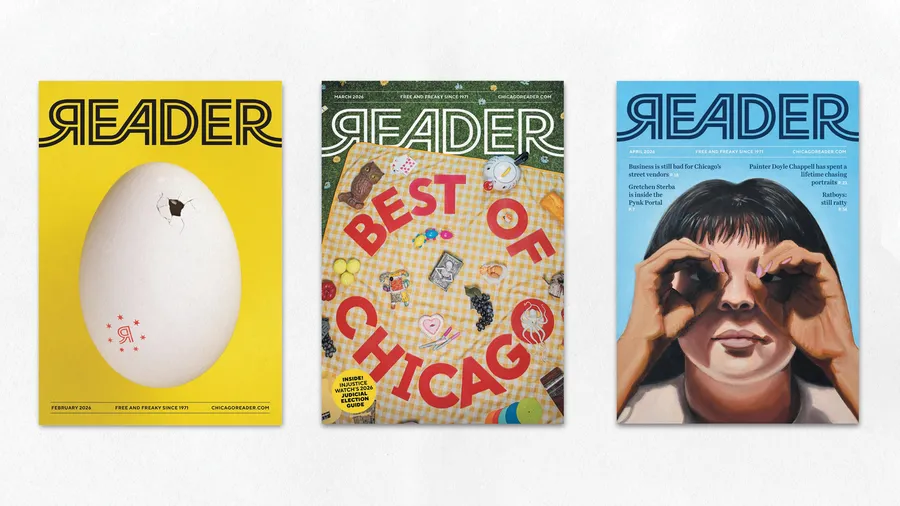
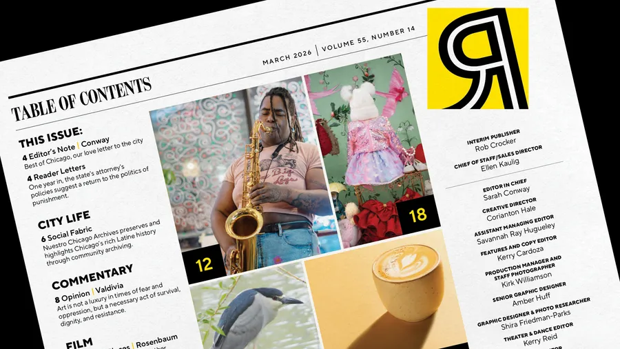
(Above and below) Cover and interior layout design directed by Corianton Hale.
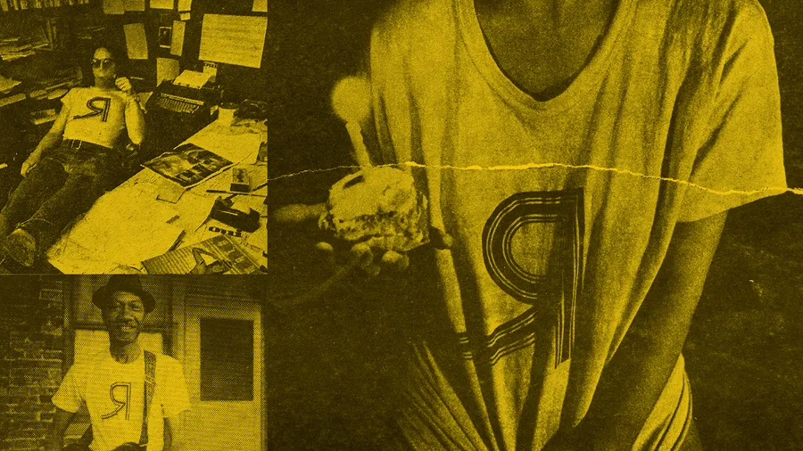
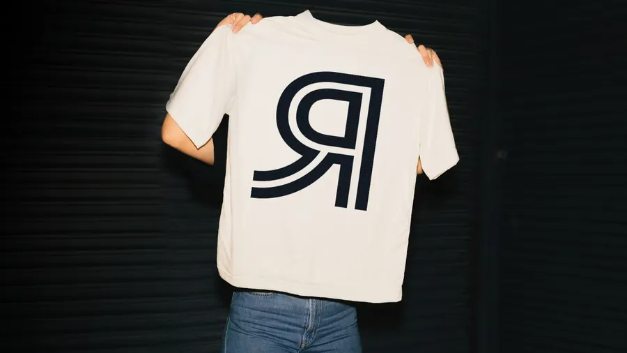
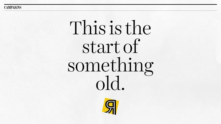
"This is a Start of Something Old" is a campaign subverting expectations through playful language and archival imagery. Bold and approachable, it grounds the reader in the past and creates excitement for the future.
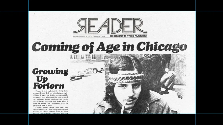
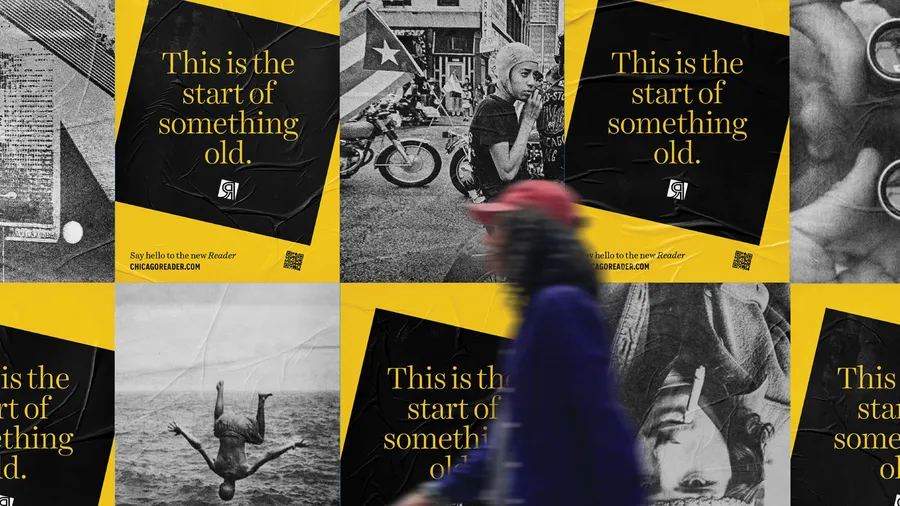
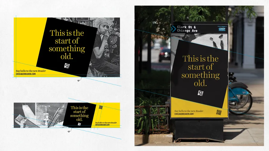
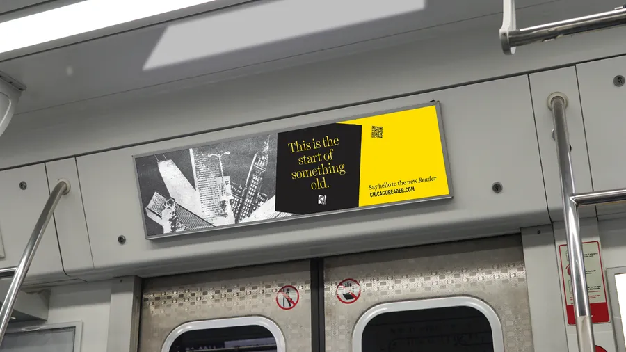
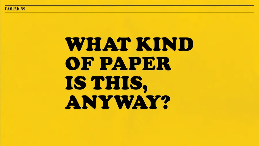
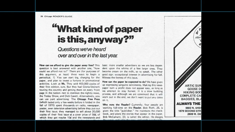
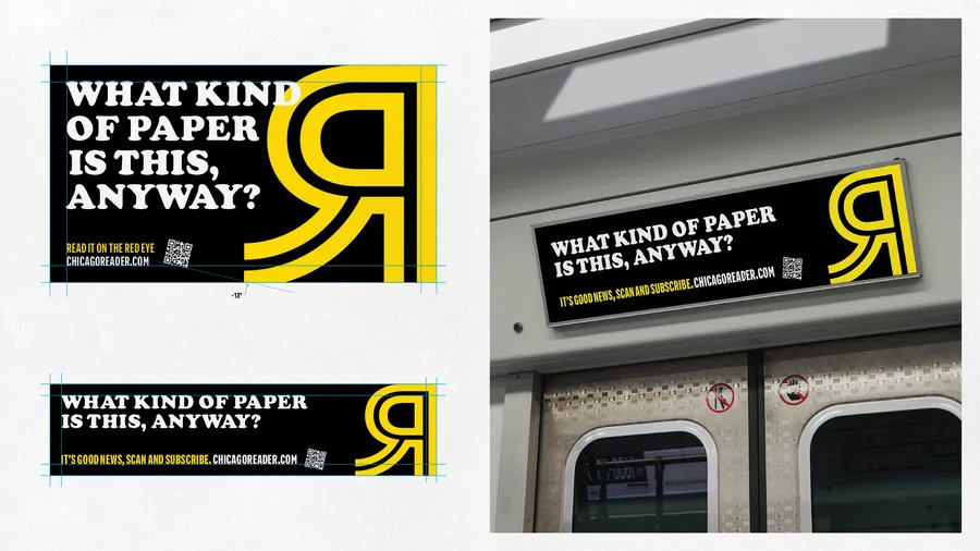
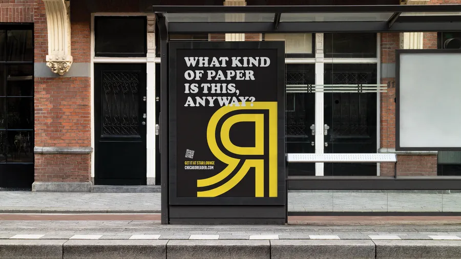
"What Kind of Paper is this, Anyway?" is historically-driven awareness campaign inspired by the Chicago Reader’s archive. The campaign aims to pique the interest of old and new readers alike.
"One Big Idea" is a flexible language-driven awareness campaign reintroducing the Chicago Reader to the city and beyond. It was inspired by Cecil Adams' revered column, The Straight Dope.