Chicago Repertory Ballet Brand Identity
- Credits
-
John Pobojewski
Concept, Design Direction, Strategy, DesignDesirée Solenberger
Design
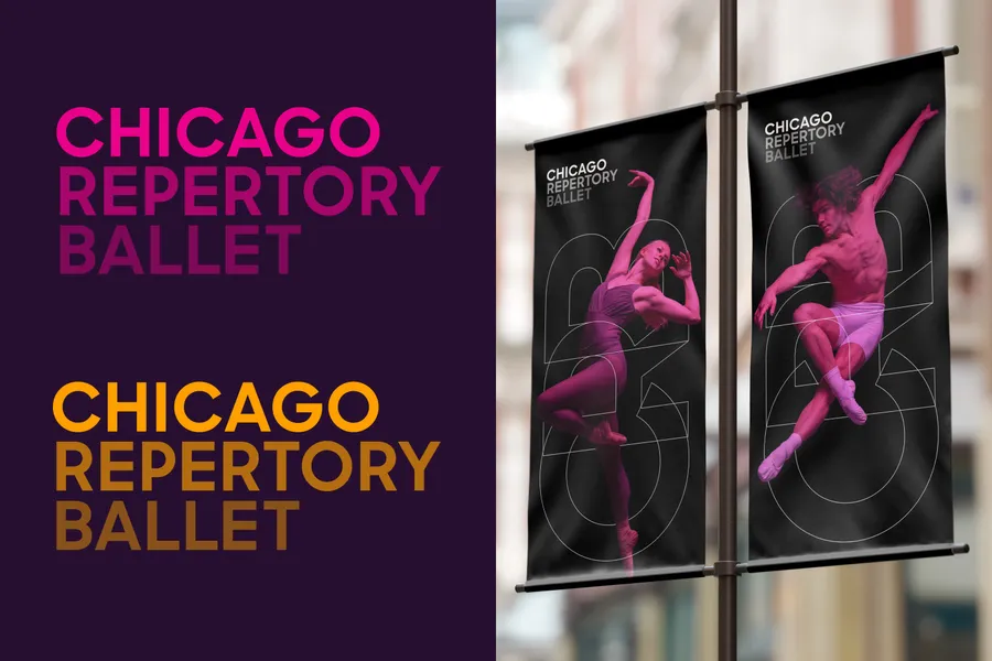
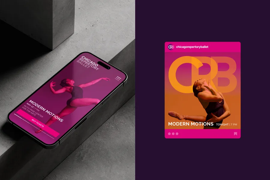
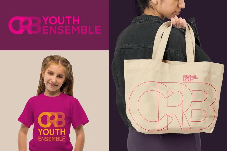
In commemoration of their tenth season, long-time collaborator Chicago Repertory Ballet invited Span to design a new visual brand identity for the company. Our response was to create a modern typographic ”frame” that visually supports the dancers themselves, interweaving photography throughout the identity’s secondary monogram.
The typography is a geometric sans serif inspired by the classic ”C” found on the Chicago Theatre. Powerful, fully-saturated pink and orange tones represent the company’s bold voice in both their programming and their commitment to equal representation towards all races, affiliations, gender identities, and sexual orientations.
