Hot Chi Brand Identity
- Awards
- STA 100 2021
- Credits
-
Nick Adam
Concept, Design Direction, Strategy, DesignAvery Branen
Design, Illustration
Hot Chi is a Chicago-style, Nashville-inspired, hip-hop-loving, hot chicken and ice cream restaurant In Chicago’s Chatham neighborhood. Life-long South-siders, restaurateurs and family Amer, Mutaz, and Kinan have long had a passion to feed communities. When Chatham (a neighborhood considered to be a food desert) lost what was widely considered the best fried chicken franchise in Chicago, the brothers decided to step up.
Span named the restaurant Hot Chi, a play on their specialty, hot chicken, while at the same time embracing Chicago’s nick-name Chi-Town. Hot Chi is simple, memorable, and screams Chicago-style Hot Chicken. Made up of two 3-letter words, the name itself is intentionally embedded with a graphic strategy making the two terms to perfectly stack.
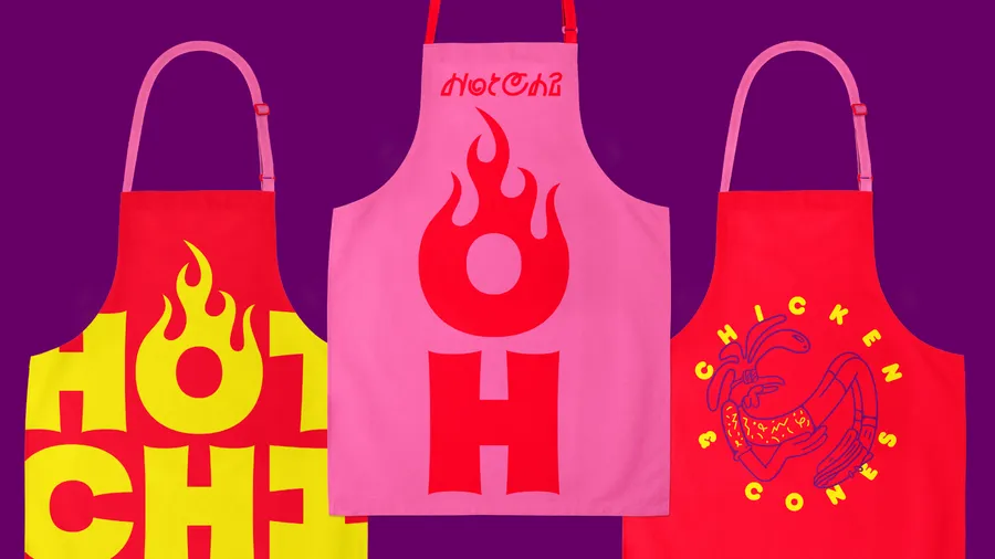
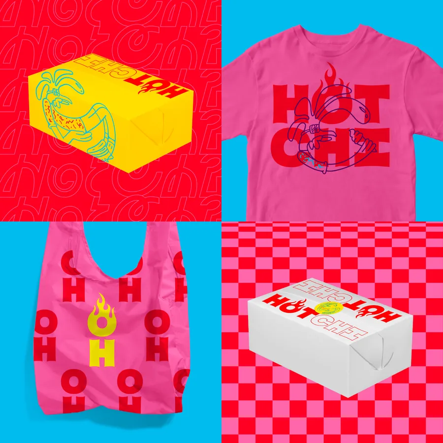
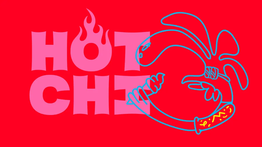
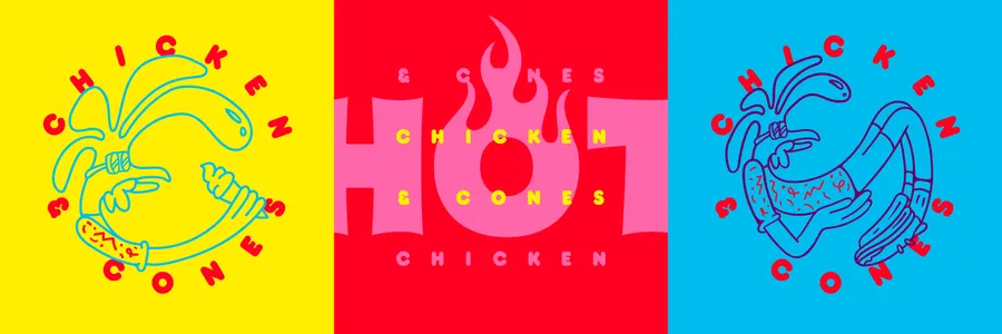
Span drew the custom lettering of the Hot Chi logo to embrace the aesthetics of homestyle cooking and the urban landscape with sign-painter lettering styles. Each letter was drawn with equal widths centering the ‘O’ in the word ‘Hot’ and igniting it with an iconic flame treatment. Our visual approach transformed the typographic to iconographic. We created a mascot to emphasize a fun and approachable personality. The mascot is often seen eating an ice cream cone, a direct rendering of the restaurant’s offerings — Chicken and Cones.
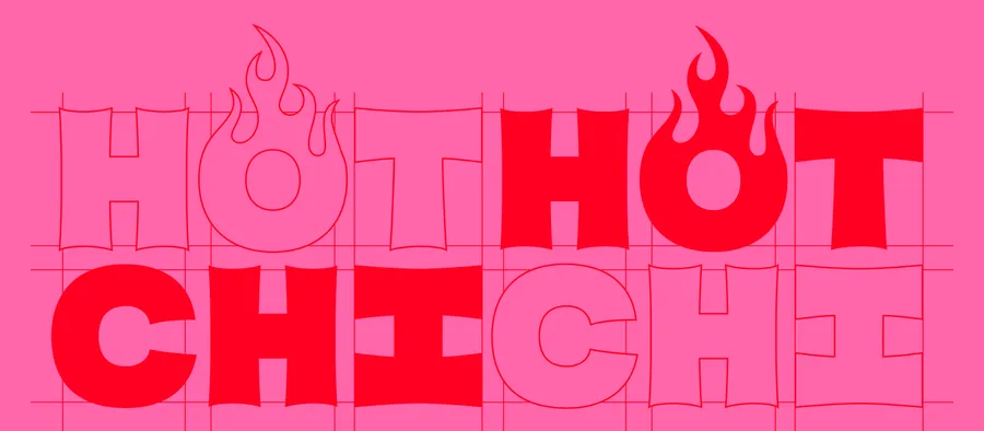
Span drew the custom Hot Chi lettering allowing the letters to stack and the flame to center
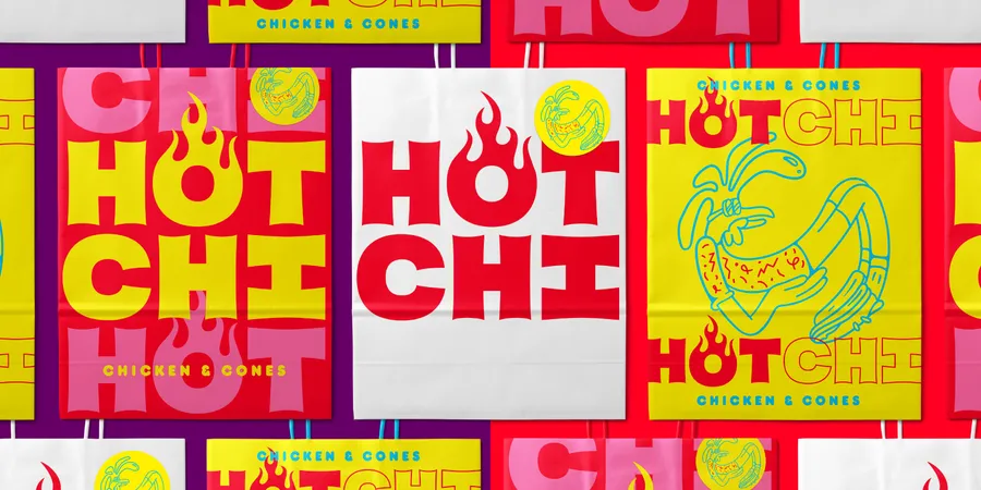
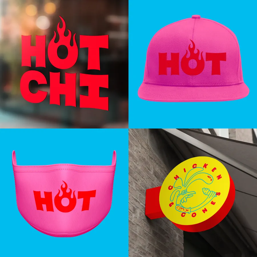
The classic Letraset typeface Frankfurter offers a familiar fast-casual feel, while the dayglo hi-vis colors communicate spice
Span designed a secondary signature logotype for artful moments
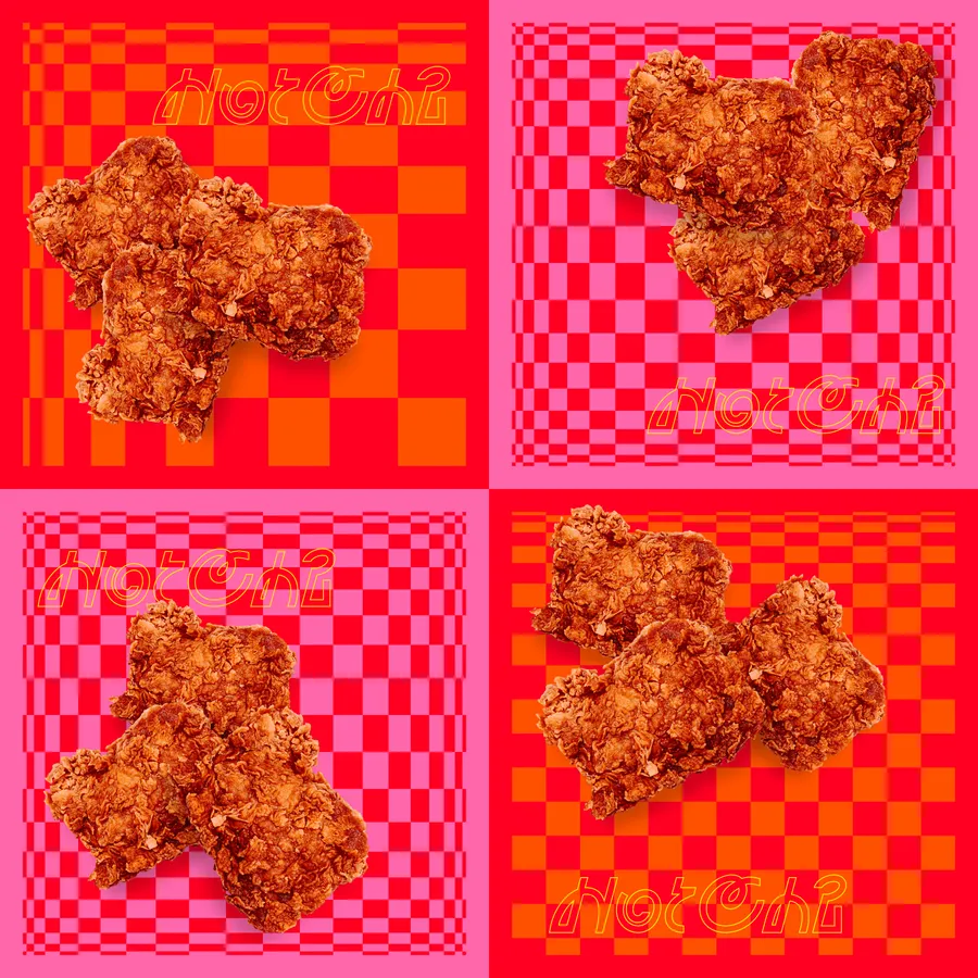
Classic homestyle, white and red checker patterns turn up the heat with inspiration from Bridget Riley’s op-art