Silverroom and Pop-Up Visual Identity
- Client
- Silverroom
- Credits
-
Rick Valicenti
Design DirectionNick Adam
Design Direction, DesignJohn Pobojewski
Audio
Designed while at Thirst
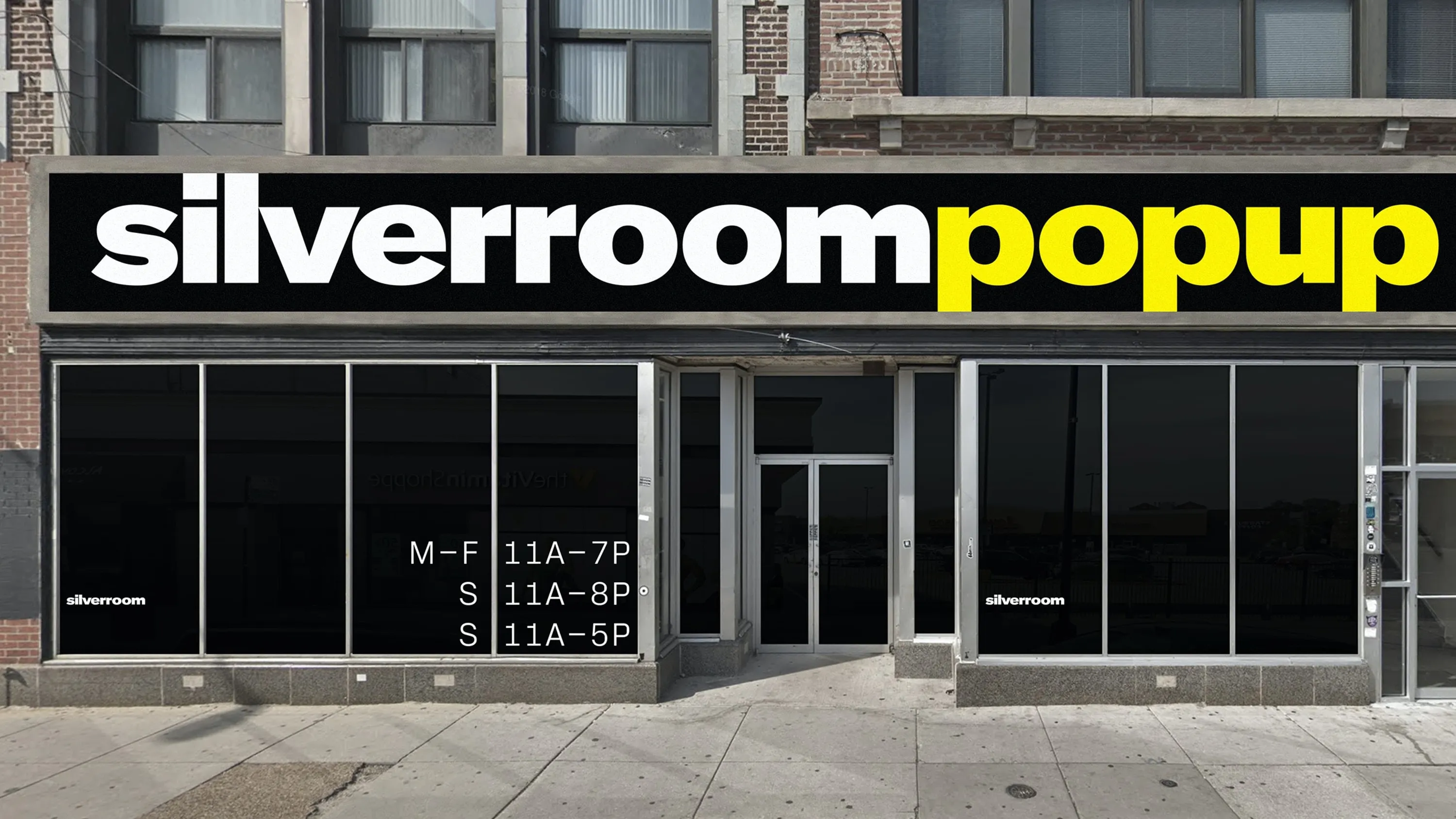
Chicago’s Silverroom founder and 2018 Loeb Fellow, Eric Williams, approached Thirst's Rick Valicenti and Nick Adam to reimagine the visual identity of his retail community space. Harvard GSD describes Silverroom as “The intersection of the worlds of fashion, music and visual art. Williams is committed to creating spaces and curating events that strengthen the community and fuel positive economic impact.”
Williams innovates the traditional models of Urban Planning through intentionally evolving the space to be a people-centered art and community enterprise. Our collaboration brought vision and a new comprehensive identity for the Silverroom. Adam’s type design unified formal ideas such as openness and structure while paying respect to the pulse of Reid Miles’ Blue Note album covers.
The work is dope.”
Eric Williams, founder of the Silverroom
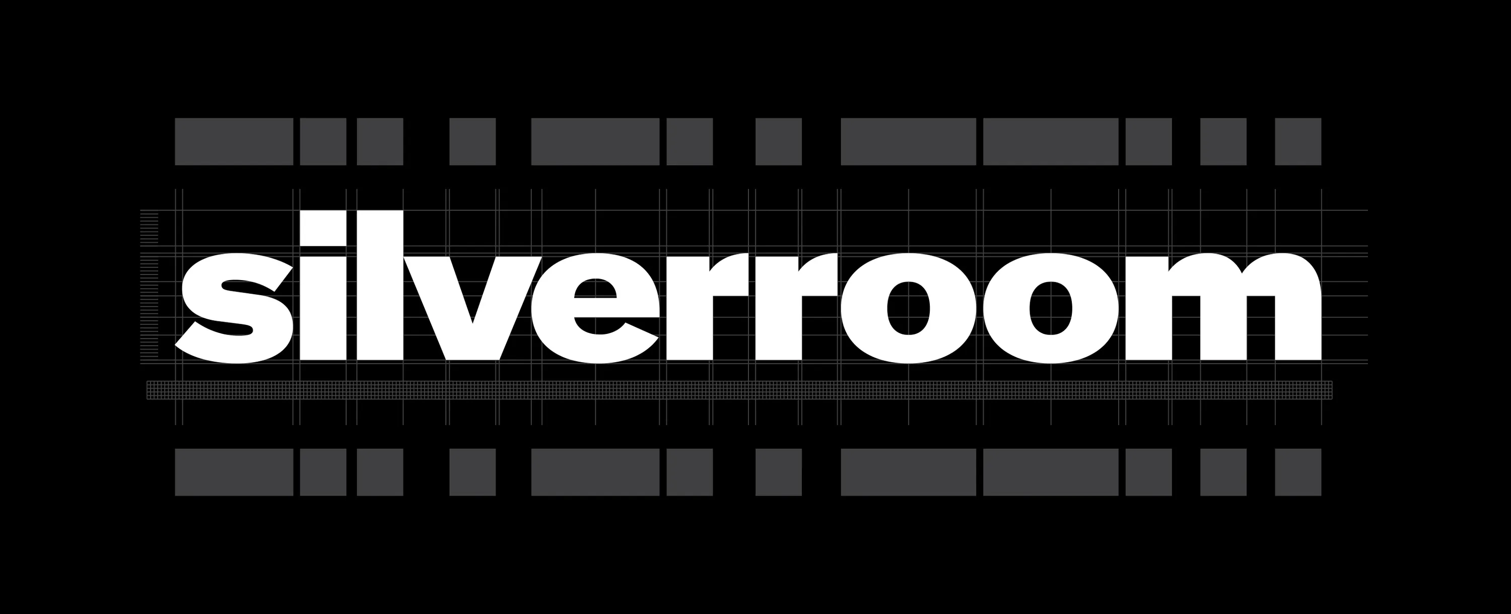
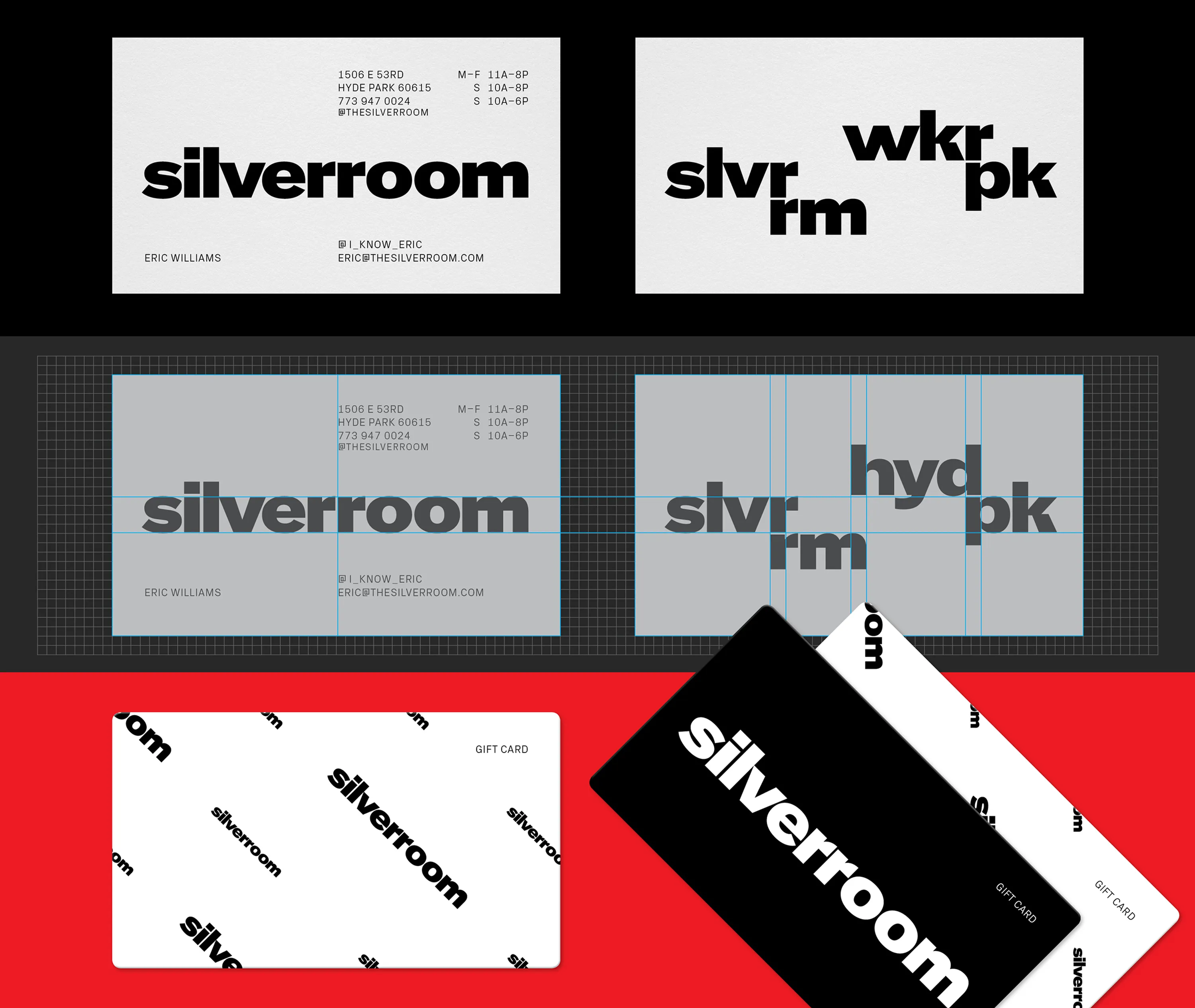
Nick Adam's type plays on rhythmic spacing, weighting, and dramatic flat and round contrast.


Interior architecture by Future Firm, with Norman Teague Design Studios


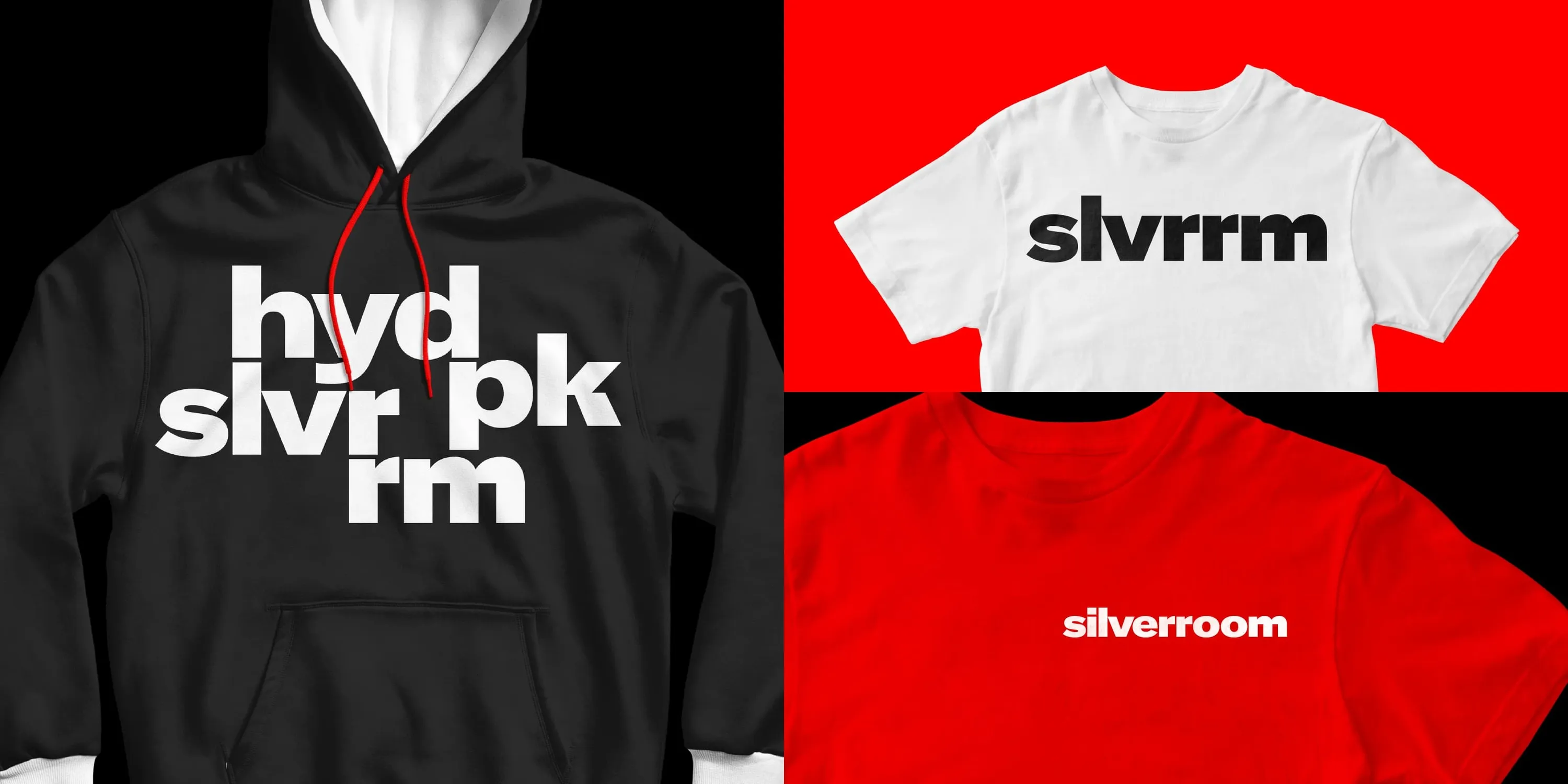
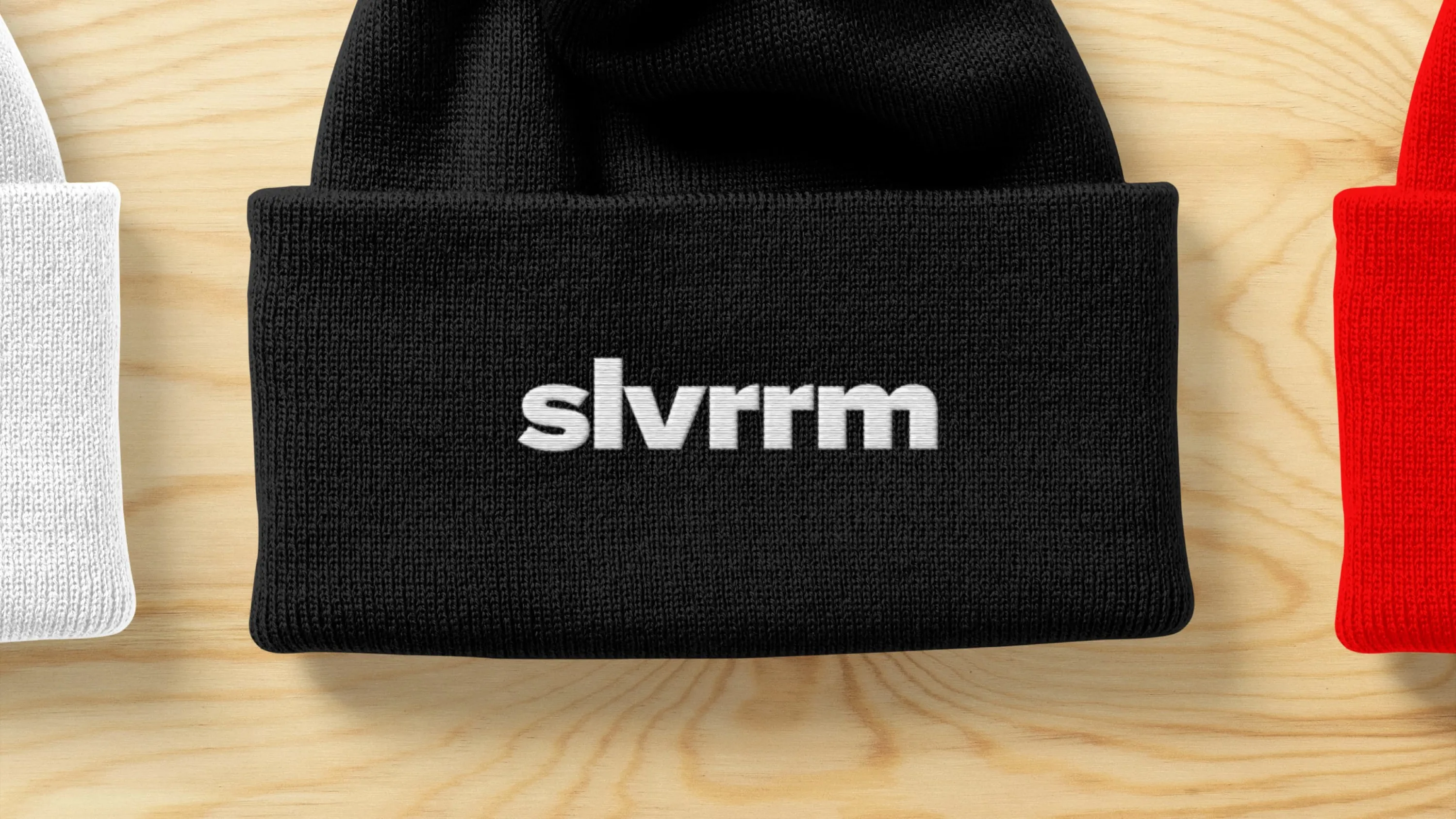

Identity contractions work perfectly for social media.
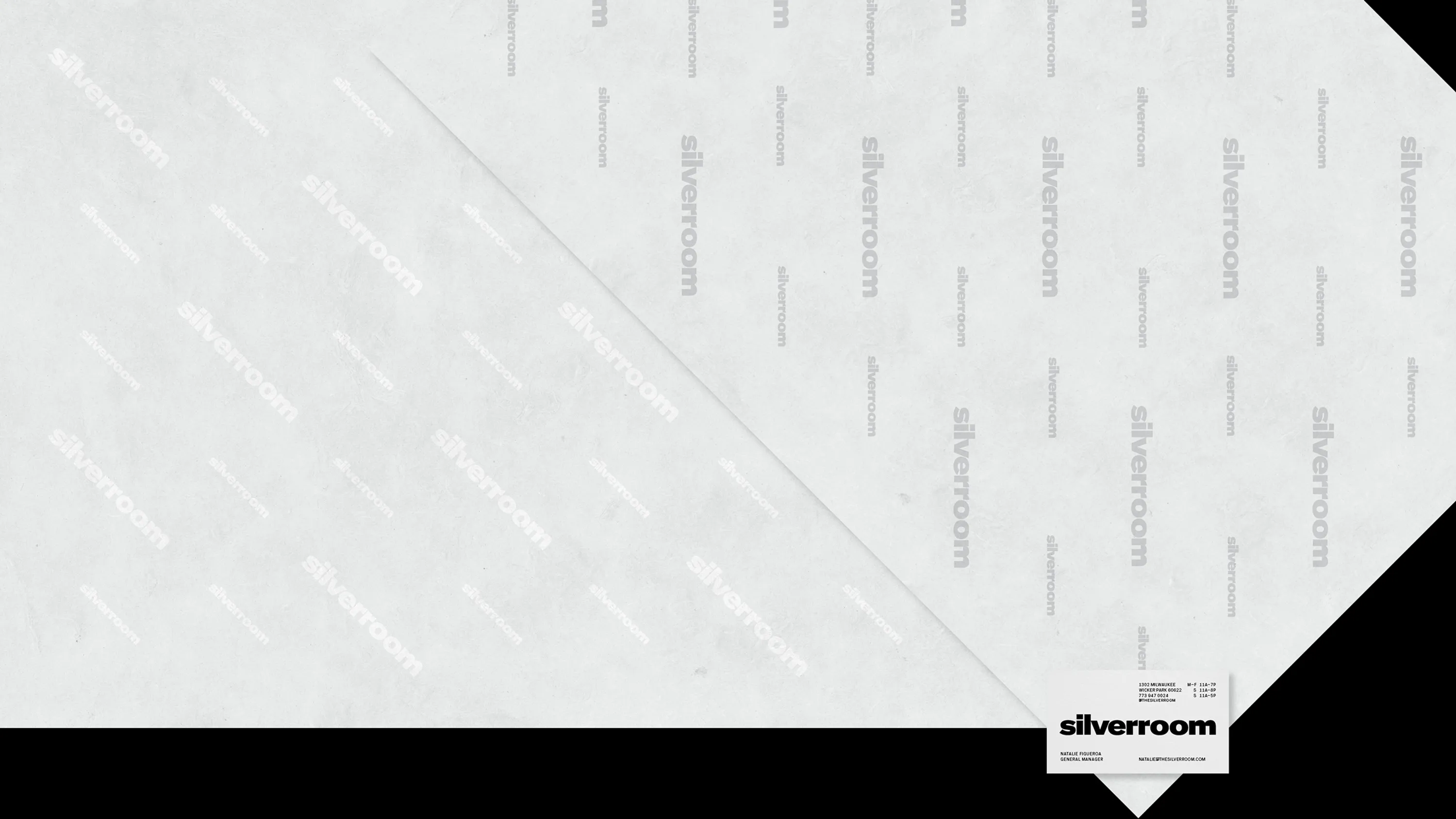
Business card for scale
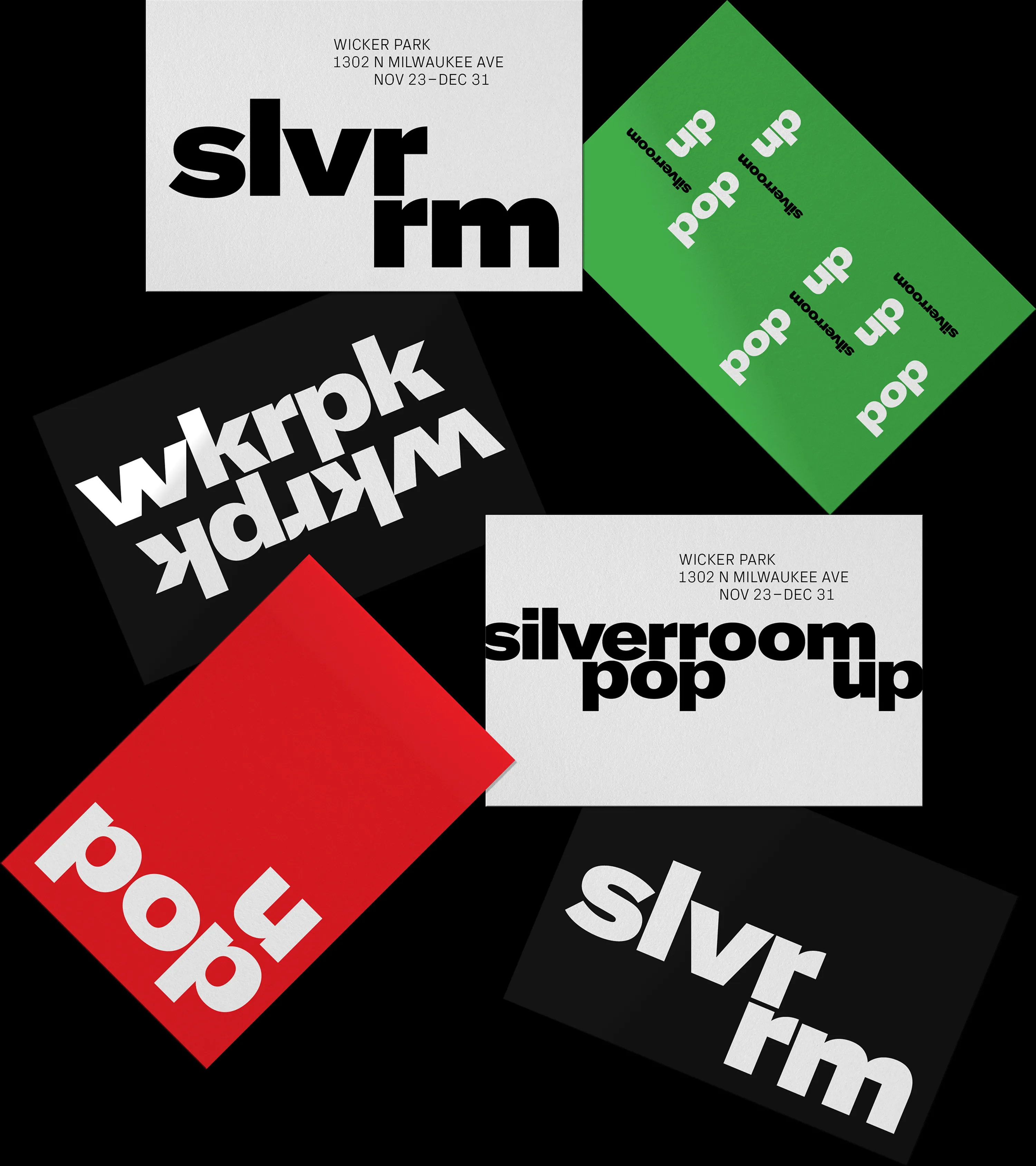
Postcards

Neighborhood posters